


Wednesday
Feb272013
0375: A Blast of Burgundy
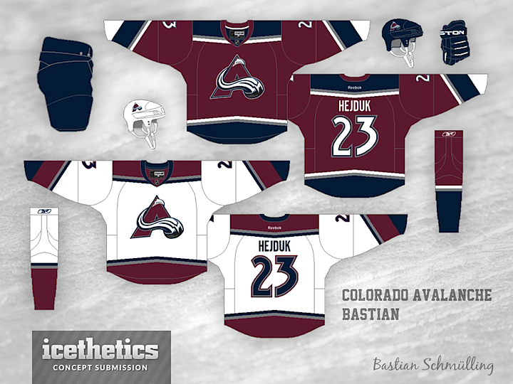
If the Avalanche ever opt for a more traditional jersey design, Bastian Schmülling has just what they need right here. I think this is a fantastic look.
Designed by  Bastian Schmülling
Bastian Schmülling 
Reader Comments (13)
I like the design a lot but isn't the blue too dark for Colorado?
It looks great! But it needs the shoulder patches! C'mon, there's always room for big foot!
I miss the blue! The logo looks weird without the oval behind it. But I do like the way the angles from the old jersey at the bottom are making a comeback!
i like it, but it is missing the light blue. without it, i think it just looks too dark. i like navy and maroon together, but they just blend together too much from a distance.
I love the road jersey! Something about the home jersey seems...odd. I can't place it. Maybe it's the lack of blue in the logo (not enough contrast between it and the jersey) and the white seems too strong on the end of the sleeves. I'm not designer, though - that's just my gut reaction!
not bad, but i think you need the circle around the A and the blue looks a little too dark. lighten it up a bit and you'd have a solid jersey set, especially compared to their current ones.
I like that the black is taken out of the scheme, but the blue is a bit dark. The colors at end of the sleeves don't add to much and seem like unnecessary detail. They would be better off gone.
Put the oval back in the logo and this is a 5-star concept.
Make blue lighter and add the circle back to the avs logo
Love the road jersey in particular! The only thing that I would change on the home jersey would be to flip-flop the colours in the crest, seems like the burgundy in the logo blends in too much with the jersey itself. Would love to see an alt. jersey based off this template. Great work!
The logo looks way better without the circle behind it.
The logo looks too off for me to even notice the rest of the concept.
Flatten the striping on the bottom torso (forget having that little peak) and this would be great.