


Thursday
Feb282013
0376: Becoming Generals
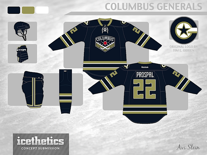
In today's concept, Avi Stein imagines a rebranding for the Columbus Blue Jackets as the Columbus Generals — you know, after a few military promotions. For a crest, he's opting for the unused logo seen in a video on the Blue Jackets' official website last year. For the shoulders, he's borrowing a logo originally designed by Tim E. O'Brien.
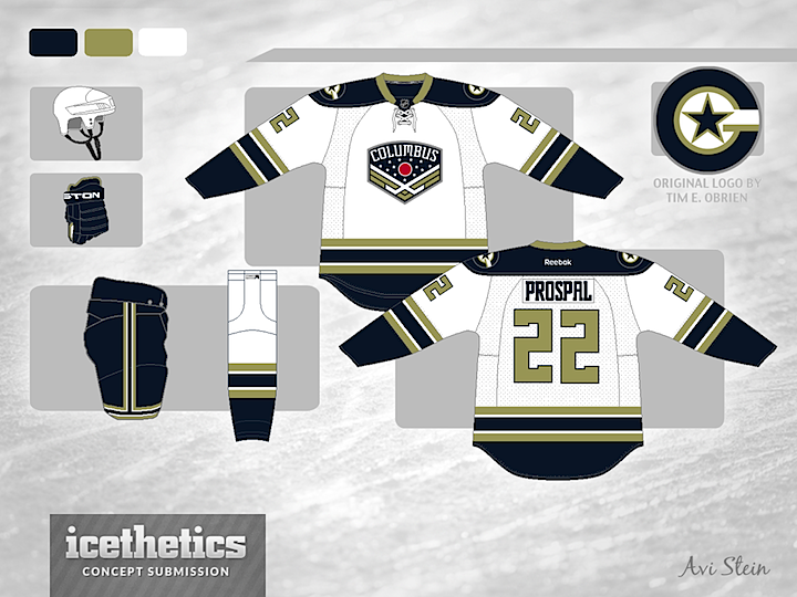
Designed by  Avi Stein
Avi Stein 
Reader Comments (20)
I would of liked to see that jersey with a camo pattern.
Awesome concept. They should have been called the Generals from the beginning. I love the logos and the colours. It has a Jets inspired feeling to the home and away jerseys.
This one is awesome! Just make the stroke bigger on the numbers, play with the colors on the shoulder patch and you have a beauty!
Love everything except the gold. The logo, sweater, and everything else are perfect.
Love it! Professional, sleek, creative! Still honors the tradition and reasoning behind their original branding of "blue jackets". Lets make this happen!
This is just ridiculously good.
love the dark ones. that would be something i would wear with pride, if i were a fan.
Huge CBJ fan I think we should change to these! GO JACKETS!!
Thanks guys, I appreciate all of the love! I'm working on another CBJ project right now that I will send to Chris, so stay tuned! If you want a preview of it, go to http://boards.sportslogos.net/topic/91512-blue-jackets-2013-14-welcome-to-a-new-age-updated/
i like the logos and a move to navy and gold colors but i just can't get behind the name change. trim the "G" into a "C" on the shoulders and keep calling them the bluejackets and i sold though.
the one spot of red is really nice and for some reason really grabs my attention in a good way. maybe i'd go for navy numbers with a gold outline on the road sweater but still very solid.
Overall, I think it's an improvement on their current uniforms. Their current identity is weak, and their basic red-white-blue scheme is overused and boring (Yes, I get that the colour scheme is from Ohio's flag, but it's still weak.). Your design gives them a bit more identity without being out of character.
Like it a lot and think they should totally make the change. But would rather see the red replace the gold. That teams NEEDS a major rebrand!!!
Am I the only person in the world who actually likes the Blue Jacket's current setup?
I have an old Hockey News that states the Columbus team was going to be the Xplorers. I also head the are thinking of changing the nickname from Blue Jackets
Is that supposed to be gold? It looks like olive green to me, and I'm digging it. Maybe yoke the home shoulders green if I'm right. If its supposed to be gold then a lil more yellowed is all ya need and I'd be excited to see this on the ice.
Ryan Y: I'm with you. I actually think the CBJ have one of the best sets and logos in the league.
Rod Giacoleetch: I'm curious where you read about the name change. I follow the CBJ everywhere and there's been nothing about a change. Don't see it happening.
As for the design itself. I thhink this wouold make an excellent 3rd Jersey, but using the current name. Well done.
Awesome concept. I hate to be nit-picky about the name Generals, but the crest looks like sergeant chevrons.
I love the look, but I really don't like that mustard-y color. I would replace that with the light blue they have on their third jersey and it would be perfect.
This look is awesome. Considering the Jackets are moving to the Eastern Conference next year, this would be great way to ring in the move with this rebrand.
Perhaps the chevron logo would look better as the shoulder patch logo.