Wednesday
Mar132013
0389: Starring the Weagle
 Wednesday · Mar 13 · 2013 | 9:00 AM PDT
  11 Comments

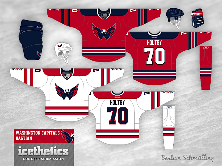
The extremely prolific Bastian Schmülling has a cool set for the Washington Capitals today. Every time I see a concept with the Weagle on it, I keep wondering why this team hasn't already done a third jersey with it. It's a great logo. And unlike their primary mark — it's an actual logo.
Designed by  Bastian Schmülling
 Bastian Schmülling


Reader Comments (11)
This is an excellent set. The weagle's a great logo for them, it manages to use a relatively common color scheme without leaving them looking too much like other teams, and the stars on the sleeve are a great touch.
The one thing I'd really like to see paired with this set is a white third based more heavily on the DC flag. It wouldn't be that different from the current white, and could probably be done by removing most of the blue (the weagle should probably still be blue, but the rest of the accents would go from blue to red, or perhaps white at the collar).
Even without that, though, great job!
The White jersey is perfect. The red jersey has too much navy, not enough white for my tastes. Perhaps inverting the red and white stripes on the waist and sleeves. That would make this uniform set almost perfect.
I'd say this is perfect. Why they haven't incorporated a 3rd like this, I'll never know. In fact, if they would decide to make these their permanents, I'd be totally on board with that too. gret look.
That is very sharp! I like how he included the stars on the bottom of the sleeves. I might even like it better than their current jerseys.
Should use the official logo
I like this set but feel the red jersey should have a white shoulder yoke.
great couple of jerseys the only problem I see is that the away jersey looks a bit to much like the white team Canada jersey from 2010
These are great sets! Would love to see some more concepts from this guy!
I can't find a single thing I would change about this sweater set. Very attractive! Props to Bastian!
Maybe a blue alternate to complete this great set? Or to at least add to their current set.
Sweeeeeeet! The Caps SOOO badly need to do this. The Weagle is way too good to be relegated to secondary logo status and I'm so tired of seeing that wordmark masquerading as a primary. Also, unlike the caps present primary jerseys, these actually look like hockey jerseys instead of Reebok Edge monstrosities. 5 STARS!