Thursday
Mar142013
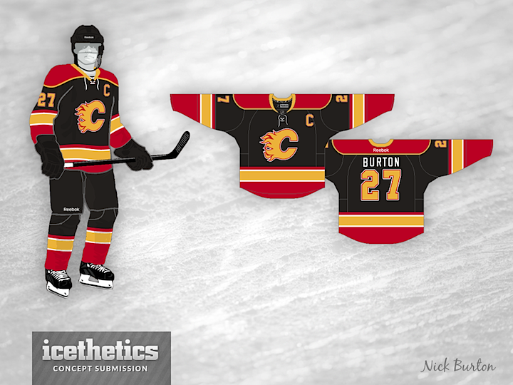
0390: Calgary Back in Black
 Thursday · Mar 14 · 2013 | 9:00 AM PDT
  8 Comments

I must admit this Flames jersey is an older concept from Nick Burton. He sent it in almost a year ago — so it doesn't really fit in with his current design aesthetic — and I'm only now getting to it. What does that tell you about the backlog? Anyway, I'm posting it because I think it's a neat look — for a black jersey.
Also, Happy Pi Day!
Designed by  Nick Burton
 Nick Burton


Reader Comments (8)
If the backlog is so big, perhaps add 3 jerseys each day.... not sure if that would make your workload unbearable but I know readers would love it!
Anyways, neat concept. I would change the gold color though to more of a yellow, nice job!
I'm a Flames fan and those old black jerseys of their's were awful. I don't want to see the team sport any more black again.
That said, I like this design, as the prevelance of gold helps make the red pop out more. Not bad.
i think this concept would be perfect if there were just red stripes around the yellow, with black cuffs and hem
That's actually really cool. I just don't like seeing the Flames logo in yellow. Not criticizing the designer for that, but the logo just doesn't look right to be when it isn't red.
These are awesome would buy these in a heartbeat.
And I hate the flames
As a Flames fan, I actually liked the Flaming Donkey logo. I would really like to see something like this in action as well. Excellent concept in my opinion.
I like the Jersey since the flames are getting a new 3rd jersey this could be it maybe the flames make a new logo like a flamming cowboy or bronco / Stallion
All in all a solid Design
I like the overall concept. It looks like a HOCKEY jersey (shoulder yokes, horizontal striping - Can't stand all the weird stuff that came out with the Edge jerseys.) It would look a thousand times better with a red C outlined in gold, though.