Wednesday
Mar062013
0382: Simplifying the Hurricanes
 Wednesday · Mar 6 · 2013 | 9:00 AM PST
  23 Comments

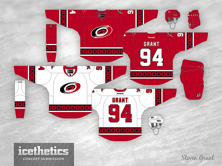
According to Reebok, the Carolina Hurricanes are slated for new home and road sweaters in the 2013-14 season. In all likelihood, the changes won't be significant — possibly something like what Steven Grant has done here. In fact, he's taken the silver out of their look entirely. Better or worse?
Update on Friday · Mar 8 · 2013 | 9:35 PM PST by
 Chris
Chris
 Chris
Chris

Steven's made some tweaks based on your feedback.
Designed by  Steven Grant
 Steven Grant


Reader Comments (23)
I hope that they will just get rid of those stupid shoulder stripes.
the cane's jerseys are already really, really red. like annoyingly red. taking out the silver makes them even more red.
Change the color to white on the home jersey and you've got yourself a jersey set the Hurricanes should definitely be using.
Well, this isn't bad... I like the silver, frankly. Adds a bit of depth. However, I do like the fact that this design has deleted that silly shoulder yolk.
Since it doesn't look any different besides the silver and the fake shoulder yoke, I would consider this worse. But I have no better ideas. I've thought that this is a weak jersey from the minute it debuted.
This concept moves in the right direction, but needs a few tweaks: Utilize current number set, add more subtile black accents, and limit the flag pattern to the waste only.
I never like the yoke, so it is nice to see it gone. I'd like the shoulder patch logo changed to something new also instead of the lips flag.
I think Carolina needs to start from scratch. Too many teams use a red and black color scheme and Carolina's just doesn't seem necessary. It would be cool to see them go back toward Whalers colors, keeping with the nautical theme, or at least use the black alternate jersey as a starting point and come up with something more "stormy" looking like those.
Way too much red in this.
I would rather see them keep the silver, makes them stand appart from the likes of Ottawa, Phoenix, Chicago etc...
Better - but go with black pants or at least red with black stripes on the pants.
It does look better now that it's been simplified. But I think what the Canes need more than new jerseys is a new logo; their primary looks like soiled toilet water mid-flush, and their secondary logo is the single flag for tropical storm warning rather than the dual flags signifying hurricane warning.
I think they should go to the secondary logo full-time, updated to the two flags of hurricane warning, but I digress.
I like this look for the road jersey. Not too crazy about that home jersey though, red overload.
This may be a tad bit better, but Carolina needs to start completely over. IMO they have one of the worst uni's in hockey next to Anaheim and Columbus.
I like taking away the shoulder yoke, but I kinda like the silver.
I know that not everyone's a fan of the shoulder yoke or silver/white accents, but imho, the all-red jersey looks REALLY over-saturated to me–I can barely make out the shoulder logo at all. The white isn't half bad though.
I know I'm in the minority but I love the shoulder stripes on the Canes current jerseys. I feel like this is a step down, although if the red jersey was the same as the white jersey (with the different colour on the end of the sleeve and the hem), I think it would be a pretty good design.
I really like the road jersey, it is much cleaner looking than their current road jersey. As for that red jersey of yours, it is way too red. I think that if you put a white shoulder yolk on the red jersey, it would actually look really good and it would balance the amount of red on the jersey. Adding a little silver would be good too.
Honestly, the only thing that needs changing is getting rid of the stupid piping on the shoulders. The silver and the current number/name fonts make the Canes' jerseys unique. Otherwise, they'd have the same colour scheme as if Detroit decided to add black. These are too boring and yet too loud at the same time.
Thanks for the comments everyone, I changed some things based on your suggestions. I completely understand the complaint about the original home jersey being too red, as I was actually trying to use as much red as possible (I thought it would set them apart from other red and black teams).
If there has ever been a team in need of a make over its the Hurricanes. Id like to see a grey shoulder yoke trimmed in black on the red and a red shoulder yoke trimmed in black and gray on the white. Arch "Carolina" over a smaller hurricane logo on the away jeresy and jazz up the numbers with a double drop shadow and slant them. I moving to NC in a few years and will get season tickets so please help them I cant look at that 40 times... LOL!
I have heard from people in the organization that the black jersey is staying the exact same. The red and white jerseys are losing the silver and warning flag pattern. In place of the warning flag pattern it will be one big stripe perhaps with thin stripes above and below it.
The updated ones are much better! Great job!