Monday
Apr012013
0408: Columbus Blue
 Monday · Apr 1 · 2013 | 9:00 AM PDT
  8 Comments

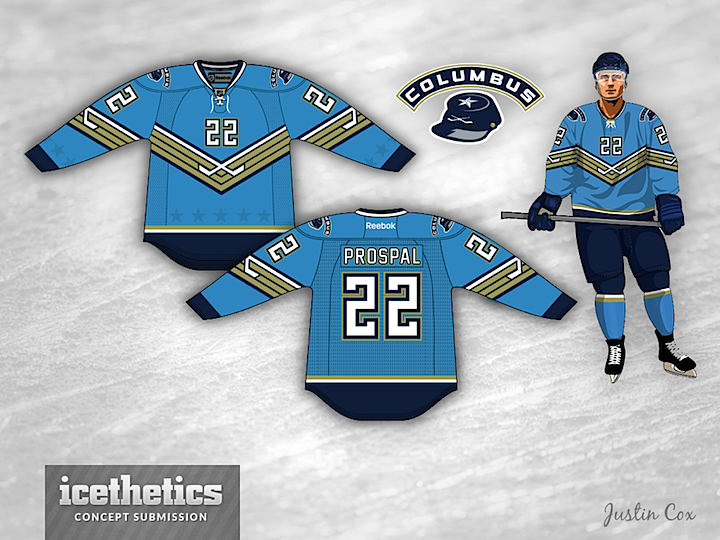
Um, it was either post this on Freak Out Friday or April Fool's Day. I usually love Justin Cox's work, and while I like this unique take here, I hope it never sees NHL ice.
Designed by  Justin Cox
 Justin Cox


Reader Comments (8)
The stripe pattern looks great on the sleeves, not in the front, it makes a V which makes no sense for the team.
I would keep the sleeve stripes and put a logo in front and you just might have a winner there !
i actually think it's awesome would change the ghost stars to white but this would be an epic 3rd
Even though this design is all over the map, I think it can be fixed into an awesome jersey. The powder blue you've got is a unique color to the NHL and the navy trim makes it pop. lose all those gold stripes and the numbers on the front and just stick the Jackets' primary logo on the front of the jersey and you will easily have a 4 star jersey and since the primary has red on it, maybe add a little bit of red trim around the numbers. Besides that, you could use a block number font.
The uniform actually is pretty cool and sleek but I think the "player" template's cut of jersey is making it a lot worse than it would be on an Edge jersey (the like other two)
Totally disagree, this jersey is awesome!
I know I will be in the minority, but I actually love this jersey, I think it would make a neat third jersey if it was only worn for a few games.
The only revision I'd suggest would be to remove the chest number and chest stripes in favour of the logo you're using as a shoulder patch here. That cap and text actually look like they could be a pretty primary.
The logo on the shoulders should be just great being the main logo on the center of the jersey.