


Friday
May172013
0454: Twist on a Habs Classic
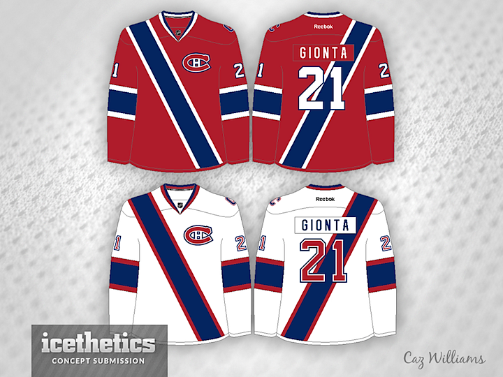
Yesterday we looked at a redesign of the untouchable Red Wings. Today, it's the similarly untouchable Canadiens. But unlike the former, the latter should really not be allowed to happen. Ever. Welcome to another Freak Out Friday. I applaud the great effort from Caz Williams, but I'm not sure a faux sash should be worn by the most historic franchise in the NHL.
Designed by  Caz Williams
Caz Williams 
Reader Comments (12)
great freak-out friday design, but awful for anything else. i love seeing daring things on friday but i can't see anything like this ever working in reality.
While that's not a good look for hockey, if the Canadiens were a soccer team, that would be absolutely brilliant. Honestly, I'd like to see that on a soccer kit template.
... Actually, I think I know who might be able to rock the sash: the Rangers. They could add a sash, and put the team name diagonally on the sash. Outside of them, though, this is a hard concept to play with.
Sweet Baby Jesus! What have you done to my Habs?!? I applaud the effort, and I think the captains patch on the shoulder is really neat, but I think the Habs are perfect just the way they are.
In all honesty, I kind of like this. Not enough for it to be a jersey, but I'd buy this as a sweatshirt.
Looks too much like a soccer jersey. I hate soccer...
WTF?!? Not even worthy of a freak-out.
Definitely a FF post.
The red jersey looks like something for a regal guard. Just add a few medals on the blue sash and there are ready for the gala ball.
As a fan of soccer shirts inspired by other sports (like Matt Willis's Soccer Out of Context series turning all 30 MLB teams into soccer identities), I like this; as a fan of hockey designs, this is just something that doesn't fly.
I didn't know hockey was doing Turn Ahead the Clock Night. But in all seriousness, for a Freak-Out Friday, it's a pretty good attempt.
Actually, that's pretty close to what the Habs wore for the 1911-1912 season: http://ourhistory.canadiens.com/jerseys-and-logos/1909-1946
I would buy this in rugby shirt form.
Although this should and would never be an NHL jersey, I actually like the design. It's fresh and different. It would be an amazing soccer or rugby design. But it's easy to use the same stripes and patterns over again, it's hard to come up with something this new, so props to the designer. If this was real I'd probably buy it.