Thursday
May162013
0453: Sprucing Up the Wings
 Thursday · May 16 · 2013 | 9:00 AM PDT
  9 Comments

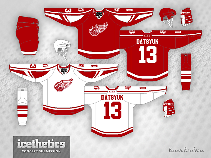
I know the Red Wings are one of those untouchable teams when it comes to uniform designs, but this page is nothing if not good for exploring new ideas. Brian Brideau had a pretty neat idea for the Red Wings. I don't know about you, but I'd kind of like to see this in action.
Designed by  Brian Brideau
 Brian Brideau


Reader Comments (9)
I love it!!! I am so tired of the boring old jerseys they have! Make this now!!!!
Not bad, but I would lose the odd stripes/color splash on the sleeves. It's very college-gy as is. Take those away and it's a pretty solid look.
no. no. no. no. NO. NOOOOOOOOOOOOOOOOO!
(okay, maybe add the shoulder patch to the current unis.)
Either one looks terrific for a Winter Classic match-up or for a third jersey.
Really like this set. I'd make the stripes on the red jersey match those of the white jersey. Great job! 5 stars.
Like I mentioned in the IceHL color voting last night, one-color teams look great.
looks awesome, much more inventive use of the edge template than reebok
This is missing the curved name made famous by the Wings. Put that on and make it a modern alt and it's not too bad. Just that they're one of the teams that should never change.
Love this look. The wings have such a difficult brand to modernize, and this concept does a great job using subtlety to update the classic sweater.