Wednesday
May292013
0466: Saddle Up, Cowboys
 Wednesday · May 29 · 2013 | 9:00 AM PDT
  5 Comments

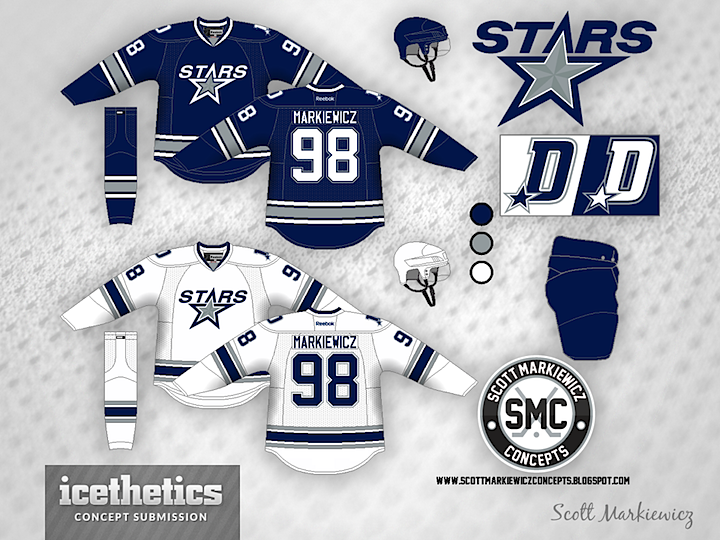
Today's theme is very obviously the Dallas Cowboys. Imagine the Stars decided to align their brand with one of the most well-known in all of sports — and certainly most well-known in their city. It might look something like this option from Scott Markiewicz.

Mason Hesse also tried the blue/silver route with somewhat different results. In fact, despite using the same colors as Scott, Mason's concept feels more like an idea for the Tampa Bay Lightning than the Cowboys. If you had to choose, which option would you prefer?
Designed by  Mason Hesse&
  Scott Markiewicz
 Mason Hesse&
  Scott Markiewicz


Reader Comments (5)
The top concept is awesome! As much as the league has a lot of blue, that is great concept! The lower one is also great, it reminds me of the old Capitals jerseys.
the question is, would they also wear their whites at home?
I think I would really like the second one as a Lightning Jersey.
These would all make excellent Lightning jerseys, but it's always cool to see sports teams combine.
I love Scott's concept. That is fantastic. I would love to also see a green version of those jerseys made without the beveled star on the logo. Once again, job well done.