Friday
Jun072013
0475: Disney Duck Freak Out
 Friday · Jun 7 · 2013 | 9:00 AM PDT
  10 Comments

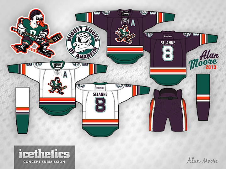
The Ducks seem to be an easy mark for Freak Out Fridays. But I really love what Alan Moore has done both in terms of color scheme and adapting the logo from those classic Mighty Ducks movies. If not for the logo, I might make a case for these jerseys to one day hit the ice in Anaheim.
Designed by  Alan Moore
 Alan Moore


Reader Comments (10)
The logos I'm still up in the air about, but a return to this color scheme would make the Ducks unique again. They currently have some of the most boring unis int he league. I think a return to something like this is a no brainer.
This is a good concept for the ducks. I'm not freaked out at all, they should get these.
Dude! Those ROCK! I LOVE THEM!
I was just about to start a look like this! I love it. Might put mine on hold now as this is so well done.
I agree with Chris, these are a really solid mix of the old & new. The colors work very well and I've always thought the current letter and number font would look great with the old colors. The lace-ups, stripe patterns, & pants look really good imo.
I love these jerseys! I love this colour scheme. The logo however would never fly. Thats freaky.
Put the old logo on front and send it to Anaheim we got us a great jersey
I'm a fan of the movies so I absolutely love these! Can't see them ever becoming reality though. too good to be true
Love this concept! Somehow the orange works with the old set of colors. Dont know about the D1 Duck as the primary logo though. Awesome job Chris!
This concept is actually freaking awesome! I would love to see the Ducks with those jerseys. Good job!