


Monday
Jul152013
0513: Boston Brown
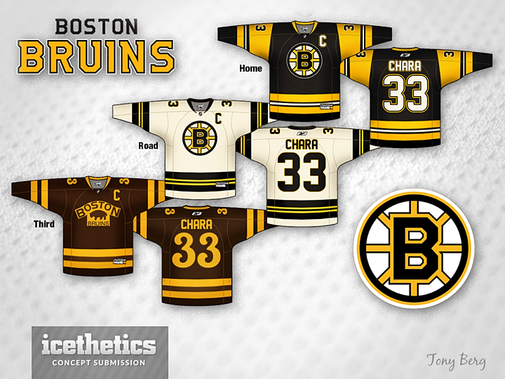
Tony Berg had a neat Minnesota concept last week. Now he's treating us to the Boston Bruins. It's a cool look but the first thing that stands out to me are the Penguins-style sleeves on the black jersey. But apart from that, I love the brown third. What's your take?
Designed by  Tony Berg
Tony Berg 
Reader Comments (7)
As a UPS jersey - a third brown version might be, but who is that three legged thing on a logo?
And now for a fifth time: Mr. Editor , Chris , how come you are still ignorant to my messages and to my numerous art works that I've submit to you??? I think it is time to break up your silence.
The black one is too much like the Pens from the early 90's. That's what threw me off. Love the white and brown jerseys.
Just swap "Chara" with the "Cheers" logo and that brown jersey's numbering would totally fit in place.
Great Design I love the home and 3rd . The Away one needs fixing on the yellow But the home could also serve as a Pittsburg jersey !
@Felix Puchinsky. The three legged thing is an actual Bruins logo: http://www.sportslogos.net/logos/view/z1utfxgasxwrgig9pgh27yd65/Boston_Bruins/1926/Primary_Logo The concept is nice, but Home and Away could work for Pens, and the Away should be true white, a little tired of the off white. Love the Alternate though.
@ Laurent, the black would be a sweet Pens jersey 9LOVE the yellow gold) HOWEVER the problem is that under RBKs color pallet the Pens gold resembles beige and or khaki. My wife has an RBK Authentic '08 (SCF patch) Pens #29 Fleury (home white....oops away white) and the "gold' is the exact shade as the KHAKI St. Johns Bay dress pants that I wear to work everyday
IMO the bruins home and road uniforms are one of the two or three best in the league. That being said its hard to improve upon near perfection. It's a good try but looks too much like a 90's penguin uniform and is not an improvement on what they currently wear.