


Tuesday
Jul162013
0514: Pittsburgh Gold
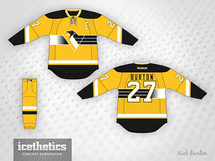
With all the talk about the Sabres going gold with their new third jersey, you have to wonder what other teams might be able to pull it off. The Pittsburgh Penguins have done it before, but not quite like what Nick Burton had in mind. His concept borrows from the Pens' original third jersey from the '90s.
Designed by  Nick Burton
Nick Burton 
Reader Comments (9)
i always liked that logo- i had the white jersey as a kid- but that stripe always seemed kind of weird to me. still not really a fan of it. like the idea overall, not not so eager to see that stripe pattern to return.
As much as I hate the penguins (being a Flyers fan), I would much rather see them change their colors back to this...rather than stick with the ugly vegas gold. I am really linking this jersey; one change I would make would be to have the black and white stripes go all the way around the torso instead of having the white, silver, black fade mesh thing going on (if that makes sense). And also add a thicker black outline to the sleeve numbers and "C" patch.
If you left off that stripe across the middle of the jersey and go with the skating penguin, then you might have something.
I absolutely loved that fading color stripe behind that logo, and that entire jersey. I'm still trying to get my hands on one.
It's just soooo 90's.
I think the old version had the three stripes and the thick stripe meet in the center of the back.
This may be the type of thing you're looking for in a third jersey - a unique pattern that doesn't work for another team. Another third jersey example might be the old Hurricanes one with the squares in the stripe.
Good jersey hate that logo
When I saw this I almost had a heart attack. I cannot go on about how much I love that logo. I grew up watching games at the Igloo, I had the jersey this concept was based off of, I freaking love the Van Damme movie Sudden Death (it's really good, an action movie that takes place in the Civic Arena. The logo is seen hundereds of times in it, and I love it.) I have a lot of merch with the logo on it. This is basically my favorite sports logo ever, and I would die for seeing the Pens use it again, with replicas of the jerseys they wore with it, or at least decent jerseys.
I want to see this at games, I want to see this on TV, I want to see it on merchandise again. You have no idea the joy it brings me when I look at this logo. It's simply a masterpiece of design that is severely underrated. I thank you infinitely for recognizing and acknowledging that logo. And I love this concept so much. Just thank you. I sincerely hope there are other people out there that appreciate the logo as much as I do.
@ NASCARFAN160, by the same token, that pajama uniform (as Paul Steigerwald called it) you speak of and that Pigeon logo (as Lemieux himself called it, I'll have to dig that article up from my old Pittsburgh Press clippings) makes me puke. If you go back to when the Pens were born in '67 they always had a Skating Penguin logo (they never used said logo until the '11 WC...the fat penguin/scarf was supposed to be logo worn on original uniforms back in '67). 70's Skating Penguin, 80's Skating Penguin, '93 Pigeon, '02 (as a 3rd) - present (full time) Skating Penguin
I'm a huge fan of this Penguins logo. The skating penguin looks like a minor league logo to me. Sports logos don't have to have sports equipment in them. And they shouldn't, unless it's done in a clever way. Animals in sports logos don't need to look angry either.
I don't mind asymmetry in jerseys sometimes, but I've never been a big fan of the weird gradient/striped chest stripe on that old Penguins jersey. But I like the way the white lines from the logo extend to the chest stripe. They should just go all the way around.