Sunday
Jul212013
0519: USA Hockey
 Sunday · Jul 21 · 2013 | 9:00 AM PDT
  6 Comments

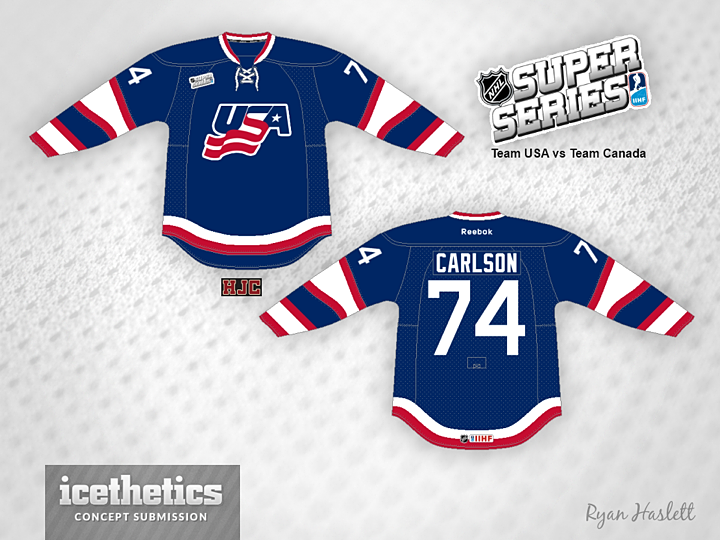
Think it may soon be time to find a new theme for Sundays. Or perhaps to drop the Sunday theme altogether. But for now, Ryan Haslett shares this look for the United States.
Designed by  Ryan Haslett
 Ryan Haslett


Reader Comments (6)
don't like the curviness of the bottom stripes, but the sleeve stripes are interesting. i do like that the stripes make it kind of looks like a flag in the wind.
I don't like this in here is why: 1. sleeve stripes reminds me the cigars band., 2. stripes on the bottom of the sleeve will not be visible because gloves will cover them up., 3. no creativity here versus past USA concepts., 4. bottom hem is not necessary. I would change a shape of a sleeve stripe ( simply make two red bands close to each other, like on a crest ) and a yoke is asking for white stars to be place on - like on a flag. Then it would be a great jersey for our Team USA to proudly wear in Sochi!
Chris, has there been a loss of interest in International Sundays? The International concepts have been some of the better concepts posted on here as of late. Anyway, this is a neat jersey. The only thing I would do is straighten the stripes. Besides that, this is good.
@R: There's certainly a decreased interest from the designers. There are basically three guys I've been rotating through so I don't feel we have enough for a weekly feature. That's not to say I won't post good national team concepts. I'm definitely happy to keep doing that.
LIKES:
The sleeve striping. Like as has already been stated, it's reminiscent of a flag waving in the breeze.
DISLIKES:
The hem striping at the bottom, it looks like the jersey is melting. Those stripes should go straight across.
The shoulders do seem to be a bit "naked" too. Maybe add a few stars to them.
I wish the IIHF would let the teams use "corporate" logos again. There is just something nice looking about both the USAHockey & HockeyCanada logos.
Oh I see. If that's the case, I can understand why it is probably time to change it up a bit. I'm glad to hear that there will still be some International jerseys posted once in a while. As I said before, the designers who have been making the International stuff have continued to do a very good job.