0646: The U.S. in Sochi
 Sunday · Nov 24 · 2013 | 4:11 PM PST
  4 Comments

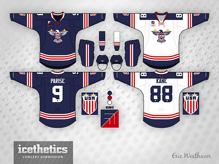
With the Olympics now more than three months away, I'm bringing back International Sundays. Each week we'll take a look at some interesting national team concepts. We're kicking things off with Eric Westhaver — a designer who's work you'll be seeing a lot here — and his take on Team USA. Below is his explanation of the design choices.
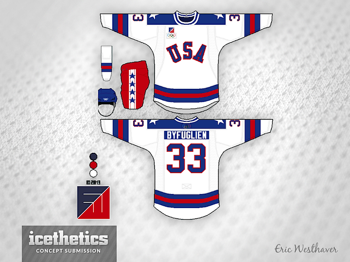
Patriotism reigns supreme here. There is a new eagle logo on the front, a new crest logo on the arms (shown on the side) and a brand new, totally original font with subtle stars and serifs. Eagle and crest both have two gold stars because of the two Olympic gold medals. The throwback is, of course, the Miracle on Ice. Because why not? U.S. hockey has never had a bigger moment after all!

Eric submitted a series of concepts for most of the countries taking part in this winter's Olympic tournament. They will be featured each Sunday.
 Eric Westhaver


