Tuesday
Jul302013
0528: Revising the Sharks
 Tuesday · Jul 30 · 2013 | 9:00 AM PDT
  11 Comments

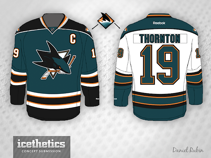
The San Jose Sharks are one of a handful of teams expected to make tweaks to their uniforms for next season. Daniel Rubin tried changing the shoulder patch and the striping around the bottom of the jersey. Already an improvement, but I think we'll get a bit more than this when the time comes.
Designed by  Daniel Rubin
 Daniel Rubin


Reader Comments (11)
Replacing yellow with silver would be a nice touch
I wouldn't be surprised if they swapped out the orange with silver. I think they have great uniforms so I hope they don't do anything too drastic. The shark looks better than it ever has. Not a huge fan of the black 3rd but I love the other two,
this is barely different than what they actually wear, and I don't like the slight changes that were made. almost zero reason for this concept, as far as I'm concerned.
Nice and basic, I like it. Looks better than what they already wear, but not by much. I'm all for subtle changes though. I'd like it if they got rid of the orange in their jerseys.
Even better if they reused their inaugural colors, or the colors they used from the late 90's-2007.
They just need to go back to their original jerseys. The jerseys they wear now are some of the ugliest in hockey. The yellow and black completely ruin the jerseys in my opinion. I usually hate black based jerseys but the alternates they wear now are so much better than their home and aways becuase it doesn't have that yellow in it. The Sharks had some of the best jerseys in the league before 2007, the switch to edge style jerseys ruined their jerseys almost as much as it did the Stars jerseys.
I might be in the minority here, but I love what the Sharks wear now. I don't think they should change a thing except for getting rid of the stupid front numerals.
I don't like it. It tries too much to break a predictable striping pattern.
I honestly see no problem with the Sharks' current uniforms. They're unique and not flashy and that's all a hockey uniform needs to be.
IMO Sharks have worst colors in the entire league...never liked the teal/blue/whatever and the orange. If ever a team could be rebranded/get a new log -- this is top on my list.
Why do you all seem to think that is yellow? last I checked the sharks have Orange as their third color and that looks like what is on the concept above as well.
Side note: I agree with most of you that think they should swap out orange for silver.
They use the black third every playoff to me its either they are going to make the 3rd the new HOME and the cureent home as 3rd and i think they are going to use the 3rd logo with no triangle background as their main logo
This is really great! Exactly what they SHOULD be wearing now. love the color on the cuffs and fin shoulder logo. But really like ditching the chest number. Also like the pointy shoulder yoke. Great job!