Wednesday
Jul312013
0529: The Orange and the Blue
 Wednesday · Jul 31 · 2013 | 9:00 AM PDT
  10 Comments

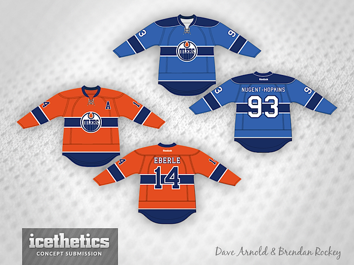
For whatever reason, the Edmonton Oilers seem to get left out of the concept conversation at lot. Could be the most folks think they're already as good as they can be. Or they're just not interested in making improvements. Here, Dave Arnold and Brendan Rockey have teamed up to create a pair of alternate uniform ideas. One orange, one blue. Are the Oilers on an inevitable crash course with an orange third jersey or what?
Designed by  Brendan Rockey&
  Dave Arnold
 Brendan Rockey&
  Dave Arnold


Reader Comments (10)
I really like the orange jersey. I also think it would work if they just took their current dark jersey and switched the placement of the orange and blue on it for an alternate.
Lifetime Oiler fan here.
No.....just, no.
Put a blue yoke on the orange jersey and change the font to match the Oilers' other jerseys, and send it to the team! Absolutely beautiful concept, why aren't the Oil wearing these already?
If the Oilers are to go with an orange third jersey, why not resurrect one from the WHA days?
the orange is swell the blue is nightmare fuel
I like the colour combos and the Canadien-type stripe. Interesting stuff
Looks clean at least
I can see the blue one as more of a Jets jersey, the orange looks pretty cool though
Good attempt. The orange version's numbering should be in white as it gets hard to read on top of the blue strip. The powder blue one is interesting
Great to finally see an Oilers concept.
It's a very interesting process to try to take the regular Oilers logo and put it in a revamped, simpler jersey.
I can't say however that I'm behind this one. First, a small but crucial point to me is the exact hue of blue and orange. The blue and orange here are too desaturated, that is they are slightly greyed, and it makes them a little sickly. If you look at the dark blue for example, it's sneaking into that Colorado Avalanche toned down blue that I find so depressing. It might be a result of computer software selection palettes, and not the intention of the two gentlemen who made these designs.
The only other thing that I dislike here, sinks it for me. It's the horizontal bar underpinning the logo. I know the Canadians use it, but the Oilers logo is different and I don't think it works here. The Canadians logo itself is something of a bent strip and it's not much taller than the jersey stripe so the two elements link together visually better. In the case of the Oilers logo, you have to partially consider it as part of the logo, but the circle logo doesn't need it. The circle is a strong shape itself, and the bar mitigates the impact of the circle sitting in the middle of the jersey as it normally does. Unfortunately, when you look at this horizontal bar, it reminds you of jerseys from other sports which to me is usually unwelcome in hockey shirts. I'm not conservative, but I think there are so many visual moves to be made that could be great, and still fall inside the tradition of hockey. I also can't help thinking of a wrist watch.