Monday
Aug122013
0541: How to Fix Vancouver
 Monday · Aug 12 · 2013 | 9:00 AM PDT
  7 Comments

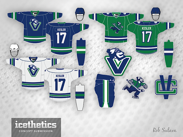
Rob Sulava has solved the Vancouver Canucks. I'll grant this isn't something no one's ever thought of, but it is a beautiful demonstration of how good the Canucks could look if they really wanted to. And they wouldn't even have to pay for any new logos. Smashing work.
Designed by  Rob Sulava
 Rob Sulava


Reader Comments (7)
I love the home and away. But I can't get behind using the full-bodied Johnny as a primary crest.
The jersey designs work, can't stand either Jonny Canuck logo.
Its clean enough, but as a Canucks fan I really fail to see how its an improvement on either the orca "C" main set or the revamped Stick-in-rink alternate we already have. Is the Johnny head really stronger than either of those logos? I like it as a secondary, but as our main logo?
Anyways, the main set does look nice an clean, though the shoulders seem a little bare. Also, no stick in rink shoulder patch? Blasphemy! :P
The alt just reinforces to me that making a good green third for the Canucks is hard... I have not yet seen one that feels quite right... hard to get a good balance with the colors, and poor full body Johnny just looks a little bare all by himself.
I've seen decent logos putting full body Johnny in a roundel, but thats a lil overdone. I really wonder how he'd look on a triangle or V for Vancouver, kind of like the Penguins, Sharks or old school Anaheim.
One of the best Canucks concepts I've seen to date. However, here's what I would do:
1. Make the skating Johnny Canuck the primary and move the Johnny V to the green alternate jersey.
2. Add the updated Stick 'n Rink logo to the shoulders of the home and away set.
3. The font would be the traditional block-style and green accents added to the numbers on the home and away set.
4. Remove the blue shoulder yoke border from the white sweater.
5. Keep the socks striping consistent with the sweater striping on the home and away set.
Overall, a very nice looking set that utilizes the Johnny Canuck brand. I have a strong feeling that once the Canucks are done with their Millionaires centennial celebration, we are going to see Johnny gradually make the move to primary status.
i really wish people would come up with a new logo instead of using these goofy 'vachon' logos. that's how you rebrand the canucks.
although, i like the design of the away jersey.
They need a new logo/s and they need to completely change to fix their failing identity. This was a nice try but in my opinion a swing and a miss. I'd kinda want to see a 2012 all star game ish jersey with some alterations but im probably alone on that.
I can't stand the blue and green. I prefer the black, red, yellow and white; if those colours were combined with the Johnny Canuck logo and the current layout, that would work for me. I'd do one myself, but I just don't have the time.