


0542: A Mighty Retro Trio
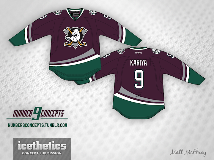
With the Ducks already confirming a "Mighty" throwback is in the works for this their 20th anniversary season, Matt McElroy lays out the intriguing possibilities that lie ahead. First, there's the classic. Can't go wrong with a little eggplant and jade. Though I might quarrel with the modern-day striping.
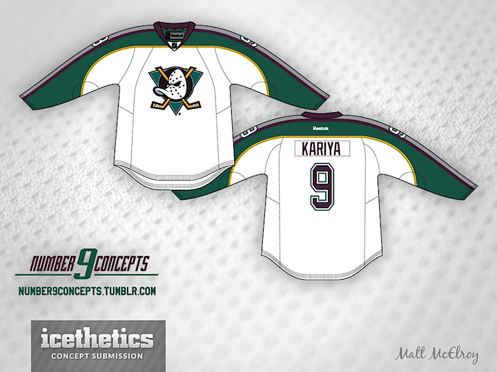
Then there's the white alternate worn between 1997 and 2000. Another solid look with unique sleeve striping that sets it apart from other hockey sweaters.
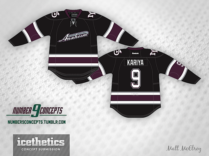
And of course there's the trusty black number that the club used as a third jersey during their final three seasons as the Mighty Ducks. Turned out to be a harbinger of things to come as the new Ducks have worn black ever since. Any of these three strike you as a good option for throwback fever this season in Anaheim?
 Matt McElroy
Reader Comments (14)
"Can't go wrong with a little eggplant and jade" should read "Can't go right with a little eggplant and jade"
That color scheme is just hideous
Well... If look carefully enough there are more on a palette besides jade and eggplant : white, yellow and gray were other colors during a reign of a " Mighty Ducks " of Anaheim. I wouldn't mind to see " Ducks " putting on their original uniforms for a Dodger Stadium special event. Top concept is my favorite out of three. I'm not sure if I sold on a curved stripes over a traditional diagonal? Somehow, dots from a crest's mask asking to be added somewhere on a jersey... Bottom concept telling me that is LA " Kings " appropriate color scheme. Middle concept looks in progress.
The top one is amazing...the other 2 are awful. I don't mind the eggplant as a main color, but when it's secondary and paired with the black, it's brutal.
Why not a district 5 ducks look for the outdoor game?
http://img811.imageshack.us/img811/3902/quackquackquack.jpg
The first one looks awesome! I love how it combines both eras of the franchise.
#1 is great!
I'm tired of all the Ducks concepts. aside from the fact that every single concept is pretty much exactly the same, they all use the same dull, boring, ugly colors.
Their old third wasn't black, it's just a really dark shade of purple. It's a two-tone purple jersey.
m0s: Not sure where you heard that, but it's not true. The 2003–2006 third jersey was always black.
First off, this just gets me more and more pumped about the throwbacks. These are all great and likely, I wouldn't be surprised, and I'd totally be happy, if they come back with a replica. The first one is definitely my favorite, those jerseys need to come back permanently. Maybe one day the voice of the NHL fanbase will prevail and the Mighty Ducks identity will make a triumphant return. I'm anxious to hear how the jersey sales will do if they bring back something like the first one. Though I'd prefer the original striping pattern, this one is close enough for me.
As for #2. I love their 1997-2000 alternates, they're perfect alternatives to their inagural sweater set, I don't think I would've minded if they eventually replaced them with their original home/road jerseys. But in any case, I'd still get this if they resurrected it via Edge.
And number three...I was never too fond of this jersey. But I'll be okay if they bring this back, as long as they bring back the teal/purple, too. But overall, amazing trio of concepts. I'm looking forward to the big day!
I really like the top one, I wonder what it would look like with the new "D" crest?
Striping is atrocious
Chris is correct. The 3rd jersey was indeed black.
As a Kings fan, never understood why they went with a black, purple and gray third... But these look pretty good, although I don't care for the amount of grey in the second concept.
@Aaron Sorry I got your request so late, and I wish there was a user reply notification system on here because you probably won't see this, but here you go. It's kinda amateurish, but it's what I can do.