Thursday
Aug222013
0551: Winnipeg Throwback
 Thursday · Aug 22 · 2013 | 9:00 AM PDT
  12 Comments

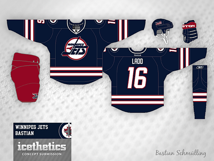
It's Thursday, so let's do a throwback. Bastian Schmülling is back with this mix of old an new for the Winnipeg Jets. What do you think? A smart third jersey when the day comes?
Designed by  Bastian Schmülling
 Bastian Schmülling


Reader Comments (12)
Absolutely perfect. What a great mix. The perfect 3rd. Well done!
Beautiful uniform except for the pants. I've never liked the look of red pants with a blue jersey and socks. Other than that, fantastic.
Wow, the current air force logo looks really good as a shoulder patch. That said, something about about having three encircled logos on the same sweater looks off to me. I'd love to see the old colours come back but this set needs some tweaking - air force shoulders with different primary or same primary and maybe no shoulder patches?
Ummm is there some reason why the Winnipeg Jets don't already use this uniform??? This one gets 6 stars out of 5.
If only the Coyotes (the original Jets organization) would approve of them using this logo, but then again it's probably best associated with the original franchise only. Either way, I'd love to see the new Jets use this, especially with the shoulder path, I love it. A white version and there you have a great sweater set.
@Don I think he made the pants read because that's what the color was on the jersey that this is referencing.
I don't use the word often, but that uniform is gorgeous. I would so much rather see that than what they're wearing. Their current jersey's nice, but that is pretty much the perfect blend of old and new.
@NASCARFAN160 - The Coyotes have no say over the use of the old logos, the trademark is owned by the league, and is available to the current Jets should they want to use it. True North made that known when the name came out, but they wanted to establish a new brand. True North controls all merchandise with old and new Jets logos on them, and made it very well known that they were no longer making new goods with the old logo.
As a winnipeger, especially as one that works in sports retail, I am SO BEYOND SICK of this stupid 90's logo crap. Be honest and look at it objectively and take off the nostalgia goggles. If this were a new logo you would all HATE it, it's a circle and a wordmark!
Nothing against the concept itself, as most of the 90's logo concepts go, it's a good one. But I am so tired of the logo and the people screaming to bring back a team that left 15 years ago, and hadn't been successful since the WHA anyways.
sighRoyal blue would be better than navy, but I do like that it is blue and red rather than two shades of blue.
@ IAN K
Your point about old logos could be made for probably each of the original 6 teams and then some. How do you think Boston fans would react if they were given an expansion team, called it the Bruins, and their logo was a spoked B. They would get murdered. And the Leafs? That's grammatically incorrect.
The Jets 2.0 now actually own this trademark as of February, 2012, not the NHL any longer. They can use it however they wish (Though I'm sure there are clauses within the league's rules...)
If the pasted link doesn't work, search the Canadian Intellectual Property Database for Trademarks and file number 1133568
http://www.cipo.ic.gc.ca/app/opic-cipo/trdmrks/srch/vwTrdmrk.do?lang=eng&status=OK&fileNumber=1133568&extension=0&startingDocumentIndexOnPage=1
Six words: THIS. IS. SO. FULL. OF. WIN!!!!!!!!