Friday
Aug232013
0552: Another Brooklyn Freak Out
 Friday · Aug 23 · 2013 | 10:44 AM PDT
  12 Comments

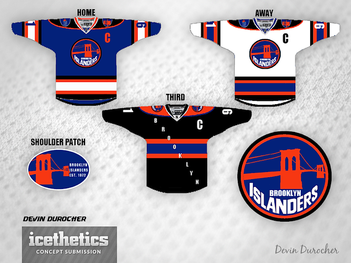
You wouldn't believe the number of Brooklyn-based Islanders concepts I've gotten since the team announced it was moving. Some good, some bad. But every once in a while I come across one I really have to share. Devin Durocher's is one of them. I can't decide if it's one of the best things I've ever seen or one of the worst. Either way, I thought you should see it.
Designed by  Devin Durocher
 Devin Durocher


Reader Comments (12)
These are ATROCIOUS. They're still in New York and have made it clear logo/name won't change. I like the idea of incorporating the Brooklyn bridge on a third, but that's about it. Didn't think it was possible but that third is worse than the current thirds. Black/orange/blue don't work.
It should be noted that when the islanders they will still be called the New York Islanders not Brooklyn. That being said I love the concept of the logo. I do not like the idea of diagonal letters on the third, that belongs on the Rangers jersey and the Ranger's jersey only.
this may be the worst thing i've ever seen on here
I just assume it's been a slow week for concepts? haha.. this isn't worth a share IMHO
That logo has some very good potential. Everything else should be thrown off of the Brooklyn Bridge.
I um...like the color scheme...and how it has black in it...and, um...yeah, that's about it.
Logo in the concept ( the way it is done ) - HAS ZERO POTENTIAL !! A diagonal script belongs to NY " RANGERS " - so, LEAVE IT ALONE!!! 2. adding a black color to an existing " Islanders " color scheme - IT MAKES IT either NY " KNICKS " or NY " METS ". On a logo now; NY " ISLANDERS " do have one of the nicest, decent logos in the entire NHL - LEAVE IT ALONE and DON'T PLAY WITH IT!!! Mr. Devin Durocher was trying to past a poorly done silhouette of the Brooklyn's bridge on top of the existing hockey's club script forgetting completely about the letter " I ", which doesn't join the rest of the lettering in any form of motion nor a shape, never mind the spacing and etc. Bridge doesn't look even close to reminiscent a Brooklyn bridge by any means... It kind of looks like a scarecrow thing in the garden or a top portion of a construction crane. Then a word " Brooklyn " beneath??? Noting positive about this concept, sorry...
Brett Yourmark said that he wants to have the islanders have the Brooklyn brand . Brett your Mark said that he wants to have the Islanders just like the borough of Brooklyn and the nets that means he said he wants to incorporate black and white for the uniform just like the brand Brooklyn. HELLO BROOKLYN
the black is horrible, but the home and away COULD be good with a few tweaks. i may or may not love the logo. i wouldn't change that at all.
@Dustin I presume Chris means ridiculous, whether it be in a good or bad way when he says "worth a share". :P That, and the chance that someone will like it.
Not saying this is terrible, it was a nice experiment. To be honest, the logo is pretty cool. But the third jersey, and overall design of the home/away are just...too much.
Warriors ripoff
This concept's blue and whites have a lot of potential, as black can be incorporated into the scheme if done a bit more subtly. But yeah, the black alternate is atrocious. If black was just used as a trim color on the blues and whites, not on the shoulder yokes, the idea could work.