Monday
Aug262013
0555: The White Winged P
 Monday · Aug 26 · 2013 | 11:28 AM PDT
  10 Comments

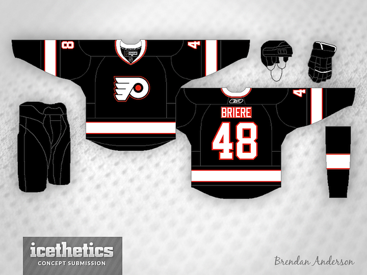
Anyone interested in seeing the Flyers bring back black for alternate jersey purposes? Brendan Anderson has a neat idea for one. And it involves a white version of that classic logo. Yay or nay?
Designed by  Brendan Anderson
 Brendan Anderson


Reader Comments (10)
I'm a huge Flyers fan. This? Eww . . . no. An orange P, however, may look cool with this design. And lose the orange nameplate.
Like it, but it would never happen. The winged P is black with a white background. Has been that day since day one and will be that way as long as a Snider is involved in the team.
Nice work, but I think if Philly goes with a black alternate, they should keep the same template as the home and away sweaters but with black (obviously) being the main color.
i think it would look better if you just eliminated the orange from it all together. if nothing else, delete it from the nameplate and the middle of the P. the orange dot just looks out of place and it throws off the rest of the jersey.
The orange looks out of place because there's not enough of it. The logo looks terrible in white. Any nameplate coloured other than the jersey looks awful.
This would easily be a 3-star concept if you put their actual logo on the front and removed the orange nameplate. I think this would also look a lot better if there was more orange on it. Maybe make the orange stripes thicker and make the white stripes a little bit smaller. Besides that, I think this could be a decent concept.
Was hoping this would be on a Freak Out Friday closer to Halloween, since that's what I was kind of going for. This would never work as a full-time third, but could be an interesting holiday warm-up jersey (similar to teams having St. Patrick's Day warm-up jerseys). But hey, if Flyers fans don't much care for them, maybe they should adopt these as a full time third, haha.
It's alright. The crest should be the same as the original, though, it looks weird like this. The good black Flyers jersey I've seen is the 1997-2007 one.
Switch the orange and white everywhere (except the numbers) and I think this would look great. Not enough orange.
Ya know, I'm in the minority here about the crest. I like it. The best-looking Philadelphia Phantoms jerseys they did were when they paired the white Phantom crest with the purple alternate sweater. The orange nameplate? Yeah, no, that needs to go. The striping? Okay, but I agree more orange needs to be thrown in SOMEWHERE. I just don't know where. I disagree that they need to go with the current design layout just with black as primary color; their home and roads are wonderfully throwback-boring enough. I love them, and will buy them in perpetuity, but some new design options need to be thrown in the mix if PHI entertains a black third. I personally love the 2012 WC. Maybe that design layout with black body, white yoke, and appropriately changed-up striping?