Sunday
Aug042013
0533: Metropolitan Green II
 Sunday · Aug 4 · 2013 | 9:00 AM PDT
  17 Comments

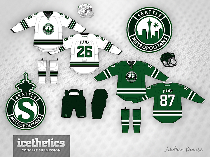
I'll be honest, I don't know if the new Seattle Sunday series was a hit or not last week because I wrote and scheduled this post three weeks ago. And I've been on vacation during that time so I probably haven't had time to make any edits. So how about a second take on the green Seattle Metropolitans idea? Andrew Krause put together a really clean look. I'm still not a fan of the name, but I could get behind any team that looked this sharp.
Designed by  Andrew Krause
 Andrew Krause


Reader Comments (17)
The name becomes even weirder now that their is a division with the same name!
Now I want a team in Seattle just to see them use those jerseys! Excellent!!! Love them!
The logos have a Starbucks feel to me. Not sure if that was intended or not considering that Starbucks is based in Seattle.
Great concept, man! Can anyone tell me how to make the nameplate an font curved like Andrew did?
very nice, though i must say that i like the secondary logo better than the primary. slap that on the chest instead and make the primary the shoulder patch.
I also don't like the name but the green pants are a plus. I wish Dallas had chosen to go with green pants and someone tell Calgary to go back to orange pants full time and ditch the black.
I get a little Starbucks too, but very clean, and eye catching design. Love the green on green everyone is going with for Seattle.
very nice well done designer. really like the secondary logo as well almost could be used as the primary or easily interchanged. classy work
I think this is another very good Seattle concept however, I think the green uniform is far too similar to the Stars' new home uniform. I also think this would be a lot better if there were no roundels and an extra color added to the set. Besides that, Seattle Sunday has given us another very good concept.
I love this concept and I agree with a few things mentioned above: 1) very similar looking to the new Stars' uniforms, and 2) the secondary logo with the space needle is pretty bad ass.
Now, to the Starbucks thing...I didn't see it until it was mentioned...and now I can't not think of it, haha.
starbucks starbucks starbucks
Saskatchewan Rough Riders
damn it...
I was liking this design until the Starbucks comments...... Not that i see it beyond the color and the circle mark, but because I already live around that logo too much (Wife is a former employee) that I would distance myself from the probability of association.
I want a team in Seattle. Metros would be great but is highly changeable.
I will want a jersey for said team.
I have a 85% expectation said jersey will be green.
That said, I do not want a jersey that will have a heavy Starbucks connection, (even if I could put my regular order on the nameplate for a laugh).
Nor something that too heavily invokes the Sonics. (Possible if done simply to work with the look of the future arena).
Thanks for the comments guys.
The Starbucks connection was unintentional I will admit, and I still don't truly see it. Sure Starbucks is green and circular, but other than that there's really no similarities.
The jersey's are actually the same as the Bruins, sans a colored yoke. I do get the Stars connection for the home, but again, the stripes are different. There is a small sliver of green between the emerald and white stripes, which may be hard to see from a distance.
Great looking jersey but there are obvious branding issues. Metro's is a stupid name and you can not do a roundel logo for a Seattle team without someone making a Starbucks comparison every two minutes. Sports teams should strive for a unique brand. This concept looks good but it shares major design cues with every major brand in Seattle. You don't want to share your brand with a multinational coffee company and use the same space needle element as five other sports teams in the same market. This should be common sense.
Im a Dunkin' Donuts guy so I dont see the Starbucks thing
I saw your work on this logo and jersey set on the sports logos forums. It really is a great set, I think the original green and white scheme worked à little better for a unique identity. Here the dark green is easily mistaken as black (I saw It on another monitor and thought it was) which unfortunately resembles Dallas more than you probably meant to. The two tone look or maybe lighter greens would make this great look even greater in my eyes. Anyways, awesome stuff.