Monday
Aug052013
0534: Burning Flames
 Monday · Aug 5 · 2013 | 9:00 AM PDT
  14 Comments

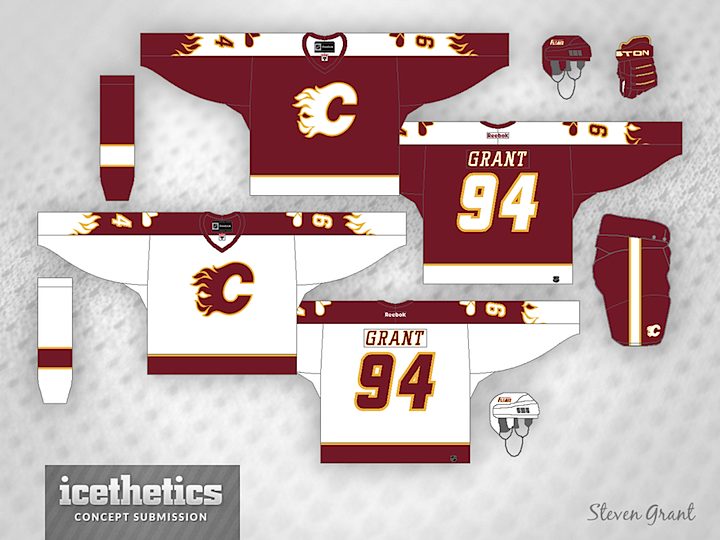
Steven Grant recently sent in this design for the Calgary Flames. It features new shades of red and gold and an homage to the old Calgary Cowboys on the shoulders. And what do you think of the flames on the sleeves?
Designed by  Steven Grant
 Steven Grant


Reader Comments (14)
The Flames are well-positioned and not overdone. It's a good concept.
the flames are kind of minor-leaguey, but i like how everything else turned out. the colors are good, the logo pops on both the red and white, and the whole jersey isn't busy with a lot of extra stripes and stuff. very nice.
The red one is really nice, but I don't think it converts into a light one too well. Something has to be altered on the light one...
I like the whole design, only I'd go with a more crimson red like the Flames had in the 80s. What a great design for an alternate.
I like the design, but I'm not sold on the colors. Change them to the red & yellow they use IRL and I think we've got a winner.
I think it needs a little more yellow. From a distance, you might not even see it. A bolder font for the name plate would be good. I like the flaming sleeves. And thank God there's no black.
I love this. I think the shoulders are subtle enough not to look too gaudy. One of the best things is the red pants that would make the white jersey pop. I think I would stay with the color the flames use for their 3rd jersey now but I love this concept.
@tim
The 80's red is the same red they have used on all of their jerseys (minus heritage classic)
Love the concept tbh. My only criticism would be to go with an 80's Calgary colour scheme. Otherwise I love the design. Different, but not too out there.
@CLIB542, the uniform database says that the 80s red is brighter than the red on their current uniforms (Home and road).
Don't care for the homage to the WHA Cowboys - there is no real tie-in with the current franchise so why try to force it. Looks a bit like the unis they wore in the mid to late 90s, although I'm glad to see the removal of the black trim and no wierd diagonal stripe on the front.
Their AHL team should pick this one up. It's a really nice concept and love the colors. The flames on the sleeves, brilliant. Thumbs up from me.
@R
I have all the jerseys, I could line them up for you if you want. They are all the same. The black is what throws it off
@CLIB542 I just checked and in fact, I was wrong. Honestly, I'm shocked that you are right. I checked on a few sites and in fact, the red has remained the same. I have always thought the red was darker on their current ones and the throwback had a brighter shade of red. Talk about an Optical Illusion. I can't believe the black throws it off that much. Even the uniform database looked like the red was a lighter shade on the throwback. I can't believe the lack of black on the throwbacks makes them appear so much brighter, when that uniform uses the exact same red as their current home uniform. After finding out I was wrong, I must say, that red looks way better on the throwback jersey.