Wednesday
Aug072013
0536: Soldier On
 Wednesday · Aug 7 · 2013 | 9:01 AM PDT
  13 Comments

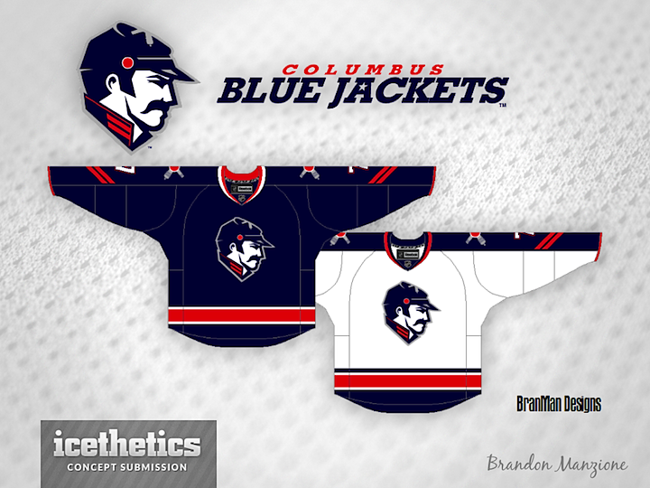
The Columbus Blue Jackets are named for the soldiers who fought for the North in the American Civil War. Maybe they should start looking like it. Brandon Manzione designed this brilliant logo along with a part of sharp sweaters. What do you think? Time to ditch the flag-wrapped star?
Designed by  Brandon Manzione
 Brandon Manzione


Reader Comments (13)
Solid concept, cool logo idea. Love the chevrons. IMO the face should be angled slightly upwards in order to give the character a little bit more positive attitude.
I love the logo. The jerseys are a little too simple for me but would be perfect with a few additions.
Logo is fantastic. Only thing i would maybe try and do is not have it so "new age" and sharp edges. Maybe try and create something that looks like it was made a while ago.
Just seeing the logo gives me more ideas.. but its a great logo, really like it.
Jersey is a bit bland but i don't mind it. The Chevron's on the sleeves are a nice touch.
That would by far be the best CBJ logo.
Great concept that brings forward a new look while still keeping it within the whole Blue Jackets feel, specifically their first jerseys. The only thing I would change is swapping out the cannon shoulder logos with perhaps a simple white star or even the current primary.
I really love the jersey but the logo is bothering me. I can't explain why. It is a slick logo....maybe it is the mustache.
This is actually really cool. I love the chevron idea. Also this clears up the whole "what's a blue jacket" thing.
This. Now. NHL would never do it because they aren't ballsy enough to take a concept from this page and use it.
Wow. This is so well rounded. Definitely a good direction for Columbus, I'm a huge fan of this!
Not really a fan of the face logo or any other ones featuring humans besides the old Sens logo. I mean what made you choose the person to look how he does? Who is he? Not really "iconic" or unique like other logos are. Plus the guy looks like Ringo Starr. Everything else about the jerseys are pretty solid.
It's a huge improvement over their current look, but the logo looks more like Stalin than it does a Union Soldier. Maybe it's just me. 5 stars regardless
Not to disagree with you guys but there is a slight difference with Chris' definition of why they were named the Blue Jackets.
the factory that made the Blue uniforms for the north was actually in Columbus, hence the name Blue Jackets.
Although the moniker does invoke american north patriotism, in response to 'what is a blue jacket' question, well, literally, yes it's a soldier from the north, but the team is so called because of it's ties to the soldiers uniforms. The rich Civil ar history is a very strong tie to Ohio. With training bases set up there and when the American government asked for ten divisions, Ohio sent 23.
Also, I've been a fan of the franchise from the very start (I'm from Gatineau, QC, so it's not geographically motivated if you're wondering) and I must say that their current logo is very misunderstood. The first logo (that spelled out CJB with the hockey stick in neon yellow/green), I do agree was horrible. But the current one is full of meaning and evokes patriotism that represents the brand that is the Columbus Blue Jackets. Elements in that logo are very well laid out. The Ohio flag (which is very similar in features to the American one) forms a C for Columbus and wraps around a star (which was a common feature on the North's uniforms.
To me, ties to the locale's history are what makes a logo great, as long as it's well designed of course.
An unnamed soldier's face does not do it for me. Plus, the jersey is very bland. the Chevron is probably the only thing positive I can take from this design... but that's not to say it's a bad one... but for the Blue Jackets, what they currently have is way better.
By the way, if you have the chance to go to Columbus see a game GO. they've created a very lively district called the Arena district and it's just buzzing before game time, attendance has tailed off the last few years but they were selling out for 7 seasons from inception and with them on the way up, attendance, I'm pretty sure, will soar once again. I wish we had that in Ottawa... way to put an arena in no man's land lol!
I really enjoy the jersey. I've been a Jackets fan since I've been born, and I appreciate how "clean" the logo looks, however I feel that the blue is to dark. I would recommended either adding the lighter blue like what's in the current alternate jersey, or maybe adding Senators gold to some areas to break up the blue. Overall, an amazing idea.