Tuesday
Aug062013
0535: Bringing Back Brooklyn
 Tuesday · Aug 6 · 2013 | 9:34 AM PDT
  11 Comments

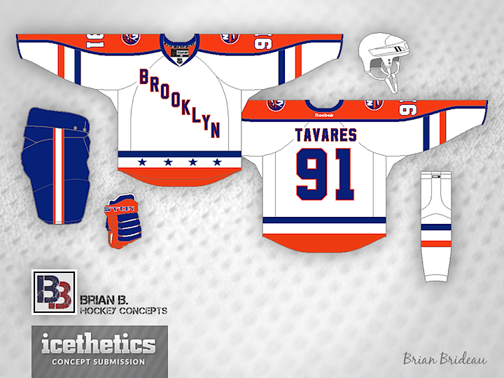
Today, Brian Brideau presents an alternate jersey for the New York Islanders — featuring the wordmark crest used during the 1941-42 season by the Brooklyn Americans.

And not for nothing, but it seems the NHL is already cashing in on that wordmark. The t-shirt above was spotted at the NHL Store in New York City by Brandon Holmes.
Designed by  Brian Brideau
 Brian Brideau


Reader Comments (11)
looks like an old all star jersey with BROOKLYN on the front
If they're testing a rebranding to Brooklyn, I say drop the Islanders name and colours instead and go with New York Americans. Encorporate Brooklyn in the main logo or highlight it in a secondary logo / shoulder patch. Swap the orange on this jersey back to red and use this as a third.
looks like the one I did about a month ago for the isles vs rangers outdoor game
Considering the potential disastrous options, I could live with this.
As an Isles fan I like it. It tastefully combines one franchise's history with another. Only drawback is that most of my fellow fans have an immediate aversion to any diagonal text for obvious reasons.
I like this one alot. I think this would make a great alternate once they actually move.
I like this uniform concept and as an Isles fan it keeps with tradition maybe a blue jersey with the main logo on the chest and the BK on the shoulder would make a great uniform
I like it, though it might seem like they're ripping off from the rival Rangers.
What if the text were going up, bottom left to top right, kind of like the NHL logo?
First Brooklyn themed Isles jersey that didn't incorporate B&W or botch the original logo. It's a breath of fresh air. As an Isles fan, I'd love to own one of these. It would be a big time seller IMO. Only change I would make would be to make the striping on the sleeves more closely to the design they have now. Maybe the orange shoulder yoke could stop at the shoulders and not run down the arms (like their current thirds and the orange thirds of the past). I like the Brooklyn Americans blend to it, but it doesn't necessarily have to be so close.
This would make for a magnificent third once the Isles move.
As has been mentioned. Isles fans don't like diagonal word marks. I would rather not acknowledge Brooklyn at all but Yormark and Wang see dollar signs.