Tuesday
Sep102013
0570: Fixing the Hurricanes
 Tuesday · Sep 10 · 2013 | 10:01 AM PDT
  13 Comments

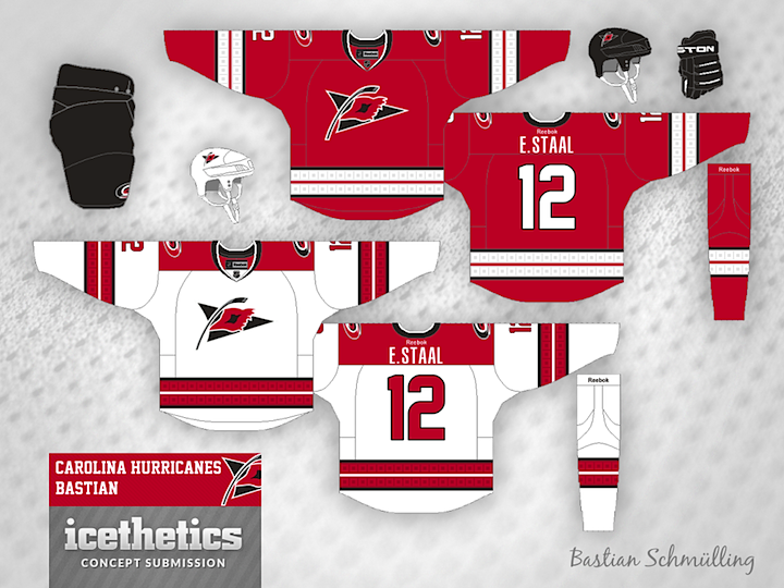
Few were impressed by the Carolina Hurricanes' new uniforms this summer. So a couple of our regular contributors to the Concepts page sent in what they thought would be great improvements. Brian Brideau rounds off the shoulder yoke of the white jersey and adds the storm flags back to both.

Meanwhile, Bastian Schmülling has a different solution. If the Canes just wanted more classic striping, why not make the storm flags a little more subtle? I'd say that would've been better than removing them entirely. Which of the two designs do you prefer?
Designed by  Bastian Schmülling&
  Brian Brideau
 Bastian Schmülling&
  Brian Brideau


Reader Comments (13)
I dont think we need to fix the hurricanes. the new jerseys look great. They are not too flashey like an AHL or CHL jersey. The more jerseys change the more tradition teams lose. I dont mind little alterations but in the end the best jerseys in the league have been the ones that have stayed the same for years, Even ugly ones that havent changed at least have tradition.
Both concepts are very raw and far from being called " fixing Hurricanes ". Top one reminiscent Blackhawks home jersey and a bottom one very much team Canada. Crest on a bottom jersey doesn't work as a primary logo with that thing in a middle being similar to a vagina. Why not include storm flags into entire body of the jersey on home and away with a few stripes here and there and call it a day- how more simple can it be??? I'm puzzle by artists coming here with their submissions and they all are very, very conservative, like some KGB officer standing behind them with a gun. I love designers thinking outside the box , like myself.
I prefer the first one. The second one is good but should go back to having red pants, helmet and gloves because that's who the Canes are. I'm not crazy about the black stripe on the first one pants.
I like the hurricanes new uniforms, but I feel that they lost their "identity" with them. I loved the uniqueness of the hurricane warning stripe on the sweaters, and both of these concepts correct that. I like Brian's concept a little bit more because of the striping, and the shoulder yolk.
Both are really good, but Bastian's is really great!
Bastians is great but, I wish the main logo was on the front and I dont think you need a shoulder yoke and if its here it should be round.
Brian's red striping screams Chicago. Bastian's is unique but I think it looks really cool, maybe just have one stripe rather than two.
The first ones are decent. They aren't wow but they do get what Carolina was going for while keeping the flags so I'd say its a bit of an improvement. The second ones I really like how they look but making the flags "subtle" completely ruins the point because they are now just squares inside of squares instead of hurricane flags.
The first one, yes. Just yes. I'd do anything to have the flag patter back where everyone can see it at all times. These would have been perfect. But hey, you can't blame them for still putting it on the jerseys, just where it can only be seen if it's on a hanger...
But whatever, regardless of the red jersey's significance to the Hawks, I still think it's a near perfect jersey.
@ Nascarfan160: Thanks. I understand that the arms stripes are directly from the Hawks. I couldn't figure out what put on the arms to make them unique. Any suggestions?
Is there any reason why these type of posts are called "Fixing the..." aside from a clever way to say just a new design?
Right off the bat, the designers should say what is wrong with the current ones, then explain the "fix" they created.
I'll give you an example: the Hurricanes flag logo is incorrect. It's been wrong from Day 1. A hurricane watch is two of those flags, not one. It was removed from the jerseys by the team. So, the fix is...bringing them back and putting it on the chest?
Another example: the primary logo is supposed to have an "eye" in the hurricane. But it doesn't stand out, aside from the black eyebrow. Move the black center a little to the left to make it more of an eye?
The least that should be changed is reverting back to the original number design. The plain-text one being used is boring.
Both jerseys look great... much better than the Canes existing set. Personally, I think the flag logo is horrible, but I know it has a lot of fans. The striping on Bastian's jersey is awesome though.