Monday
Sep022013
0562: A Third Jersey for New Jersey
 Monday · Sep 2 · 2013 | 8:00 AM PDT
  12 Comments

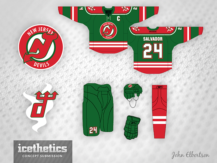
After a week's worth of Wild hubbub, you're probably a tired of green and red. So naturally I've decided to give you more of it. Seriously though, I think John Elbertson has put together a snappy Devils third jersey concept. New Jersey's higher-ups may not be interested in alternate uniforms, but let's not forget the Devils are going to need something for when they venture into the outdoors this winter.
Tomorrow, we look at ways of fixing the Sharks' boring new sweaters. (Hint: We're ignoring the players' "weight" complaints.)
Update on Wednesday · Sep 4 · 2013 | 6:35 PM PDT by
 Chris
Chris
 Chris
Chris

John took a stab at some revisions based on a few of your comments. What do you think?

Designed by  John Elbertson
 John Elbertson


Reader Comments (12)
These are pretty good. I love the abundance of green.
I'm not crazy about the "NEW JERSEY" being caught off in the roundel.
The "d" trident logo is great. Is it an original? I don't think I've seen it before. What is the white shape behind it? Smoke?
I can't wait to see what their actual Outdoor Classic unis look like.
I like the idea of adding green to the palate, but am not thrilled with the (almost) all green uni. The Devils have worn red as their main for 30 years, and it is something that should stay. A red jersey with green stripes though, would be very nice.
also curious as to what the white stuff is behind the lowercased/trident logo?... dont like the red socks, but otherwise I think its pretty cool
an idea for the white smokey stuff... make it in the shape ofthe original NJ logo???
I think this is a great look for the devils should they ever consider throwing green back into the mix for an alternate. The only thing I would change is the pants. Make them red! I think it would bring more balance to the colours and make the whole set look a little less green, which I think is needed.
seeems like this should be a freak out friday submission.
so christmas-y but i kind of love it.
I don't care for the green at all! Green doesn't scream "Devils," regardless of what they wore in their past. Swap out the green for black, or a deep red, and I think this jersey design gains a lot more. Not many two-tone colours in the league right now... I think a two-tone red in Jersey would be sharp!
Not a fan--too christmas-y. If they red and green were switched, it'd be an improvement, but it still might be a bit too much with the shoulders.
spectacular!
I like John's idea of using two shades of red for the Devils. It reminds me of my Jets using two shades of blue, and they pull it off very well, in my opinion.
Though there's room for improvement. I'd darken the dark red a bit more and use one white stripe for the hem to match the sleeves on the home jersey, then it'd look even better.
The logo in the revised black one is a little large; otherwise, it gets five stars from me.
If the traditional Devils font was used on the black set, I would lay my money down faster than Kovalchuk on a 747 to Russia. That might be the best Devils third jersey idea I've ever seen.