Tuesday
Sep032013
0563: Fixing the Sharks
 Tuesday · Sep 3 · 2013 | 10:00 AM PDT
  9 Comments

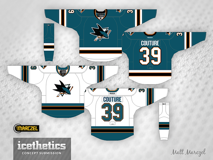
The San Jose Sharks' new uniforms got pretty mixed reviews when it was unveiled. And plenty of readers had suggestions for how they could improve them. To that end, I have a couple of great ideas to share today. First, our hero of hand-drawn art Morgo Uxbridge proves shoulder yokes aren't a dealbreaker, but you really need something in the waist area.

And regular contributor Matt Marczel proves the same, but in a different way. Kind of a bummer looking at these and seeing what the Sharks missed out on.
Designed by  Matt Marczel&
  Morgo Uxbridge
 Matt Marczel&
  Morgo Uxbridge


Reader Comments (9)
Love the top look
Matt's concept is perfect! Everything looks right!
I swear the Sharks must be employing the "New Coke" strategy to sell more jerseys in the future. It just bafflese that they took as close to perfect jersey as possible and made really stupid changes. Strip them of everything except sleeve stripes and then in a couple years bring back waist stripes and fix the dum single orange line and everyone goes "oh boy! The sharks fixed their jerseys! Now I can buy them!"
@ Bryan W: I disagree. I don't like how the stripes clash with each other on the road. As for the home, it's just the Dallas template recolored in teal. People may not like the minimalistic approach the Sharks have taken, but at least they preserved some key elements from their identity. The concept isn't bad. It's just not better than the real thing.
I actually think that the Sharks should go back to their original designs. Use orange as an accent if they absolutely have to, but I've always liked how the inaugural Sharks sweaters blended new (the logo and teal colour scheme) and old (the striping) and how well it stood out against the more traditional colours of almost every team in the NHL when they were in use. This bearing completely in mind that I didn't know what hockey was until the very late 90s. The alternate in the first concept is my dream Sharks jersey. The home and away in that concept reminds me too much of the Pittsburgh sweaters of the early "Vegas Gold" era, of which I've never been a fan, but at least the jerseys emphasize the teal rather than using it as an accent colour.
Those orange stripes just completely ruin the jerseys for me. If they would've eliminated those from their last jerseys they would have been perfect in my opinion.
I totally do not buy the whole lighter jersey nonsense. If that is the case just make the game jerseys with sublimated striping Cresting, numbering and lettering can all be stitched.
I thought Marczel's road jersey looked great but I'd rather see the bottoms of the home jersey in teal. Otherwise it looks too much like Chicago.
Matt's is the route that the Sharks should have gone. Very sharp and classy looking, while hearkening back to their inaugural threads. Maybe taking the orange out of it would be better even. The new ones that they did opt for are too plain, and the BS about weight is insulting to the intelligence of the fans.