Sunday
Sep222013
0582: Seattle Ravens
 Sunday · Sep 22 · 2013 | 2:28 PM PDT
  8 Comments

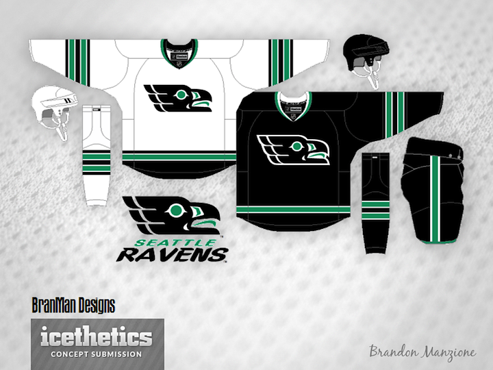
Here's a cool one for Seattle Sunday. Brandon Manzione introduces the Seattle Ravens. The only problem I could foresee is when this team plays the Philadelphia Flyers. Lot of similarity in logo style there, but otherwise a really sharp concept.
Designed by  Brandon Manzione
 Brandon Manzione


Reader Comments (8)
The logo does have quite a few elements from the Flyers logo, but it still screams Pacific Northwest. Nicely done! The jerseys look good as well.
Put the logo on a slight angle, and it should fix the problem.
Interesting concept. I'm unsure whether I like the logo or not. Part of me likes it, part of me thinks its kinda ugly. I wonder if it would look better angled diagonally up or down.
...as for the jersey itself. It seems a little bland... a little boring even. I'd say if you gave this set some numbers, and revamped the striping it would look a lot better. Maybe some sort of alternate logo on the shoulders would help too. As is though it is just seems generic even a lil unfinished. But hey, at least its not just another Metropolitans set!
Anyways, aside from all the critique, kudos for trying something different here.
Looks a bit too much like the Stars as it is
I don't see Eagles nor Flyers in the logo. Might be the green or black. Try Red? Burgundy? Brown? Try non-Seattle colors.
Logo is very sharp, very nice. Jerseys are great, too. I would prefer double stripes around the hem.
I see what you mean with the comparison to the Flyers logo, but the Senators had a logo with a similar effect for years so it isn't unprecedented. And I agree it seems to emulate the 1990's Stars with the colour scheme and striping. But the Stars aren't going with that look anymore. I'd like to see the numbering on it to get the full effect.
I like the idea, it's a nice direction to go in, I think it needs more. My only real concern is the color scheme looks too close to San Jose to me,especially the black jersey. Maybe just my monitor.
Logo is kickass, but it's diminished somewhat by the black home. Make it green, maybe, and it'd be truly awesome.