


0583: By Bastian Schmülling
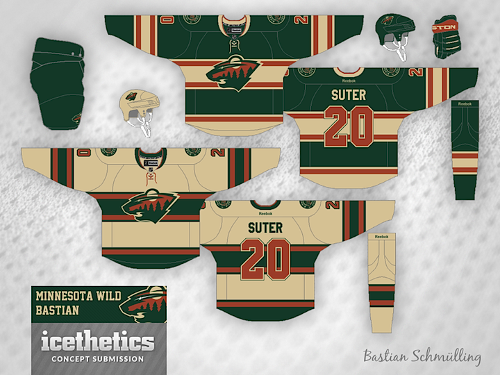
I'm launching a brand new theme week today! We have so many artists who are so prolific that I thought they deserved their own week right before hockey season starts. So each day we'll feature a trio of concepts from a specific designer, starting here with Bastian Schmülling. His Wild jerseys may look a little dingy, but they also look like instant classics.
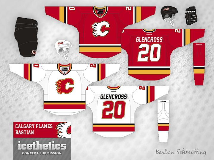
The Flames could use a uniform simplification and Bastian has the perfect answer and the best use of black I've ever seen on a Flames concept.
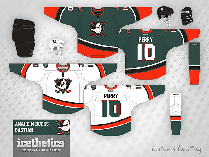
Finally, the Ducks need a way to distinguish their palette from the Flyers and that gold just isn't cutting it. So how about green? Not the first time we've seen green and orange combined in an Anaheim concept, but certainly among the better examples.
Bastian still has a ton of work that's gone unpublished to date, but I'm working to rectify that. He's got a great eye for uniform design and I, for one, am always excited to see what new ideas he's come up with.
 Bastian Schmülling
Reader Comments (15)
Love the new theme! Lots of talented submitters whose work I'm looking forward to seeing!
The Anaheim is my favorite.
Love the Calgary unis. Only change I would make would be to go with a red helmet and gloves (but leave the black pants).
Minnesota - not bad but compared to their current uniforms it really isn't an upgrade.
I don't like the Anaheim set. I get that people want to keep the orange for Orange County. Also they want the throwback to the teal from the origins of the team and get rid of the black which is overdone. But I look at it and see someone trying to make a Miami Dolphins hockey jersey.
I love Bastian's work! He's on my Top 3 list for sure.
As for these concepts, not a huge fan of the Minnesota kits, but I really like what he did with Calgary and Anaheim.
I don't particularly like the use of black on the red Flames jersey. However, that Anaheim one is absolutely perfect.
Wow, the Anaheim jerseys are great. A rare 5 star rating from me. Just love that color combination.
The Calgary jerseys are also sharp although I'd ditch the black.
The Minnesota ones are decent but are a downgrade from what they currently wear. I also just really hate that retro off-white look.
There's two words that come to mind with all of these. Clean and classic. The Minnesota one is possibly the best Wild concept I've seen on this site, taking full advantage of their color scheme.
I'd rather see his Flames' design on the ice than what they have now, and I think they should go back to that white with black/yellow outline logo for their red jersey. The black used here reminds me of their shortly-lived late 90's jerseys of which I adore so much.
While I occasionally don't like anything with a Mighty Ducks logo on it that isn't purple and jade overall, I like this. Green and orange, a reference to the original Disney movie jerseys. Now, while I'm not the biggest fan of them, I'm all for paying homage to old, classic things.
This a a great theme, I hope to see Burton featured one day, and his beeeeea-utiful RoboPenguin concept!
Normally I'm partial to the black flaming C for Calgary, but this is good enough to sell me on the white logo instead. This would be an instant upgrade for the Flames without a doubt.
I like that striping and colour scheme for the Ducks, but you need to fix the logos. The green triangle disappears into the green jersey. And on the white jerseys, the webfoot D would look better in orange.
This is a cool theme, well deserved for such talented artist. I love the concepts page b/c some of the work that pops-up is just amazing. Anyway I really like the Flames and Ducks designs. I agree with a few others a red helmet would look sick for the flames and the Ducks uni is a unique way of incorporating past & present.
As a Flames fan, I love the set. Well done!
The Calgary concept looks a lot like the jerseys the SHL team Luleå Hockey wears in the European Trophy Tournament... http://hockeymode.blogspot.se/2011/08/luleas-european-trophy-trojor-in-action.html
These concepts are awesome. As someone who loves the Flames' original uniforms and is very disappointed that their retro third is being retired, your concepts are the first ones I have seen that include black that I would be a huge fan of. Those Flames concepts are the highlight of today's concepts for me. As for your Wild concepts, (No pun intended :p ) I think they are really good, especially for using vintage white however, I think all the red on the uniform as well as the red on the logo need to be as bright of a red as your Flames concept so that the uniforms really pop. Finally, for your Ducks concept, I think it is good. I think it would be a bit better if you used the same Jade color the Ducks used when they were still Mighty. Besides that, as I said before, these are awesome.
It could just be that I'm a Flyers fan and so am naturally inclined to like black and orange together, but I've always loved the Ducks jerseys and think the gold is a really cool accent. The Ducks always look like sinister black storm troopers in their black jerseys to me. Having said that, my favorite Ducks concepts are the ones with eggplant. I'd love to see more of those.
I would love to see that Anaheim jersey with gold instead of black. I find black along with blue to be so overused. I think the green the orange and the gold could look sharp if used right plus it would be completely original. If possible I hope someone makes it! Love the jerseys overall though.!
Has anyone noticed the Minnesota Wild sweaters are based on the Montreal Canadiens iconic red sweater?