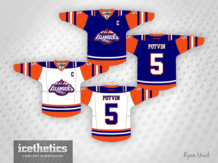
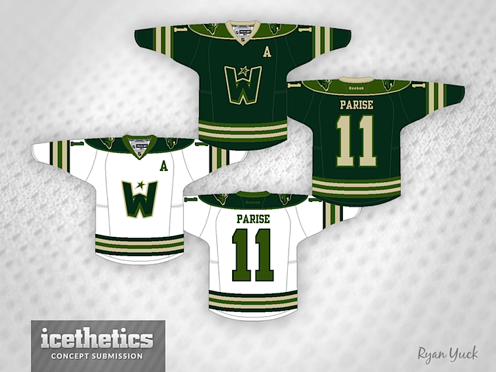
0588: Freak Outs by Ryan Yuck
 Friday · Sep 27 · 2013 | 8:00 AM PDT
  8 Comments

Our theme week continues into this Freak Out Friday with the guy you might call the King of Freak Outs. Ryan Yuck's tendency toward the unfamiliar can be jarring at times. You could never call his work bad, but it's definitely out there. Like this re-imagining of the Islanders' fisherman jersey — without the fisherman or the wavy stripes.

Here he merges the Canucks with the old Vancouver Millionaires. It's a strange idea for a hockey sweater, yet there's something about it you can't help but like. Maybe it's the green.

Speaking of green, Ryan's Wild concept takes a little inspiration from the Minnesota club that preceded it — the North Stars. His work is definitely creative and worth taking the time to look at, but I'm not sure I'd necessarily want to see it on NHL ice. What do you think?
 Ryan Yuck


Reader Comments (8)
Those Islanders' jerseys are fantastic! How is that a freakout?
Hm...I've seen much freakier, but these are without a doubt freaky in their own league.
All three of them are at least decent to me. I particularly like the last one; using two shades of green is nice.
STOP! STOP! STOP! Enough already with the "four stripes; four cups" Islander thing! No other team does this!
the concepts themselves are fine, but i've gotta say. i'm not a fan of that template. it makes it look like the sleeves are short and fat. overall weirdly proportioned templates. i have a hard time taking any concept using it very seriously.
Love the crest on the islanders jersey without teal, but i agree about the top portion of it being tired (4stripes... Again) and the anchor is a bit small in proportion with the rest. What i'd love to see if its possible for the artist to do is to implement the top of the lighthouse from the old secondary logo where the anchor and stripes are and move the anchor down to the waves if he feels it needs to be there, that would make for an amazing crest.
As for the jersey pattern itself, not sure the same color shoulders work for both. It would be cleaner if the white jersey had white shoulders. That said i also think a squared cutoff point for the top of the sleeves something akin to the canucks millionaires jerseys would be sharp and clean up the pattern some, matching the hem striping to the sleeves would help to balance it out. All in all a good job on all three!
@Mark, that's the point of the "Four Cups, four stripes" thing - no one else does it! It's supposed to be unique and pay homage to a unique and storied part of their history.
@ME. I know the Islanders had a great run in the early 80's and won four straight cups. But why is this stripe thing so unique to them? The Canadians had four in a row just prior to them and 24 overall. I don't see their uni covered in extra stripes. Or any other team in the NHL. It was a great accomplishment but I don't think it should recognized years later and set them apart from the rest of the league.
That being said, I did like the most of your Islander set and the Wild too.
That islanders one is really nice in my opinion, I don't really care for the reasoning for the four stripes being on the jerseys but I just think it looks cool on this set. With so many teams going retro I really wouldn't mind the Islanders doing something new but not crazy. I can't picture the Vancouver ones actually being worn but I would certainly welcome it, definitely a plus for that almost "crest" style logo.
The Wild one is my least favorite out of the three but it isn't really a bad jersey, I just think using only shades of green would look bad on TV and I think their current logo is one of the best in the league already.