


Monday
Jan132014
0696: Philly in Grey
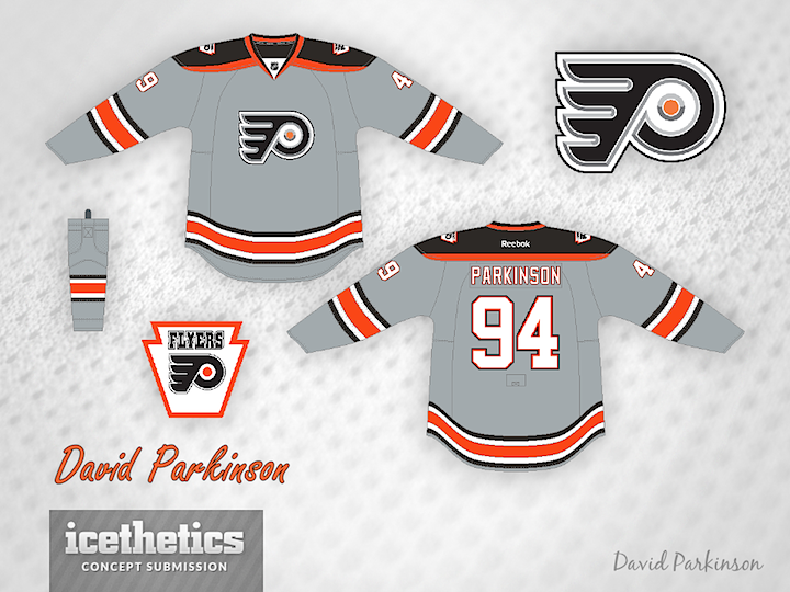
I never know how designs like this one will go over with you guys. You'll either love it or hate it. Could you imagine the Philadelphia Flyers in grey? I think this could be such a sharp sweater by David Parkinson, who was inspired by a ball cap design he once saw.
Designed by  David Parkinson
David Parkinson 
Reader Comments (5)
i like the jersey and the design, but the chrome logo doesn't work. i get why you used it for this concept, but it doesn't work well with the philly P.
Love the grey look, less white/more orange would really make it pop (i.e. orange numbers)
I've always wanted to see Carolina in a sharp grey/silver jersey tho
I've always been interested to see an actual gray jersey in the NHL. I think the logo changes make it looked a bit washed out, with the normal Flyers logo would be quite a bit stronger.
It's not that it's an unattractive design, I just don't think that it fits in with the Flyers' identity. A gray sweater, under the right circumstances for the right team (Kings, Ducks, Canes), SHOULD really pop. But not for Philly. The chromed logo was fun for an experiment 10 years ago, but I think the experiment proved that there are just some logos you can't mess with. It would be like trying to mess with the Canadiens or Red Wings logo. Once perfection in a logo is obtained, no amount of rebranding can or should attempted.
i really love this jersey. if it had the normal flyers logo i would give it 5 stars. with the chrome logo ill give it a 4