Tuesday
Jan142014
0697: Anaheim Preview
 Tuesday · Jan 14 · 2014 | 8:01 AM PST
  9 Comments

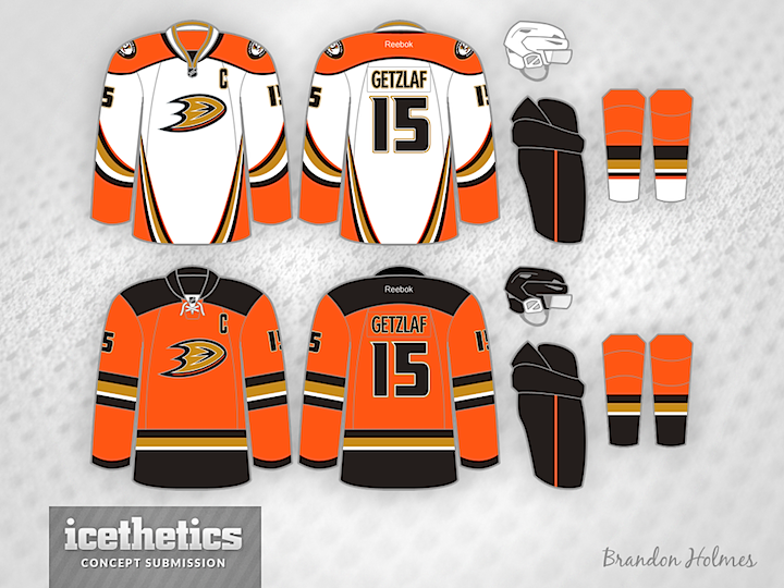
It's been reported the Anaheim Ducks are considering promoting their third jersey to the new home set as early as next year. That could bring with it some other changes, as imagined by Brandon Holmes. First, he offers up a white version for road games. Then, how about a new alternate — in orange! Could you see these completing an updated set of Ducks uniforms in the near future?
Designed by  Brandon Holmes
 Brandon Holmes


Reader Comments (9)
love the orange one.
first reaction to the whites are that i don't like them because of the side striping, but thinking about it a little more, it might look better on a player than it does as a flat image. kind of torn on that one. the sides and the sleeves are just so... curvy.
That alternate is a thing of beauty. Stick on the duck mask shoulder patch and I want one right now.
I've seen numerous concepts of a recoloured to white Ducks third before. None of them have really worked, but this comes pretty close. Although I wonder if the orange shoulder yoke is a bit much.
I...I can't believe I'm saying this, but I love it!
And I'm a guy who stands firmly against the new ducks colors since '06, but his just f*cking looks beautiful. That orange really pops, and the gold trim really stands out. Not sure if I like the different stripes/yokes, I think they should have matching ones, but I guess a little creativity works here and gives each jersey it's own look.
Problem of course is the flyers, two teams with virtually the same color scheme might not work. Granted the gold pops here but I don't know if it will be enough. I wouldn't want Philly to use black again or anything but this could get weird.
I like how the alternate jersey uses the colours most people associate with the Flyers (orange and black) yet still gives a look that will give the Ducks their own look and identity. You won't do a double take if you see that jersey on a player. I might suggest a bit less orange on the socks that go with the white jersey, but that is about the only change needed.
If they really wanted to do something "abstract," they could pull a Nashville and introduce a gold jersey with the shoulder patch as the logo for an alternate.
So we just saw the top concepts of 2013...I think we're looking at the top concept of 2014 right here. That white is sick...There are very few road uniforms that look as good as their home counterparts and this would definitely be one of them. AND that orange is fantastically modern while still having a retro feel.
nice.
The only change i would make is the orange jersey have the recolored mighty ducks logo on the front i was in the team store yesterday and they are promoting the recolored logo over even the "D" logo
I like these better than what they currently have. But I'm not a fan of the current third, it looks weird with the socks they use.
I think the Ducks 3rd, Islanders 3rd, and Buffalo 3rd are all in the running for some of the worst design choices as they all have something in common - too much going on. Stripes everywhere!
I can imagine somewhere a designer presented a great design to the teams and someone in management said "well .. why don't you add a few (more) stripes". This process probably repeated until someone said "great" as the designer felt shame for the abomination that had become of his work.
Like the new road, it's about time that they dropped the wordmark jerseys and went to their third for their main identity. I always thought it was better.
The third is looks really good too, except for a couple of things:
A. looks too much like Calgary's new thirds and
B. Too many teams are jumping on the square shoulders bandwagon, it doesn't add any unique identity anymore, something that is essential with a third
Honestly, for a third, just stick with the Mighty Ducks throwbacks