0685: Johnny Canuck
 Thursday · Jan 2 · 2014 | 8:00 AM PST
  8 Comments

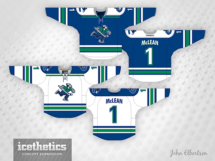
As Tampa/Vancouver Week winds down, we continue to explore the Canucks' ongoing identity crisis. On Tuesday, the stick-in-the-rink logo was featured. Today, the star is Johnny Canuck. John Elbertson created this set with a home, road and retro-inspired alternate jersey.

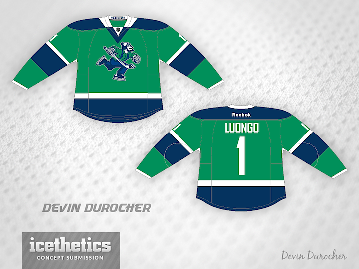
Now how about in green?

Ben Macdonald's contribution would actually fit in quite nicely with John's home and road set. And that Johnny Canuck logo really stands out well on green.

Devin Durocher also went with green but I thought his overall feel was different enough from Ben's to warrant posting them together. Do you have a preference? Would you like to see Johnny Canuck on the chest of a Vancouver player someday?
By the way, is there a reason why everyone who designed a Johnny Canuck jersey put a goalie's name and number on the back? Weird, right?
 Ben MacDonald&
  Devin Durocher&
  John Elbertson


Reader Comments (8)
love the first one. especially the white version.
the first pair of jerseys from john elbertson, is damn near perfect, only one change that needs to be made - get rid of the orca logo shoulder patch and replace it with the stick in rink logo, then it would DEFINITELY be perfect!!!
I really like John Elbertson's home and away sets here. The blue and the green really work well together and give the jerseys some nice pop. His 3rd, well it looks like it is there for the sake of being there - not unlike that third jersey when the Canucks used it. Ben and Devin's designs are both ok, but neither one really pops for me.
The first two designs by John may be my all-time favourites, and honestly, I would love to see a third in the flying V colours instead of the navy/red/royal blue colour scheme.
Never liked that logo. I want them to try their stick in the rink in the shape of a V.
I don't like that logo at all, but I like all the jerseys.
Johnny Canuck is the way to go. For a team called 'Canucks' and because many people outside of Canada don't even know what a 'Canuck' is, there is no better identity.
Still love the simplicity of the Stick 'n Rink but Johnny is what the Canucks should have had from Day 1.
I'm with Vancity. I would love to see Johnny in the Flying V colours.
If you change the green to gold, change the collar color and switch out the logos, that first concept would make an amazing Blues jersey.