Entries in pittsburgh penguins (25)

Thursday
Jul192012

0152: Ahoy, Penguins! Arrrgh!

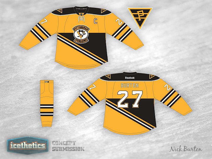
Maybe I should've saved this concept for Talk Like a Pirate Day, but that's still a couple of months down the road. Nick Burton has an interesting jersey offering for the Pittsburgh Penguins based on their Steel City NHL predecessor, the Pirates. This isn't the first concept we've seen from that era of the NHL in Pennsylvania...

You may recall a number of Quakers-inspired Flyers jerseys that started appearing when it was announced Philadelphia would host its first Winter Classic last year. This one by Jack Gambro was one of them. I'm reposting it here because I think it makes a good companion for the Penguins/Pirates look above. What do you guys think? Would these make for a great-looking game or what?

Thursday
Jun072012

0110: Flashback to 1995

Look familiar? The Pittsburgh Penguins wore a similar third jersey from 1995 to 2002. Alan John Herbert has created a bit of an update to that design for today's concept. We should turn it into a game. Can you spot all the differences?

Saturday
May052012

0077: Steel Town in the '70s

New series this weekend. I'm shelving the Winter Classic stuff for a while in favor of Retro Weekends! We'll save it for special throwback-inspired jersey designs like this one from Colin May. The colors call back to the Pittsburgh Penguins from the 1970s. It's actually a neat look.

Monday
Mar262012

0037: A Possible Fix for Pittsburgh?

Last week I lent voice to the opinion that the Pittsburgh Penguins are overdue for a uniform overhaul. They wear a generic template with washed out colors and a weak design. I'm not saying Alan Waldron has the perfect solution, but this is certainly a step in the right direction. It minds the club's near half-century of history with bold lines and a design that stands out. If it were me, the one thing I'd change: forget Vegas gold and go with full on Penguins yellow from back in the day. Where do Pittsburgh fans stand on the matter?

Having said mine, it's only fair now that I let Alan say his peace on the design:

I kept the Pens 5-stripe pattern because I like the fact that it's a design element unique to the Penguins and featured on our inaugural uniforms. I know there aren't many people in the 'Burgh that like the diagonal Pittsburgh on the front, so I've included a second option with the circle logo which I think is equally as attractive.

Page 1 ... 1 2 3 4