


Concept Collection VIII
 34 Comments
You've been patient (most of you). My inbox has seen a lot of concept art over the past few weeks and I'm thrilled to finally be posting it! (Seriously, if someone can help me figure out a way to make Icethetics my only job, we'll all be a lot happier. A lot.)
All right, I've got 14 items to get to tonight, so let's not waste time. We'll begin with the Colorado Avalanche, whose brand new third jersey has recently been leaked (see the blog for more info on that).
A lot of readers have bemoaned a lack of creativity, I believe having to do with the fact that it's simply a revision of the Avs' previous third. This first concept certainly avoids drawing on past designs while simultaneously reminding us the Nordique spirit will never die.
;) BD
BD
The other team soon releasing a brand new third will be the Florida Panthers. Rumor would have us believe it may look a little something like this.
;) Ryan Haslett
Ryan Haslett
It's a return to red, which I'm sure longtime Cats fans will appreciate, and it borrows very heavily from the Wild's home uni — easily one of the best in the NHL.
Seeing all these new third jerseys the last couple of years makes me wonder who got it right and who didn't. Some teams don't have one and could really use it. Obviously, the Penguins, Wild, Sabres and Blues got it right.
I've been hoping the Rangers would one day return to the Lady Liberty jersey which at one point was my favorite in the league. Here's a re-envisioning of that.
;) nyr1583
nyr1583
The Capitals would do well to add a blue jersey. Many have suggested the Weagle take center stage, but why not a red version of the primary logo? How would it all look on a Lethbridge Hurricanes sweater?
;) Ryan Haslett
Ryan Haslett
The Canucks dropped the ball with their third last year. It was what we all expected, but that should be their home sweater, and not an alternate. Here's one idea for an alternate with yet another brand new logo.
;) Matt Marczel
Matt Marczel
Now that Whalers merchandise is making its way back onto store shelves, maybe the Hurricanes could pay tribute on one St. Patrick's Day sometime.
;) Matt Marczel
Matt Marczel
Maybe even the Red Wings could get in on the third jersey action — even though they've never been one to follow that crowd.
;) Matt Marczel
Matt Marczel
The Dallas Stars dropped the ball worse than anyone two years in a row — bad home and road sweaters followed by a shockingly worse third. Since we're talking nostalgia and vintage these days, why not a trip down memory lane the heart of Texas?
;) Matthew Duke
Matthew Duke
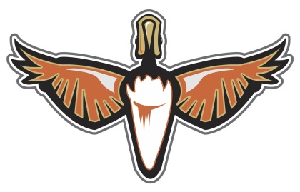
Lastly, the Ducks. It seems like every concept post at some point feels the need to help out those poor Anaheim Ducks. Nobody was sad to see the "Mighty" go away, but nor were they glad to see the artistic carnage that would ensue on the sweaters to follow.
;) mcskilz
mcskilz
I'm not saying gold is the way to go necessarily, but maybe stepping outside the box isn't a bad thing. Anyway, the colors are great, but the logo could use a lift.
 Jake Niehl
Hey, an actual duck. Go figure.
I enjoy ending a concept post with a little something to freak you out, if at all possible. Tonight is no exception. The Sabres and Canucks have their 40th anniversaries coming up next season. Let's get started by putting an actual saber on the Sabres' jersey.
;) J.B.
J.B.
And hell, why not just run the gamut of past logos and colors for the Canucks? You know they never did have a red jersey.
;) J.B.
J.B.
A little something to frighten Panthers fans. As we near Halloween, perhaps this could be a costume.
;) Jules
Jules
And lastly, one of the most ridiculous Atlanta Thrashers concepts ever to grace these pages.
;) mcskilz
mcskilz
Show your mcskilz! To the first person who can legitimately make the rest of the numerals out of that simple Thrash logo — bragging rights for life!
Hope the wait was worth it. I'm really trying to keep this updated. And since I know it's what you guys want, I'll make a special effort to have something new hear at least once a week — though it likely won't be in the quantity you see tonight.
Keep those concepts coming! Email them to icethetics@gmail.com.

Reader Comments (34)
KESLER is spelled wrong on the canucks jersey...FAIL
yeah, that is what i kinda meant about the Avs third. use a tweaked version of the foot logo as the main crest. concept shown is good, not great...way better than having 'COLORADO' in Rangers-style.
Having seen those Lethbridge Hurricanes jerseys in live action a few times now, I think the Caps would look pretty sharp in that style as well. The one improvement I'd like to see: the Canes are wearing traditional block style numbers on their jerseys, and I like to see them try the style of cresting that the Capitals wear.
Wow. I absolutely love that Colorado concept. I like the template, the color and even the crest isn't bad.
i like the black and green panthers unis, like something i would make on the video games.
No, no, no on the Wings' 3rd jersey. I can't stand any of these things because it's just a straight up cash grab, but the Winged Wheel looks awful on that design. It's much too close to my heart to be mutilated like that. Fail.
That avs jersey is amazing. People here in colorado would love that
The Canucks have had a (mostly) red jersey in the past.
The Avs jersey is pretty cool but I would change the socks. also, i think it will be cool to put an octopus on a detroit third jersey
kesler not kessler
dude ive sent you like 1000 concepts in the last 4 months and not one of them has been posted
Colorado concept is amazing I have yet to see a good alternate concept for the Red Wings and the Ducks. 2 tough teams to rebrand
Pretty sure the "panther scratches" on the the third Panther's jersey are actually a tilted version of the Monster Energy Drink logo!
Maybe A Vintage Day...
Too Bad My Jersey Is'nt There.
That first Panthers jersey should work in theory by borrowing off of Minnesota's, but it just looks too similar to the current Thrashers 3rd to look good in my book. Gonna say the same thing about the Florida Monsters. That would be the only explanation that the colors are black and green. But all in all, it's nice to see concepts again. Thanks Chris
i like those panther jerseys haha.
@ Hman:
I have a Monster Energy can right next to me and really they only look similar because they are both scratch/rip/tear designs and use black and green. It's possible the creator was inspired by the Monster Energy logo, but they are different.
And as much as I think the Capitals should use the "weagle" if and when they introduce a third jersey, if they were to go with that concept, I don't think anyone could argue against it.
Where do I begin...Oh right, at the start. : P
Aves: While this is a nice tribute, there has to be a better way for this team to pay tribute to their former self. (at least until the NHL comes to their senses and brings back the Nordiques) The shoulders and arms kill the look. Tweak one of them and it would look decent.
Panthers: No complaining here...they'd look pretty solid in a jersey like that.
Canucks: First one...I could go into detail about the spelling of KESLER but I'll ignore it. An Interesting idea incorporating centre ice. Though it needs some work. Second One...this is one of the reasons why the "Halloween" colours shouldn't make a comeback in Canuckland (Unless it is Halloween).
Detroit: If Detroit ever went with a third jersey, they'd go with a red version of their winter classic jersey. But that's just my opinion.
Dallas:This...Is...AWESOME!!! I think Dallas needs to get a call from their former self and put this jersey to use.
Sabres: Looks like something a junior hockey team would wear
Panthers 2: Whoa! With that type of green they'd adopt the nickname "Nuclear Panthers"
Thrashers: All I can say is, wow...Let's hope that type of number style stays on this blog...
Damn my posts always end up in the freak outs! lol all in good fun though.
And no I don't work for monster. I just really like lime green/black combo and i thought the slash mark was a good 2nd. Simple but still cool.
I always thought the Panthers had some of the worst jerseys in the NHL.
So something different.
I actually think those black panther jerseys look awesome, I would buy one.
The Duck logo looks like a pair of sunglasses. the black/green panthers jerseys look pretty sharp, but a bit minor league-y. Knowing how all southern teams feel the need to incorporate a hockey stick into their logos, i bet they'd cross the scratchmarks with a stick to form an 'F' for florida
i just sent you like 10 concepts, most of them are shitty but can you at LEAST post ONE of them
I like that Florida Panthers jersey with the round logo and the Dallas Stars tribute to the North Stars. The navy Washington jersey is nicely done but I don't think it suits the team. They have beautiful red jerseys already.
@Connor: Don't send him admittedly bad work and it might get posted. Don't whine about it either, doesn't make you look good.
Am I the only one who thinks the star should be at the bottom of the "D" in that Dallas concept? Considering they're in the south US...
Yes!!
Some concepts!
I really like the Avs jersey. they should def implement that.
Keep it up, Chris.
REALLY looking forward to weekly concepts posts again!
(Maybe even seeing some of mine! ;D )
The Stars jersey is the best concept I've EVER seen!
Another shout-out to the GREEN Stars mockup. Looks better than anything they have worn since moving to Dallas.
I love the wings and how simple their jersey has always been and how they've never followed the trend of having a third jersey.
That being said, I absolutely LOVE the third jersey concept posted above. I would buy one of those in a second.
@Conner Instead of submitting a thousand average ideas, why not put your time into making one or two outstanding ones?
i like the idea of the Stars jersey but i dont like it too since the Northstars left MN. I wish the Wild could the the naming rights from them so we can go back to being the Northstars or even letting us use the a throwback Northstar jeresy would be sick
Is it possible for the florida panthers green/black halloween jersey to be available so i can buy it haha
i would pay good money for that
As a Canes fan I would be down for a Whalers throwback on St. Patrick's Day and maybe even some other games.