IX: Oddball Parade
 Saturday · Nov 7 · 2009 | 7:32 PM PST
  9 Comments
 As most of you noticed, I took the past week off. Plenty of stuff to talk about but not enough time to write updates. So I made a change. The Concepts section is now the Icethetics home page — rather than the blog. The blog is still there but now you'll find it in tab bar at the top of the page.
Over the past week while I was away, a fair amount of concept art came in — some worthy of posting, some not (for various reasons). But for the most part, it was all pretty odd. Tonight, we're taking a look at it.
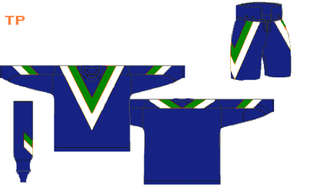
We'll start with the Canucks in a combination I don't think we've ever seen here before.
 Tristan Parfect
Last week I posted a Vancouver concept after which I mentioned the Canucks had never before worn a red jersey. Naturally, I was inundated with emails telling me how wrong I was. So I should explain. That mid-90s third jersey you're all referring to — I consider it orange and black, not red. Fine line? Maybe. Let's move on.
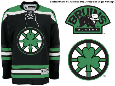
The New Jersey Devils announced over the summer that they're planning a special green-infused throwback jersey for St. Patrick's Day 2010. But what could be more fitting than the Boston Bruins going green for St. Patty's?
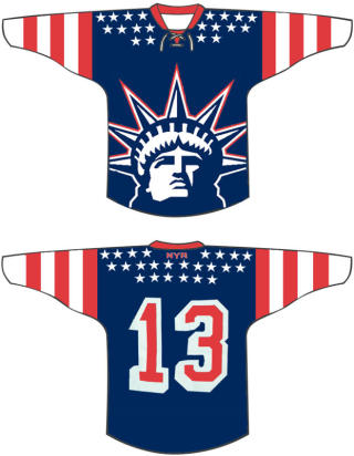
That same artist also delivered a pretty shocking concept for a Rangers third.
 mcskilz
You know, I used to like that Lady Liberty logo. Yikes.
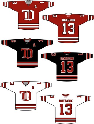
I know none of us can really imagine the Red Wings making a major uniform overhaul, but consider these for a moment.
Then quickly wipe them from your memory.
I also have an announcement coming tomorrow relating to a new concept art series that's starting soon. Remember the old days of Matt (aka GhettoFarmBoy) and his incredible NHL rebrands? If you don't, I highly recommend catching up. (Hint: No, he's not back... yet.)
Check back tomorrow for details on this new series.


Reader Comments (9)
Coincedence About The Bruins And The Celtics? I Think Not.
Being a bruins fan i think that green jersey would be kinda cool for st. patties, just as long as its ONLY used on st. patties.
I would really like the wings concept if there was no black on them. I am however a fan of the black jersey.
The blue Flying V uniforms look great. The home yellow/road combo w/reddish-orange was sharp and unique, but Flying V theme didn't go with those colours. I think the blue version would look great on the ice and it would make the players look tough. I would use the Johnny Canuck logo as the patch on the arms.
I kind of dig the NYR jersey kind of a throwback to the old New york americans NY's first NHL team
haha, I love the Bruins St. Patty's day jersey. The hat on the bruin is perfect.
The canucks jersey was red. It was technically Maroon. but that's still a part of the red spectrum.
Some of these concepts are pretty amazing, and I even think that they are better than some of the club designs in place now.But a simple correction, to a statement on the Vancouver Canucks, they in fact did wear red on their jerseys, twice. 1- Skate 3rd jersey - Slamon Red and 2- Orca 3rd jersey - Blue fading to purple to maroon, with Maroon shoulders.
The Canucks did have a third jersey that was red....it wasn't pretty. It looked like a practice sweatshirt. It was worn the same year Vancouver went to the Cup finals in 1994, and perhaps in 1993 as well....perhaps someone can pinpoint the exact years.