Entries in avalanche (8)

Friday
Aug192011

Concept Collection 48

Today's set of new concept art is just a random collection. Enjoy!

Lots of creative ideas in this group. Keep them coming!

Saturday
Apr232011

Collection 26: Long Time No See

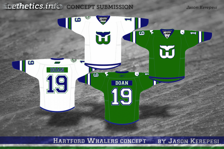
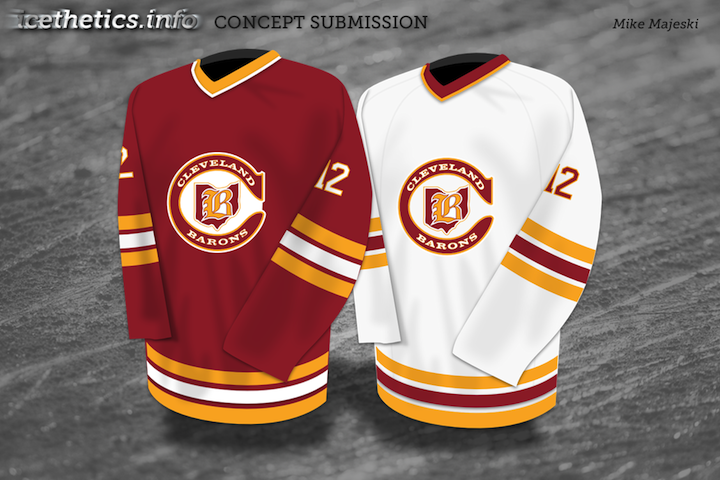
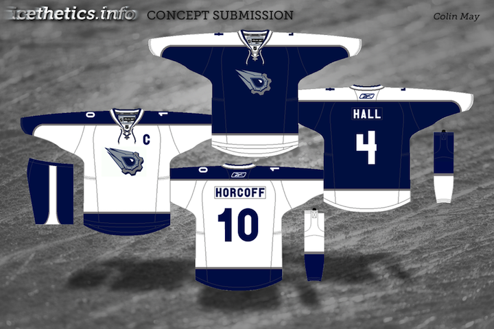
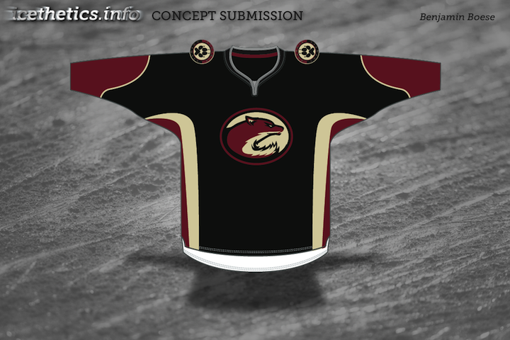
As I was considering themes for today's concept post, I started wondering which teams have gotten the least love on this page. So I took a look back, and as it turns out, there are five teams that have yet to be represented with concept art in 2011. We'll rectify that today.
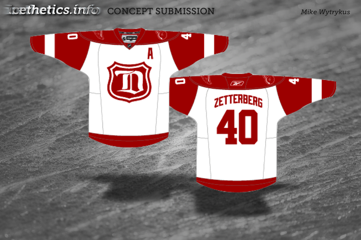
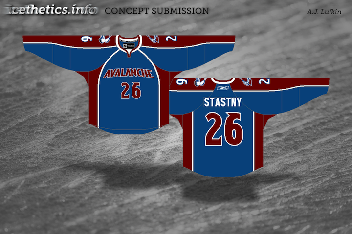
Now these teams won't have to feel left out. Coming in a future concept post, some phenomenal redesigns for another often overlooked group — the minor leagues.

Thursday
Oct072010

Quebec, Conceptually

Last week, fans rallied to bring the NHL back to Quebec City. So let's look at some Quebec Nordiques concept art this afternoon.


Brendan Anderson

Brendan kicks things off with a rather traditional blast from the past. That is, until you get to the alternate jersey. The Nordiques missed the NHL Third Jersey Program by a year but I'm not sure they would've gone with a number on the front. Still, I don't think anybody in Quebec would complain if it meant getting their team back.

Peter Debay

We get a completely new direction from Peter. Rather than the classic logo with its subtle NQ, we here's a lowercase q made out of a distorted hockey stick.

The one I really like, however, is the vintage design with its retro striping and crest design. That would be a nice looking hockey sweater — even with the red helmet and pants.

Scot McCormack

Scot also tried his hand at new Nordiques logos. The jersey remains mostly unchanged.

Personally, I'm not as big a fan of this set as the previous one and I think that's because of the difference in creativity levels. I think if fans had their pick, they'd go with more of a retro style to the uniforms.

Jack Martineau

And just for the heck of it, I thought we'd toss in an Avalanche concept. After all, they used to be the Nordiques.

With his design, Jack is bringing back the abstract mountain at the base of the jersey. Personally, I'd love to see the mountain range that used to be on the sleeves. I think more than any other team, the Avs were ruined by Reebok. This helps, but it's just not what it could be.

Email in your concept art and it may well find its way onto this very page.