Strauss NHL Rebrand II
 Tuesday · Dec 1 · 2009 | 11:08 AM PST
  28 Comments
 We recently began a new concept series in which designer Elliott Strauss takes on the immense task of creating the ideal look of the NHL. All 30 teams will receive his rebranding treatment — some with big changes, others small changes — all, hopefully, for the better.
In Part I, Elliott took on the Capitals, Coyotes and Panthers. Today, it's the Oilers, Red Wings and Thrashers. We start with Edmonton.
The bold text below are Elliott's own descriptions.
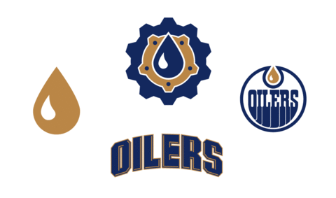
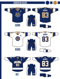 I took a rarely used logo — the one from a shield with a gear and oil drop — and played with some elements to create a new primary mark.
Uniforms are simple, inspired by the old blue and gray alternates. The wordmark is featured on the alternate.
I think most Oilers fans would agree that the new Reebok Edge jerseys need to go no matter what, and that old blue/orange combo of the '80s and early '90s is impossible to avoid.
The more I think about it, the more I think that vintage design should be an alternate worn on special occasions throughout the season.
And any attempt at joining the Thrashers and Stars with text and numbers on the front of the sweater should be nipped in the bud. Still, overall these are solid designs.
Now the one you've all been waiting for.
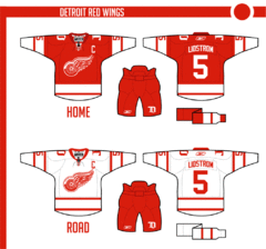 No logo changes. The uniforms are new, but from the stands you probably would barely notice. You can't do too much with the Wings.
This is one instance where I have to disagree with Elliott. I've posted many Red Wings concepts over the years but most have been met with rejection and disdain.
I think that's a mental block. We can improve upon the Red Wings' logos and uniforms but we choose not to out of a misguided reverence to tradition.
It's undeniable Detroit has a signature look and is one of the most recognizable teams in the NHL, but the idea it can't be changed without ruining years of history is silly.
Still, it would be nice to one day see the Wings add a third jersey — just not their 2009 Winter Classic one.
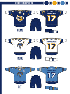 The cereal bowl logo is simplified, as is the color scheme, orange and maroon are no more. The jerseys are pretty modern and put a heavy emphasis on the bird head pattern.
The changing crest logos from home-away reference the franchises' original uniforms.
The Thrashers are suffering from a color overload so this simplification is welcome. I did prefer the baby blue jerseys as alternates but I was always a fan of the asymmetrical sleeves — though I know I'm in the minority among Icethetics readers.
Each team should have an element to its uniforms that stand out and separate it from the rest. Slightly altering striping patterns usually isn't enough to create a unique identity. That's one thing the Thrashers achieved with the ATLANTA text down the sleeve.
And they can't get rid of those maroon third jerseys fast enough for me. I think Elliott just about hit the nail on the head with this concept.
Coming up in Part III, the Maple Leafs get a major makeover.




Reader Comments (28)
Holy crap, the Oilers look like the Winnipeg Blue Bombers of the CFL, and any wordmark only jersey is a misstep unless you're the New York Rangers. Overall I'd say the Oilers score a passing grade though. B-
Detroit is Detroit. I can't stand the team, never could, so anything good or bad about those jerseys is completely lost on me. No judgement.
Atlanta you took a step in the right direction there. I love the white jersey, and the alternate is another success, but I'm not too fond of the dark blue home. I think the sleeves are a bit distracting and overwhelming compared to everything else. Also not a fan of the number style. Switch the alternate and the home and it's fantastic. B+
bout time. nicley done. thrashers home & away should have same logos... nice thrashers colors tho wings are nothing special would of liked to see something new with them.
I'm really digging the Thrashers one, much better than the failboat version I did. I'm disappointed the sleeve wordmark is gone, but still good work.
Are the numbers split to both shoulders? What happens with a single-number jersey?
OILERS- I really like the colors for the edmonton oilers. I don't think the new logo is bad, but you could do a lot more with the oilers. We don't need anymore jerseys with text on it in the NHL. I always thought that third jerseys were suppossed to be different and creative, thirds with just writing on them are a waste of a jersey.
RED WINGS- Would somebody please do something different with original 6 logos. I know that there is a lot of history with the original 6 teams, but no logo is un-touchable. In fact, none of the original 6 has the same logo that they started with, every logo can be made better. The Red Wings logo could use a little cleaning up.
THRASHERS- The new Thrasher logo looks really nice with less colors and the jerseys are pretty sharp too, especially the third. I agree with Chris that they should keep the stripe on one sleeve.
Overall it is very good quality work. I don't mean to sound like im criticize, just giving my opinion. You can never make everyone happy when designing logos, especially sports logos.
You can't change the Red Wings or any Original Six team for that matter. The only ones that I think are decent in this batch are the Thrashers. Keep the O6 the way they are (except for Toronto. They should go back to their jerseys from the 60's).
the last 2 rebrand posts are just barely different from the current logos/unis... granted i cant really do any better, but i was kinda hoping to see a tad more creativity...
I love the thrashers. I've always loved that darting pattern, it's great to see it expanded.
Oilers need a bottom stripe, and I never liked that gear logo.
Red wings are a no. The white I would certainly notice. The red sleeves on the white jersey is perhaps the most distinctive look in the NHL. The single stripes are also a trademark. That said, I've never liked the reds. They're too bland. What you've done with them is not bad, but I'm not sure I really can say I like it. I've always thought that they would look better with contrasting sleeves like the whites have. And the whites you have look way too much like a clone of Toronto's old look- and for one of the oldest rivalries in the league, that's a huge no no.
Of course, the Red wings have significantly changed the reds since 1932 and the whites since 1961, so it's pointless anyway. Montreal has changed their uniforms more and more significantly then Detroit has.
I find the comments "I think that's a mental block. We can improve upon the Red Wings' logos and uniforms but we choose not to out of a misguided reverence to tradition.
It's undeniable Detroit has a signature look and is one of the most recognizable teams in the NHL, but the idea it can't be changed without ruining years of history is silly." to be in turn, misguided and silly.
As a british fan of the NHL, I can only sit back with a mixture of disapointment and complete bafflement as teams in-considerately stampede over their traditional image. For me it seems criminal that anyone would ever contemplate replacing the Red Wings wheel logo, or citing more real examples, the Sabres changing from blue and yellow to red and black, the Islanders adopting the fisherman logo, or the Oilers abandoning orange; something in the back of my mind just tells me it's wrong.
Perhaps it's coming from a British sporting perspective. In the national sport, football, the changing of a teams colour or logo is always controversial; indeed, even seemingly trivial matters to a North American audience, such as changing a stadium name are always met with mis-trust and strongly voiced opposition.
A case in point, a situation such as that of the moving of the Winnipeg Jets to Pheonix would just not have occured in the United Kingdom; in fact the sole example I can think of is the re-location of Wimbledon FC to Milton Keynes, which resulted in a massive loss of fanbase, financial crisis for the new club, and the fans founding their own team! Much of it is down to the franchise system, that is pretty clear. It's apparent that the fan base takes a back seat when money is on the table, and when bargaining chips (such as a new arena agreement with a city) are in play. To me it seems there are very few teams in the NHL that it can be said are true "fan driven teams"; and of those that there are, these tend to be the ones that hold onto their identity most furvently.
To me a good hockey jersey must always be respectful, and mindful of the teams history. I think it's the nature of the more commercial American (more so than Canadian) sports market, that everything is disposable, nothing is sacred in the face of monetary gain; and that means to make a quick buck we end up with the buffaslug, or "SENS" or the truly awful stream of shite Nashville seems hell-bent on churning out!
I welcome the current trend of a more measured approach to team branding in the NHL, let's all hope it continues to se the Kings back in primary forum blue, sabres not slugs, stick in rink for Vancouver, an end of Calgary's NASCAR jerseys and a return to the far superior original Senators logo (or the ever evasive "O" jersey, we can only hope). As for the newer teams who have yet to find their image (I'm looking at you Atlanta, Nashville) take a leaf out of Minnesota's book, you could do a hell of a lot worse.
All the best from the UK fellow hockey fanatics, I hope to post some concept pixel art soon!
I'm disappointed the Thrashers' logos were left largely the same. Maybe I'm in the minority here, but I've never liked any of Atlanta's logos. The primary, even after the recolouring, still just looks like an amorphous swirl with a hockey stick poking out the top. The T-shaped bird looks more at home on a Star Trek uniform than a hockey jersey. And I don't know why, but that wordmark makes me hungry for fish sticks. I have no explanation for that.
I think the Thrasher set might be you best one you've come up with so far. Good call on dropping some colors, although it would be interesting to see them with maroon, orange, and baby blue since dark blue is so widely used.
The Oliers: Nothing special, but an improvement on what they wear now; although they would probably look better with orange instead of bronze. A big non-no with the wordmark/number combo on the alternates though.
Detroit: Not bad, but again, nothing special since the design isn't that far of a departure from their current set.
This is a great rebrand so far, the thrashers jerseys are nice but they could use a bit of burgundy to off-set the blues and yellow.
Like Ian said, Detroit is Detroit, can't do much except change the little things.
finally, the Edmonton jerseys are good but you need to forget the Dallas style word-marks unless the mark is in a logo or is accented well, like Washington or Atlanta. Plus you need a bit of red accent, not much, just enough to offset the copper and blue
P.S. I am anxious to see the leafs designs, the things they wear now look like pajamas they NEED tail stripes plus maybe a 60's looking 3rd, but thats up to you.
Agree with Robby D 100%. I was shocked to read those lines regarding Detroit, and the "misplaced" need to respect historical looks in general, from Chirs. Sometimes, you get it right the first time.
That's why I'm going to go ahead and predict a massive failure for the Leafs in this rebrand line due to the words "major makeover." Unless "major makeover" means going back to the older looks, it will surely be an underwhelming and lame set of overly "modernized" sweaters which, to be honest, has been the case for most of these rebrands so far.
The only good complete set has been Atlanta while Florida, Edmonton, and Detroit are all awful.
This one is a difficult one for me to discuss in some ways. Let me start by saying I'm something of a traditionalist, and my view is if something isn't broken don't fix it. Change for change sake isn't always good, change to improve and I'm all for it.
So with that out of the way, let's start with Atlanta, I'm no fan of the dark blue, and really like the lighter blue. Switch the colour scheme around on the home and alternate and I think I could live with that.
The Red Wings, hmm. I don't know what to say, it's an iconic team, an iconic shirt, and whilst little cosmetic changes are OK, huge changes for the sake of it doesn't work for me. Till I see a logo re-brand that appeals to me, it's a case of change the stripes around etc, and leave well alone.
Now the Oilers, my team! I don't like this rebrand. I'm not a fan of the shirts that we got when we went edge either. Now I do like the return of the orange and blue shirt, it's a nice throw back to a time when the Oilers ruled the NHL. I would like to see a return to the original blue/gray alternate sweater, which looked good, but was also well thought out in terms of logo's. It won many a fan vote as the best alternate sweater around, so why ditch it? The oil drop logo in the circle is almost unique, only the Islanders have a circle logo, and they are very different to the Oilers. I honestly don't see why the primary logo needs changing. As for the shirts, they are missing the bottom stripes which till the re-brand had been a part of every Oiler jersey. Perhaps Elliot's best option for myself, wouldn't have been using the current jersey's as a starting point, but perhaps the late 80's jersey, much like the orange and blue one and working out a new design from them rather than the edge creations which no one has ever liked.
As a huge Thrashers fan, I've noticed that their new maroon jerseys are extremely popular with newer fans. What they need to do is just slap the bird head on the front of it, instead of the football thing they've got going on. That would make me much happier.
And, I don't think you can do away with the maroon. It's what sets us apart from the Blues, the Sabres, and the Predators as that navy and gold team.
I think I just threw up a little.
Oilers wordmark... wow... NEXT!
Detroit is a little lack luster
Thrashers design... best of the bunch but all three Atlanta fans are gonna be pissed if they have to buy a new jersey!
Elliott here again guys, whats up?
Ok, first let me say that I am VERY happy to see so much debate about some of these issues because sometimes that's what a good concept does, it might not be your favorite thing but it makes you think about things, and good conversation follows. I always like to see that, and the traditional vs. modern debate is very relevant in today's rbk dominated NHL. But I'll share some of my thoughts on these concepts, and respond to a specific few of you.
But first, steve, buddy, I respect your opinion that 4 of them are awful, but dude, you gotta give some reasoning, you can't just arbitrarily say concepts are awful and leave it at that. If you don't like it, give me some ways to make it better, otherwise, we won't get anywhere.
The Thrashers ended up being one of my favorites when it came to UNIFORMS. I personally don't like the unbalanced look for my hometown team, but the city as a whole does seem to embrace it, so I guess it's hard to envision them without it. But still, I like the way this striping turned out. Logos, yeah, I didn't do too much here, I really just tried to simplify, but I know a large portion of the population just does not like these logos in the first place.
Red Wings, mmm, yeah, I wasn't even going to try to do logos here. Nothing tops this in my opinion, so I gotta disagree with Chris, but it's all good. I don't know about the uniforms either, I ended up liking the road one much better. If I had to do it over, I would put less white in the homes. This is miniscule but I do thing the D logo on pants and shoulders does help the monotony of the design a little.
For the Oilers, I do think it ended up being an improvement from what they have now, that isn't hard. I just tried to keep it simple. The logo, yeah I didn't do to much. So maybe this one fails a little at really bringing a rebrand, because that's what I was going for. The other two, not so much, they were not intended to be rebrands at all. For the Oilers third, I can see what you are saying about the wordmark. It's not really hockey-ish. But I think it's better than abbreviations like Bolts or Sens.
Thanks for the comments, I do appreciate it.
And the Maple Leafs, yeah, I tried something new with the logos, I think you will like the uniforms, the logos, who knows, it's pretty unique, we will see.
First 2 oiler jerseys are good, after that its not working for me.
"I Hope Elliot Nails That Red Wings Concept For Him."
And He Does.
I am a Thrasher fan, and I love the set Elliot has come up with. Having said that, the best jersey the Thrashers ever had was the old dark blue/maroon with the T-Bird logo front and center. IMO, keep the jerseys the same, but switch the home and alternate, put the T-Bird on all three, and change the yellow to maroon. That would look amazing, especially on the lght blue uniforms.
Sorry, but you can't mess with tradition. The Oilers logo should absolutely not have been changed. I don't mind the color change, but they look like the New York Oilers with their numbers. And the Red Wings, they don't need to be re-branded. I'm a Ducks fan, and as much as I hate them, they've got the nicest unchanged identity and uniforms in the league. The Thrashers redesign is okay, but the logos are way to gaudy (the strokes are huge), and the font should have been kept the same.
I am fairly disappointed with the way those Oilers' jerseys turned out. It looked promising to start with, and all the colours employed were excellent. The way the jerseys were put together did not seem right, especially where the logos were placed. First, of all I agree that the gear from the shoulder of the third jersey needs to be brought back, but it's place is not on the crest. It belongs on the shoulder. Over the years, it has become clear that like the wings logo, the oilers crest has become irreplaceable. That logo can have minor updates, like getting rid of the red outline and changing the way the oil drop looks, but it cannot leave the chest. Secondly I love the secondary as the gear logo, but it is not much more that a secondary logo. Also the word mark is excellent and definitely an upgrade but does not belong anywhere on a jersey. It would however, look damn good on the side of helmets. The copper and blue combination is wrecked by this jersey. The stripes are nothing special and the numbering does not match the jersey at all and needs to be let go. The use of copper in the "new" logos should be more of a compliment rather that being another primary colour beside the blue. Personally I think the Oilers need to have copper and blue home and away uniforms and then have two third jerseys, one Orange and Blue, and One Navy and Silver. This set of jerseys though only would get a 1 out of 5
I think Detroit's real-life white uniforms are great. Their reds are boring though. I'm not sure if this concept is too much of an improvement, but I think it's closer. Why don't the Wings try having a red jersey with white sleeves. Like the opposite of their whites.
Great job on all. As a lifelong Oiler fan, I love what you've done with the jerseys. I'd like to see them return to the blue and orange though.
I dislike the use of straight lines on the Red Wings jersey. If you're going to use the RBK Edge Jersey, you need to follow the curves. The AHL Chicago Wolves have a very similar structure to their jerseys, and the way the lines flow with the jersey work beautifully. Gone is the "pajama tail" look that the current jerseys have.
Have the bottom hem FLOW with the bottom of the jersey, and the Red Wings jerseys (current and re-branded) would be perfect.
Example of the Chicago Wolves (how the stripes follow the jersey cut):
http://www.chicagowolves.com/images/galleries/game_photos/0910Season/1028vsRFD/Oct28vsRFD-11.jpg
Example of the Rockford Icehogs/Chicago Blackhawks (how the stripes are straight and create "tails")
http://www.chicagowolves.com/images/galleries/game_photos/0910Season/1028vsRFD/Oct28vsRFD-4.jpg
Uh, that Oilers concept is hideous. Indeed, every attempt by fans or the team itself to modify the jersey has been terrible (the current Edge abortions and the Todd Mcfarlane greasy ninja star of death). They got it right back with the midnight blue with red and copper accents that they wore to the 2006 Cup Finals. I'd like to see them combine elements of those with the design of the current throwback jersey (just like they did when they switched from blue and orange to blue and copper in the late '90s). If you're going to bring a new logo into the mix, the old rig pig shoulder patch wouldn't go amiss, but otherwise don't mess with a classic.
Nicely done. Could care less about Detroit. But I cannot thank you enough for doing away with the maroon and orange on Atlanta.
LOVE the Oilers rebrand. Get rid of that '70s logo!!!!
Red Wings rebrand is good- never change the classics.
SO glad that you changed the hideous Thrashers home jersey.
I'm a wings fan and love the tradition they have. They should never change the logo. But I do like the white sweaters here they provide a fresh look but still look classic.