Strauss NHL Rebrand I
 Monday · Nov 9 · 2009 | 10:15 AM PST
  35 Comments
 We're kicking off a new concept series today here at Icethetics. Designer Elliott Strauss has been on a mission to rebrand the NHL for the better. Some teams need sweeping changes, others not so much. For the 10-part series, Elliott set out with the following goals:
- Get rid of Reebok EDGE motifs like useless piping (Panthers), piping that randomly stops (Flames), unmatching home/away templates (Wild/Thrashers), awful-looking templates (Sens third), and teams with the same template.
- Come up with some brand new modern designs and make sure every team has a distinct identity.
- Pay attention to detail with fluid identities that feature striping that both makes sense and is consistent.
- Keep tradition when necessary.
I think Elliott is on the right track, for the most part here (though I may disagree with the need to make home and roads always match). Distinct identities, attention to detail and tradition are all important aspects to NHL uniforms. Let's see how they stack up!
All bold text in this post is in Elliott's own words. Artwork MAY NOT be reproduced without permission.
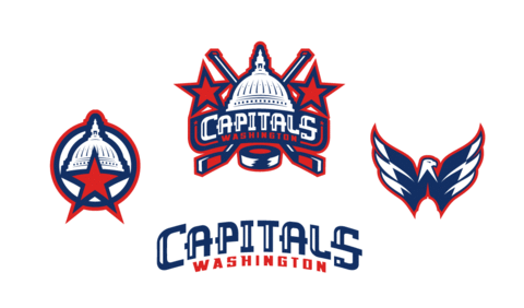
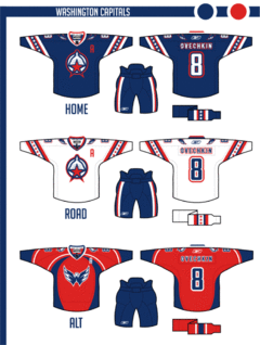 The colors stay the same, but the logo is new as I took the U.S. Capitol dome and combined it with a red star and circle — my version of the pre-Ovechkin primary.
Uniforms are a little top heavy but pants stripes help balance it out. The alternate is somewhat similar to the Capitals' current home, thought I thought the Weagle logo made a better crest.
A great start to this series. The only change I would make is to swap the home and third jerseys. To me, the Caps will always be red despite their late-90s identity crisis.
That Weagle as a crest is an incredible look that Washington needs to take advantage of one of these days.
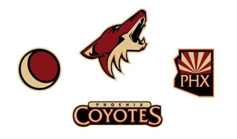
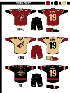 The sand color is darker here throughout the Coyotes identity.
With the jerseys, I wanted to move away from the extreme traditional look a little. Notice that the stripe on the bottom of the hem forms the same design between the jersey base and the pants as is on the arms. For that reason, the pants color had to change.
The road uniform is sand — just something different. The crest of the alternate is based on an old patch they had when they still wore purple and green.
Another inspired concept here. I think the only missed opportunity was the sweater numbers. The rest of the design really works — even the non-white road sweater.
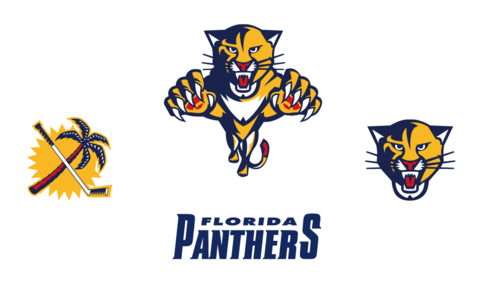
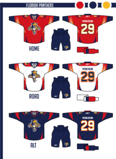 I took the Panthers' logos and updated them to be smoother and more intense.
The uniforms play heavily on the claw motif — even slight claw marks on the numbers.
The alternate relies on the contrast between navy and red.
The Panthers have had great uniforms since their inception in 1993 — at least until the Age of Reebok. What Elliott's done brings them back into the 21st century.
The jerseys are sharp and so are the logos. Very nice work as we wrap up this series debut.
Elliott Strauss is a talented artist whose work has been seen previously as finalists for both the USF Ice Bulls and KractIce logo projects here at Icethetics.
We'll certainly see more from him over the next several weeks.
In next week's edition of the Strauss NHL Rebrand, prepare for teh Oilers, Red Wings and Thrashers.



Reader Comments (35)
I like the logos but not many of the jerseys.
Washington:
Good lord man, they did away with that terrible Capital Building Logo for a reason, it was hideous then and nothing has changed since. I'm not a fan of the logos, but good work with the jerseys. I like the alternate.
Phoenix:
Love the home, absolutely love it. The tan road jersey I think is a mistake, it would be best to stick with white. As for the alternate I think it's a fail. The word mark logo is a mistake.
Florida:
I don't like what you've done with the logo, I think it looks too round and sanded, and just a little too much like the Panther was kicked by a horse as a kitten. But as far as all three jerseys go. I absolutely love them. The claw marks make for excellent striping and I love the little 'spikes' at the bottom. Put those with the current Panthers logo and you've just sold me 3 jerseys.
What bugs me about the Coyotes logo is that it is out of perspective. The top of the skull has the eyes pointing to the left, and by seeing the inside of the left cheek, the jaw is to the right. The team needs to add just a bit of the left eye to the logo to correct it.
As for the Panthers...change to logo color to yellow from gold so that it matches the stripes, other than that, their original (pre RBK) look was great.
Looking forward to the next installment. I hope he uses just the bird head logo for the Thrash, they need to clean up that mess of a logo they currently use. Away with the swirlybird!
So glad to see some new stuff here. Can't wait until our favorite teams: the Ducks and 'Nucks.
Go Kings!
Unbelevibly Great! The Panthers Logos Are Amazing! Finally Moving From Abstract...Something Matt Never Did. :\
I don't like the Capitals' logo on their jerseys. The logo is fine, just not on the jerseys. The Panthers' logo would take some getting used to. Personally, I find it too plain. Coyotes rebrand is bang-on, only I'm not sure if temas are allowed to use non-white road jerseys. Can I get some clarification on that?
the Coyotes and Panthers are great. the Capitals one missed the mark for me. the logo on the front looks off. while the design is nice. the small details of the dome get lost from a distance and arent dark enough to stand out against the white as much as they should. it worked better when they had the black and blue and gold.
the stars and stripes on the sleeves are distracting and i agree with Chris about the red being the home jersey. the sleeves should have solid stripes, if anything a star pattern inside of that.
the numbers on the back of the blue dont work for me. the narrow red outline sandwiched between the blue creates an visually odd look that hurts the eyes.
Finally! can't wait for the oilers jerseys
Nice, I like the fact that NHL teams can actually adopt these changes because they don't drastically depart from they already have. But Elliot, I love your work!
I agree with Elliott, RBK has ruined the sweaters to the point it just is cookie cutter sweaters. Next to Bettman RBK has done their best to make the game U G L Y
Just wondering, what program is used to create these logos? I am interested in designing some stuff but really dont have the means to do so. Any information would be great on to what you used to make these amazing designs.
Thanks
Awesome rebrands!
Coyotes should adopt these right away.
I don't think the Washington needs changing, although i like the concept logo. Phoenix should have stayed the same, with maybe the exception of changing the white to tan. The Florida jersey looks a lot better than the dreaded Reebok pipes they're wearing, and the logo looks sleeker, but still reminds me of more of an AHL style logos.
Good work. Your skill really shows! I think you're a little off the mark, though. For instance, while I like the logos you came up with for the Caps, you're kind of castrating the design -- the way it is now has something more. I don't know what to call it ... personality, maybe. There's something a little too blah Adobe Illustrator about where you are now. Great start, though!
I like the work, the Coyotes is fine, I'm sure the sand road jersey could work, it's perhaps one of those shirts that needs making a few games getting used to. I love the idea of the claw striping on the Panthers jersey.
However, the Capitals I'm not so sure of. Someone else mentioned that the stars and stripes on the as being distracting. For me they actually made me think this is more like a football shirt, and not a hockey shirt. I think it's the stars to be honest, I don't think it's like anything we've seen before on a hockey shirt, well not on the sleeves anyway like that.
That sort of goes against tradition, which is one of the reasons why a lot of us don't like the Edge series of shirts. They broke tradition and ruined plenty of really nice jerseys.
Love the Coyotes concept! The road one is great, but the shoulder logos are too large on the home and away. Otherwise its the best coyote concept ive seen in a while!
I hate to say it, but none of them are really doing it for me. The first two sets are a downgrade from what those teams have now, and the panthers are a sideways move at best.
Hey guys, Elliott here, I did these. I'll try to keep up with the comments over the course of this series. Good or bad, let me know what you think. Of course, it's better to tell WHY you think something because I'm always looking to improve, but all of you seem to have given great criticism so far, it's obvious that icethetics viewers know what they are talking about!!
So far it looks like the Caps are the least favorite. I'm not surprised. After I was finished I was a little iffy myself. If someone just straight up said "What they wear now is better" I probably wouldn't disagree. Right now, they have, in my personal opinion, the best modern Rbk template in the league. And Chris makes a good point, they look good in red. So, yeah, maybe not an improvement. But, the intention of this series is to, many times, go for complete rebrands and drop the current duds completely. So, here, I just tried something new, and I always say that I'd have a creative concept fail than an obvious concept succeed.
And, about the Coyotes, I don't think teams are allowed to have non-white road jerseys, but this is my concept league, so I'm not too worried about the official NHL rules :)
Thank you for the comments guys, I appreciate every one, and I'll try to post some of my thoughts about the concepts on each part of the series.
Sorry, I'm not claiming I would do better, but I don't like any of these jerseys and don't know why the weagle's colouring was changed. Good effort, keep at it, but these just don't work for me. Then again, if something worked for everyone, life would be too easy.
nice. i like the panthers jerseys. a move away from the crazy striping but still kept it modern and unique. the panthers jerseys also look updated something that they needed. i like the home and away jerseys for phoneix but i dont think that the wordmark works on the third. i personally think that the coyotes had the right idea going for the full body coyote but just didnt make it work.
i love the coyotes third, wwwwwaaaaaaaaayyyyyyy better than the ones they have now
The logo work is nice. But as for the sweaters, I reference 80 years of hockey history, you don't see many designs without horizontal striping. A sweater needs to be built around horizontal lines.
I Hope Elliot Nails That Red Wings Concept For Him.
Some good work here but to be honest, I'm not crazy about any of them. As for the Washington and Phoenix concepts, I feel they're a step down from what they wear now. Like what you said in your comment, Elliott, the Capitals have one of the best modern RBK templates in use so there's not a whole lot of room to improve. In my opinion, Phoenix has one of the better non original-6 traditional styled home/away set-ups; it's just their alternate that needs some work.
Concerning the Florida concept, I like the idea, but it feels a little too roller-hockey-ish. Maybe if you simplified the claw/slash motif it'd work better. I feel the alternate is much more appealing than the home/away. Also, I think your changes to the primary logo make it feel too segmented (the head is pretty much a circle with ears and a bottom jaw). I thought the updates the Panthers made to their primary a few years ago basically perfected the design so I might be a little biased though.
I Wonder How Elliot Cured The Abstract For The Panthers?
I'll keep my comments to the DC uniform, as that's the team I'm behind and the city I pretty much live in.
I can't see a side-view of the pants, but if the pants had stars running down the sides, that'd be a fitting tribute to teams of old.
As far as the logo, we DC fans struggle getting behind teams that are represented by a single star, regardless of color. Also, red stars in such a political town may cause a backlash.
As far as personal feelings are, I don't care for uniforms that have striping where the captain's C goes. I think that looks silly, and I've yet to see one in a mold of how I like it. Most of my fellow caps fans who I've talked to about it also don't like the concept of a third jersey for us, but I assume you're compiling primary sets and an alternate for everyone, so we couldn't complain too much. Also, the Weagle is, in my opinion, the coolest logo in sports (I know, it isn't shared by everyone), but I've yet to find someone who doesn't like the weagle. Looking at it, I still feel the same way I did as the first time I saw it at it's uniform unveiling ceremony. That said, I don't think it belongs as a primary crest. At all. I think it matches perfectly as a secondary shoulder crest. Also, because of the Capitol imprint into it, if it is on a jersey I think the ideal color for that jersey should be white. having it so large on a white jersey, it really helps to notice what it really is.
Lots of stars - not a negative on a Caps jersey. I appreciate you working a ton in. All in all, solid work, though I can't say I don't prefer the current team's templates and logos. It would work and not cause too much of a backlash (Except for the single star logo, I think) and that in itself I think is an accomplishment.
"I Hope Elliot Nails That Red Wings Concept For Him."
ditto on the rest of the original 6.
none of these really do it for me, but in terms of establishing fairly unique brands, and completely rebuilding a lot of team's "images" its moderately successful.
the caps new logo set - not so good, but again, worked for unique branding.
the jerseys are a bit of a step-up...(from the logo-set, not their actual shirts ) the road is nice. the third bothers me because by avoiding the rbk templates, you stumble right into the late 90's nike olympic template (canada, US, finland. etc), which were a similar bane of jersey fans in their time.
in your defense on the jersey, people complaining about the lack of tradition in the stars should look at the new york americans jerseys
ref:
http://pics.classicauctions.net/classicauctions/auctions/10/545.jpg (Canada)
http://www.icejerseys.com/images/olympics/usa_away_big.jpg (USA)
http://www.iwn.fi/~dana/images/thb/thb_selanne_fin_fan.JPG (Finland)
http://www.ansports.com/jerseys/nya.jpg (New York Americans, waaay more stars)
Phoenix's logo-set is pretty crap, but i can't discern that you've changed it from the current, which is probably why. That said, the work done to make a third logo (for a third jersey) doesn't look too good.crest is too large for the jersey, i think. The jersey's themselves (outside of using sand, which is a cool, but not a first time idea) aren't really establishing their own brand or uniqueness, as to me they look like the Ranger's lady liberty 3rd. The Phoenix third here is just boring. Like, early 90's Sens roads boring.
The Florida logo set looks more cartoonish after you smooth it out. Thus, less 'fierce'. Not sure if that is intended. The return to the original colour scheme (and inclusion of the shoulder yolks similar to that of their initial jersey) brings an element of 'tradition' to a not-yet 20 year old team, which is nice, and the claws work pretty well. The third seems rushed and thrown together.
all in all interesting. looking forward to future work.
The only jersey I don't like is the panthers 3rd needs a little yellow around the red on the sleves
It all looks great to me except for Phoenix tan looking jersey rather than white. Makes it look like its from the 40`s. I agree with getting rid of the reebok looks and into something like these. Everybodys team has too much white. Why not go back to the home team wearing white again, so we can see some opposing teams colors? Black,(Pitt) blue, (St.L) red, (Cgy.) green,( Dal.) orange. (Phi.)
The Onriginal 6 Has Classic Logos So Elliot Has To Nail Them!!!
Hey Elliot, good so far, with the logos and the jersey ideas. My only thought is while all the jerseys look good, they all remind me of each other. Especially in the arm area. I don't know all the terms. You got some good ideas and the arm area has some variation but they're all the same kind of slanted pattern... they look different but they all slant the same way. Idk it's hard to explain but maybe a little variation in the arm areas on future concepts would be cool. So far though you've made 3 good sets of jerseys.
Any more of these coming anytime soon? Im anxious to see more!
Love them all. Very nice job. Really love the clean look on the Caps jerseys, I think my favourite is what you've done with the 'Yotes. It would be interesting to see the helmets they'd wear with that road jersey. Excellent job!
Great job keeping with the current color sets and with the jersey concepts. The 'Yotes road jersey has me on a fence. I've always been a fan of the traditional road white. Otherwise well done all around.
The Panthers did need a change- But what is going on with the palm tree and hockey stick?