Entries in straussnhl (10)

Sunday
May022010

Strauss NHL Rebrand X

Time for the big finale. Here is the final installment in Elliott Strauss' NHL rebrand series. His descriptions appear in bold text.


Elliott Strauss

I think this is one of the more interesting concepts of the series because it gives a fairly drastic change to an untouchable team. I updated the familiar shield and brought back the Lady Liberty logo. The diagonal stripe on the uniforms has the same angle as the wordmark and is meant to match the diagonal sash on the primary logo.

The wordmark/numbers contrast the sleeve stripe order on the home and away jersey. The alternate is almost an exact replica of the pre edge alts, but the silver is dropped in favor of royal blue.

Definitely a shock at first glance — in a good way. All the key elements are still there. They just don't look the way we're accustomed to seeing them. This is one of my favorites of the entire series.

Elliott Strauss

Originally I had left some gray in here, but considering the nickname represents the Union army, I found the color gray pointless, as this is what the Confederates wore. I think these uniforms are inspired by the original jerseys for the franchise.

The red pants stay and a blue insert with star on the pants match up with the panel that you can see on the road jersey. I created no alternate because a red jersey would go against the nickname and another blue jersey would be redundant.

Straight after one my favorites is my least favorite of Elliott's series. I'm not here to put down anyone's work but this set feels lazy. Gray was never one of Columbus' colors. It's always been silver. It's an important distinction. Without the silver, the star in the logo looks out of place. And the Blue Jackets made a second blue jersey work in 2003. Just a little creativity is required.

Now with that out of the way, I love the jersey design! The sleeves are cool and so are the stars under the arms. It's a little like the stripes on the armpits of the Lightning's jerseys. Adds an interesting visual element when the players raise their arms to celebrate a goal.

Elliott Strauss

I feel that the Johnny Canuck V logo is the best they have, so it becomes the main crest in my design. The orca stays, just modified, and has a much less prominent role. Green and blue also stay, as I like this unique scheme. I've always wondered what a green alternate would look like, I think this simple striping pattern would make the blue stand out on the green.

Here I applaud Elliott's use of an existing logo because the Canucks have never had a more uniquely identifiable logo in their arsenal. It's just a shame they haven't put it to good use yet. And for what it's worth, the whale doesn't look half bad on green.

There it is. All 30 teams as envisioned by Icethetics concept artist Elliott Strauss. Do you think you have what it takes to rebrand the NHL? Send in your concepts and show us you can think outside the box when it comes to branding pro hockey!

Wednesday
Apr212010

Strauss NHL Rebrand IX

The NHL Rebrand series by Elliott Strauss is starting to wind down. This week he tackles the Devils, Wild and Predators. His own comments are in bold text.


Elliott Strauss

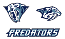
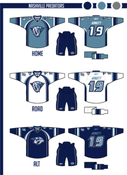
I thought that the old mustard alternate crest had potential to make an interesting primary logo, so I just cleaned it up. A simplified version of the current primary remains as a secondary. I came up with a custom font for the wordmark and numbers, and I'm happy with the way the numbers look on the jerseys.

The color scheme keeps navy and silver but adds an icy blue-gray in the place of yellow. The home jersey color of "steel blue" would make a unique addition to the NHL. The alternate slightly modifies the home/away template.

A strong entry here, to be sure. Personally, I never realized what a great logo the Predators' had on that old alternate until Elliott did some work to it. Certainly looks more like a hockey logo now. And overall, this is a really sharp uniform set. I'd by that home jersey in a heartbeat.

Elliott Strauss

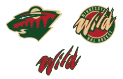
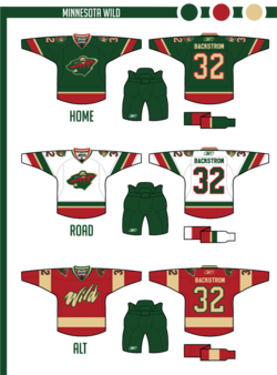
I dropped the two-tone gold thing they have going, the darker yellow is gone, and wheat takes its place. Other than that, the logos stay the same, this is one of my favorite primaries of all time, so I got rid of the circle thing on the primary crest to focus on the awesomeness of this logo.

Pretty simple uniforms. No white in the homes, but I think the small amount of wheat really makes the red stand out. Then green has a prominent role in the roads as well. The alternate simplifies things even further. I do like how these uniforms turned out.

Great to see that primary logo back on the front of a green jersey. That's where it belongs. Only thing I don't like about this set is the alternate uniform. I understand what Elliott was going for but the style of that wordmark clashes with the simplicity of the sweater. At least the team got that right for real with the new thirds this year.

Elliott Strauss

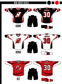
I love what they wear now, but I wanted to try a modernization. I actually made the home jersey black, which is new, and then tried some devil-horn striping. I had to keep a lot of red, so the alternate brings back the red base, with a different take on a modern devil-horn stripe.

The striping on these jerseys is just flat-out cool. The shift back to classic style uniforms means we probably won't get to see anything like this in the NHL for another 15 to 20 years. I also like the secondary logo, borrowed from the AHL's Lowell Devils, but disappointed it didn't make an appearance on the uniforms, not even the shoulders of the alternate.

And if I'm being completely honest in my review, I'm also disappointed that we didn't get a modernization of the logo along with the updated jerseys. The Devils' logo is very clearly a product of the early '80s. That's not necessarily a bad thing, but it seems out of place on the "futuristic" jersey designs. However I do like the re-coloring on the home sweater.

One more edition of Elliott's NHL rebrands to come. And by process of elimination, I'm sure you've figured out that the Rangers, Canucks and Blue Jackets are on deck. Spoiler alert: Rangers get the best rebrand!

Monday
Apr122010

Strauss NHL Rebrand VIII

After a slight delay we pick up with Part 8 of the NHL Rebrand series by Elliott Strauss. Today we see big changes out west and sometimes change isn't really necessary — if you're part of the Original Six.

The Kings, Bruins and Canadiens are featured this week. Elliott's descriptions are in bold text.


Elliott Strauss

This is the one concept that gave me the most trouble. I went through about five drafts, with secondary logos that included a lion and an interlocking LA, but all secondaries were eventually scrapped.

I finished with this rendering of a crown and the lack of purple in favor for the Gretzky era colors of black and silver. The striping is very atypical and was inspired by the old alternates from the mid-90s.

Unfortunately I am not happy with the final product here but I'm showing it anyway. I'm thinking about a complete redo, which I will send to Chris if I get around to doing it.

It's certainly not as bad as Elliott is making it out to be. But it does look like it is still in the process of being perfected. Is it better than what the Kings currently have? Maybe not. But with a little more work it could be.

Elliott Strauss

Not many changes here. I made the stripes on the arms go white-yellow-white on the home to match the white outlining on the numbers. Same goes for the shoulders, reversed on the roads. A new thing is yellow socks on the roads as well with stripes tweaked to match the arms.

Not much has changed at all here. Kudos to Elliott for recognizing some teams are perfect already.

Elliott Strauss

Obviously this team's identity is timeless but lets face it, the home and away aren't consistent, which is slightly bothersome to me. I tried making them correspond more, it's a little hard to even explain my thinking here, but hopefully you can see the consistency this design brings. I actually sort of like the blue backdrop stripe for the logo and numbers, which plays off the current homes.

The uniform change is significant and might require some getting used to, but it's certainly not the worst thing we've ever seen. And here again, there are some classic, iconic logos you just can't change.

Just six more teams left to cover in this series. Check back for some very sharp rebrands for the Predators, Canucks and Rangers in the next two weeks.