


Concept Collection VI
 14 Comments
That post featuring all the non-winning entries from the USF Ice Bulls logo contest is and probably will continue to stand as the LONGEST concept post in the history of Icethetics. Now it's time to get some new stuff posted.
One of my favorite artists, who I haven't heard from in a while, is Aaron Masik. He came up with these alternate logo designs for the Carolina Hurricanes.
;) Carolina Hurricanes concept logos by Aaron Masik
Carolina Hurricanes concept logos by Aaron Masik
Ask any Southeasterner, myself included. That windblown palm tree is the classic hurricane image.
Ryan Haslett sent in a handful of jersey redesigns. He's put the Ducks in orange and managed to keep them from looking anything like the Flyers. How? No white and more modern striping.
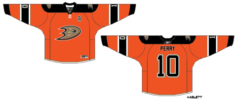 Anaheim Ducks concept jersey by Ryan Haslett
He's also given the Coyotes a little something to improve their alternates. I think the lack of that brick color helps make it more different to the home and road sweaters.
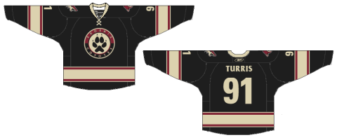 Phoenix Coyotes concept jersey by Ryan Haslett
This next one starts taking us into the realm of the weird. Imagine the Nordiques lived to see the days of third jerseys. Could they have gone with red or would that simply have given the good folks in Quebec another reason to revolt?
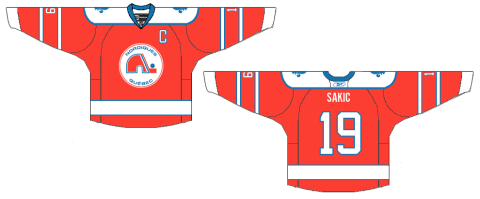 Quebec Nordiques concept jersey by Ryan Haslett
Since we're here, we might as well go full on freak out. Jeff Kennedy considers a re-envisioning of that ridiculous bug from a decade ago.
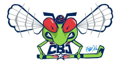 Columbus Blue Jackets concept logo by Jeff Kennedy
Keep the concept art coming in — even if especially if its freaky. I'd like to be able to offer up new concept posts every few days. Email your work in at icethetics@gmail.com and don't forget to include your name so you can be credited! (By the way, this is just for fun so you don't have to give up any rights or anything like that. Just a way to share interesting ideas with fellow design nuts.)

Reader Comments (14)
that hurricanes logo is very well done, i especially like the secondary
the bugs name is Stinger
I really like the Hurricanes' logo in the top right as an alternate shoulder patch.
I like the Cane's secondary logo, it's something fresh that's for sure. I'm not sure I'm liking all the orange (Nordique's is scary), since I think Philly should be the only one that sticks with that colour. Coyote's alternate isn't bad actually, but I think there's too much black in the league already. And on the Columbus bug... no comment... just...no.
LOVE the secondary for the Canes/ I like that "CH", but I'm not sure it belongs in the logo, so I'd probably go with the one on the top right.
is it supposed to have an FE in it or is that supposed to be wind gusts?
As a hurricanes fan, I really like that top right logo. Only trouble is we already have the flag logo, which is a very similar look.
That and you don't see too many palms in North Carolina. The Hurricane image here is pine trees and branches blowing through the air, or boats caught in a heavy storm. And flooding. Lots of flooding, but not many palms.
A cool logo could be made in this kind of vein with a sailing ship being thrown around in the storm. Throw in a lighthouse too, we have some quite historic ones. Hatteras and Lookout would be the ones to use if anyone wants to come up with a version of the logo, I'm not skilled enough to try (though I'm going to make an effort anyway).
But yeah, palm trees not so much.
As an example: imagine a ship like this
In between the lighthouse and the wave on this Ward Mask
Our coast is known as the graveyard of the atlantic for a reason...
The coyotes shoul switch their alternate to Ryan Haslett's design, as for the hurricanes logo, they should definetly take up the secondary logo, top right
I can positively can say that someone would have been shot if that Nordiques Jersey had come to reality after the WHA-NHL merger. I know, there was a Nordiques red jersey in the WHA, but that was before the NHL Canadien-Nordiques rivalry.
The C's A Bit Boring...
Some of these concepts are pretty amazing, and I even think that they are better than some of the club designs in place now.But a simple correction, to a statement on the Vancouver Canucks, they in fact did wear red on their jerseys, twice. 1- Skate 3rd jersey - Slamon Red and 2- Orca 3rd jersey Blue fading to purple to red, with red shoulders.
not that that comment should go here!
I also feel that the ducks should not ever, ever , ever wear orange. it has noting to do with the franchise, unless it's that they exist in the state that grows oranges. still i'm not feeling it