


Post-Olympic Extras
 8 Comments
Had a few leftovers from the Olympic Spirit series that ran during the Vancouver Games.
 Dallas Hicks Dallas Hicks |
By far the most popular part of the series was Dallas' flag-based jersey concepts for Finland, Sweden and Norway. Now he's tackling Canada with the same principle in mind. White in the middle with a red maple leaf (in the form of the classic Team Canada crest) and red sleeves to mimic the red stripes on either side. He's also put the Canadian flag itself on the sleeves. |
 Connor Hanley Connor Hanley |
Here's another Canadian concept, this time from Connor. The first thing I noticed was the merging of two classic sweaters — those belonging to the oldest Canadian NHL franchises, the Canadiens and Maple Leafs. Obviously, the maple leaf on the crest belongs to Toronto and the striping across the chest comes direct from Montreal. Aside from that, it's not a bad look. Just needs to be a little more original. |
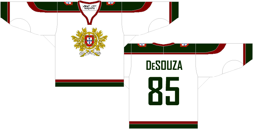 Jason Pires Jason Pires |
I don't know when was the last time Portugal sent a hockey team to the Olympics (if ever), but I'm sure it wasn't recently. Still, Jason has sent in this Portuguese sweater for our enjoyment. |
 Ethan Proulx Ethan Proulx |
Another nation not seeing ice hockey action in Vancouver was South Korea. But why should that stop Ethan? Here is his attempt. It's a little busy, but definitely one of a kind. |
 Matt McElroy Matt McElroy |
Now we finish where we started — Team USA. Matt submitted this concept. I actually like it better than the current blue United States jersey. That one's a little dark. At least this has a lot of white and red in it. |
That wraps things up for the Olympic series. More in 2014!

Reader Comments (8)
I really like the candians/leafs concept, the only problem is the red numbering fades into the red, otherwise the look amazing!!
the main problem i had with the number colouring was if i made it white then it would just be a black outline and if i made it black it would look almost un-readable
I like Dallas` Canadian jersey, but the flags on the sleeves is too much...just white stripes would be better....as for the other Canadian concepts....I love them...only thing I would say is obviously not to use that leaf logo...throw the current Canada logo on there and that would look very sick....
The USA one is very nice too...nice, simple, consistant
I would buy Connor's Team Canada's jerseys in a heartbeat.
i really love connor's jerseys, i think they would look even better putting the current canada logo (or even the canadian flag) on the shoulders. i'm not 100% sure about the pants, though; i think they would look better if they were plain black, or red.
Are you kidding me. that's just the Toronto Maple leafs logo.on a Hawks 3rd Jersey. No way!
Just thinking about it, Connor's concept would make a spectacular All Star Jersey. If not a great jersey for a tribute game for the most storied rivalry in hockey history.
Portugal is one the top European teams in Roller Hockey. Winning lots of championships. Just not on ice lol. But at least in roller hockey they good.