


Concepts Out of Thin Air
 21 Comments
We head to the Mile High City for the latest batch of concepts. Enjoy this Colorado Avalanche artwork.
 Matthew Duke Matthew Duke |
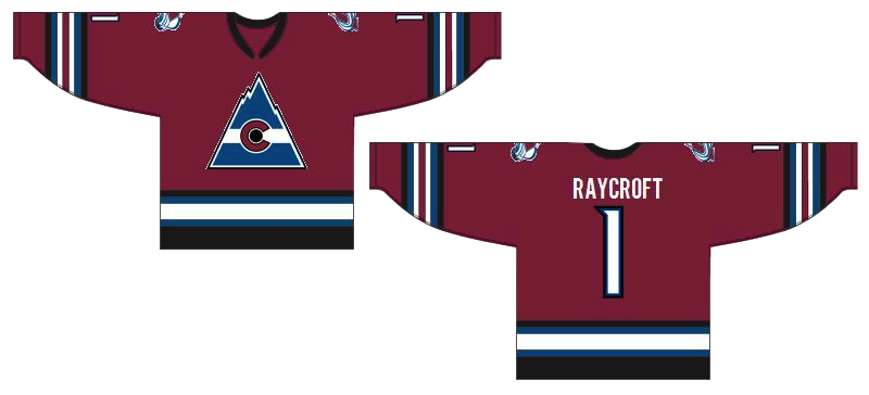
At first glance, Matthew's concept may look like one for the old Colorado Rockies club. But look closer. It's all about the Avs. It's a unique design with a new color added. Should it replace what is arguably one of the best logos in all of hockey? Of course not. But I could see it gaining a following as an alternate. Maybe not the white one. I prefer the way the striping works on the burgundy sweater. Shameless promotion for Matthew: He's got a Carolina Hurricanes concept that will knock your socks off. I'll try to get it posted soon. |
 Ryan Haslett Ryan Haslett |
I'm not sure that removing the classic "A" logo is the way to go about making an improved Avs jersey concept, but what Ryan has isn't half bad. Plus, the Caps-inspired sleeve design gives the effect of snow-covered mountains. And I have been enjoying watching Colorado play in blue. |
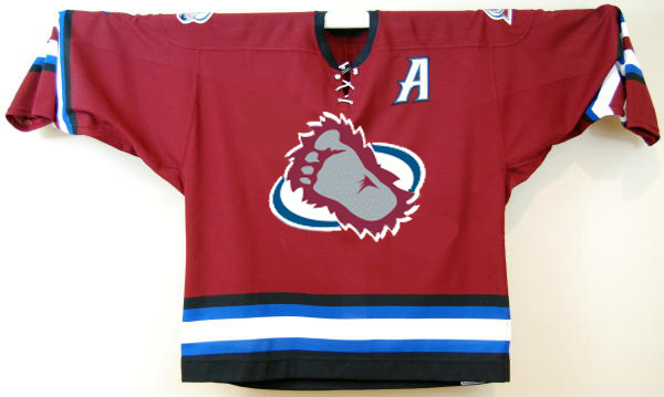 Glen Cuthbert Glen Cuthbert |
But if you do have to replace the crest, I certainly don't think diagonal text is a good thing. The sasquatch footprint, however, could be a keeper. Glen has placed it on the original Avs third jersey for us. |
 Brian Brideau Brian Brideau |
Perhaps the real solution is just to fix the striping on the Avalanche's home and road sweaters. Is Brian's Phoenix-style concept the cure-all? Maybe not, but it's a step in the right direction. Why not just go back to the original look from 1995? Don't let Reebok stand in your way. |
 Jeff Wozniak Jeff Wozniak |
Finally, as we wait for word on the locale(s) for the 2011 Winter Classic, Icethetics artists are more than glad to throw in their opinions. Jeff pits the Avalanche, dressed as the Quebec Nordiques, against the Montreal Canadiens in the epic Battle of Quebec. Who wouldn't love to see that old Nordiques logo back on NHL ice? This would be a cool match-up for a Canadian game. Any other outdoor match-ups you'd like to see? |
Hope you liked those Avs concepts. Our creative designers work very hard. Up next: Elliott Strauss' NHL rebranding series returns this week! And, as a perfect segue, it starts in Colorado.

Reader Comments (21)
Nice concepts, I really like the habs concept GO HABS GO!
Wow, Chris! You keep amazing archives!! I had completely forgotten that I had sent you that Avs concept. Seeing it get posted made my day.
i love that first avs concept!!! i don't know what you're talking about when you say the current avs logo is one of the best in the league. i've never been a fan of it. this avs concept looks like the team could have been in the original 6, and the logo had been appropriately updated very subtley in the past few years with those mountains (similar to what the bruins have done with their logo- subtle updates over time). i'd WAY rather see that on the ice over the current avs getup ANYDAY. EXCELLENT WORK!!!
You know, I'd love to see a WC that ISN'T in a stadium. Maybe Sens-Leafs on Rideau Canal, or Canucks-Flames on Mount Seymour.
lebeau, there is no way that would happen,
there would be to many uncontrollable factors with the playing conditions and seating arrangement and safety to have anyone sign off on it.
while the idea worked great in Mystery Alaska, the practicality of it wouldnt fly in the real world.
Love Matthew Duke's concept. The logo is way better than the actiual one. And Chris, the A is not a classic. i'ts a generic 90's logo.
And as a Nordiques fan, I wouldn't like to see that jersey happen. They just need to transpose the old one to the Reebok template. It looked great, no need to change it. And even then, i'm not that sure i want them to wear it, now that Joe is retired.
And white pants doesn't work. for any team.
Seriously to follow up Shawa, the Avs logo is no where near the top in the nhl. This one is much better. Its neat and brings in a bunch more history back to the team. I really like the Classic striping too! Can't wait for the hurricanes concept.
There's no way the current Avs logo is anywhere near the top of the league. Very good job on that first one, almost looks like a vintage sweater, logo at least anyway.
oh i just had a thought about your sweater, matthew duke. a small suggestion but maybe the number on the back should be outlined in white rather than burgundy or whatever it is just so it makes the number easier to distinguish when it overlaps with the blue. you did it on the front around the logo and it looks good
more to ur liking, ken? thx for the feedback i actually agree
link
oh cool, looks pretty sharp. good work
I like the top concept jersey.... not digging the logo so much but the jersey design is sweet, be awesome if they had the Av's logo they have now on that type of patterning
I think that Winter Classic would please a lot of people. I think I would like it even more if the Av's wore the blue Nordiques threads and the Habs wore the white version of that one...But Montreal has already been in it once. I say don't let them have another one until more teams have had the experience
really diggin the first concept especially with the white number modification (from the link in the comments) great work!
I wanna see a winter classic between the Kings and the Canucks in Seattle with the Nucks wearing their alt. jerseys and the kings wearing their gretzkey-era jerseys
Torts, why Seattle?
JD, im just guessing here... but I think it;s because its somewhere in the middle of the 2... safeco field tho? really?
But there's no hockey tradition in Seattle at all!! That doesn't make any sense to me. If it does happen there, it'll probably get rained out anyway
It would be nice having back a franchise at Quebec, it would be more authentic :D
I want to see Dallas vs Minnesota at the new baseball stadium in Minneapolis.