


Creative Inspiration
 11 Comments
Has it really been seven weeks since the last concept post? Unacceptable. Yes, there have been a lot of blog and tournament updates. And yes, I've been busy lately. But seven weeks is a long time. So I'm going to try some new things to keep the concepts flowing.
Since getting this page updated is lower on my list of website priorities due to the time/effort required, I'm going to start adding new concept art to our brand new Facebook page on a regular basis to keep everyone satisfied. However, I will continue to save some items to be showcased here on the site.
So I'm taking some time out this holiday weekend to post a handful of new work. Most of the concepts sent in tend to be a slight re-imagining of a team's uniform. Usually some stripes are rearranged or colors changed. But every so often, an especially creative concept appears. That's today's topic.
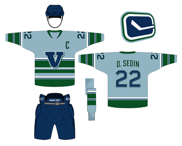 Peter Debay Peter Debay |
Peter has an interesting take on the look of the Vancouver Canucks. Interesting choice of colors and type. Gives the sweater a very classic feel. |
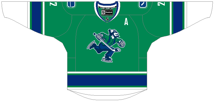
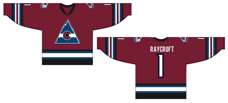
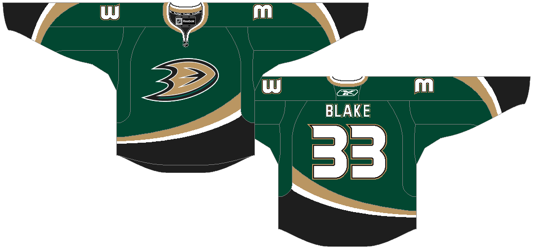 Ryan Haslett Ryan Haslett |
Ryan is one of our most prolific designers, and here I've got three of my favorites. (I know there's only one rating, by the way, so just make it an average.) First, awesome Canucks jersey. Forgot the Johnny Canuck V logo, go Johnny Canuck all the way! I also like this Avalanche concept. Great callback to the old Colorado Rockies logo in the burgundy and blue. And green is just what the doctor ordered for the Ducks. Heck, I'd settle for orange if they'd just use the webbed D on the front! |
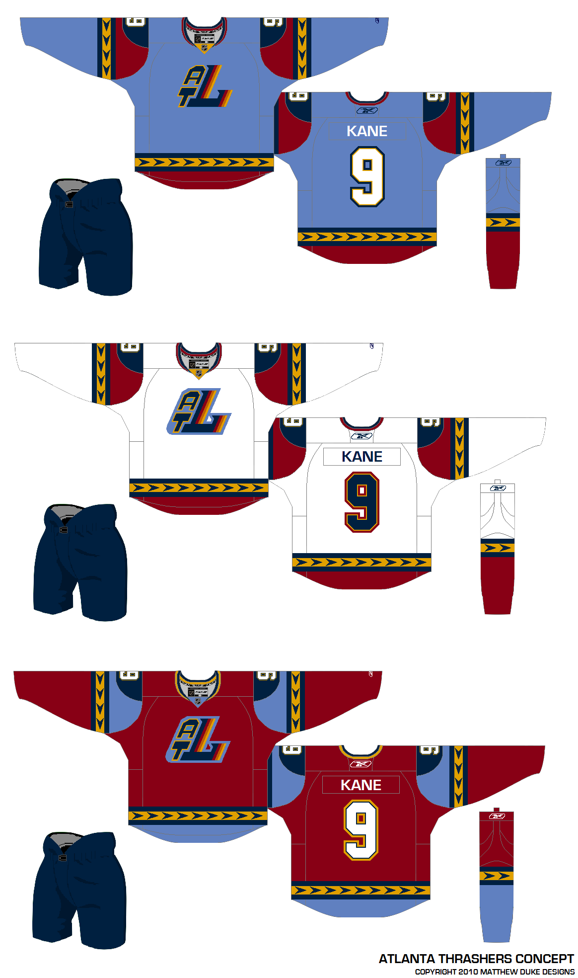 Matthew Duke Matthew Duke |
This post is about creativity and sometimes that can yield a somewhat disappointing result. I like where Matthew is going with the uniform designs, but that ATL logo was not well-liked as a 10th anniversary mark, and it's sure not any better here. But at least it gets us thinking about things for the Thrashers. |
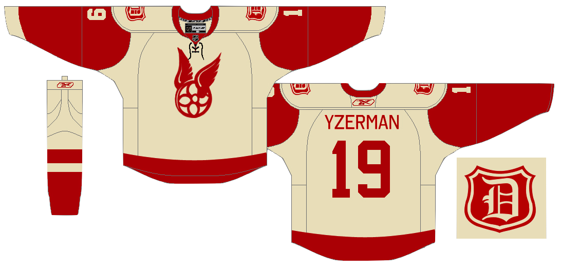 Vin Maccioli Vin Maccioli |
Here's a cool one. Vin offers up a unique alternate sweater with a very retro feel. It may not work for the Red Wings on a regular basis, but maybe as a one-off specialty thing instead. And yes, I'm also posting this one as a tribute to my Bolts' new GM — Stevie Y! I'm expecting great things from him. |
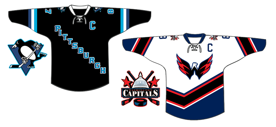 Jake Slavik Jake Slavik |
The last concept is a little Winter Classic 2011 bonus. And with all respect to Jake, this is pretty far out. He's combined so many different eras of the Penguins and Capitals that it's become kind of a jumble. On the other hand, it does help us see what was good and what was bad about these clubs' past uniforms. For example, Weagle good, funky striping not. And sadly, he's left the gold out of the Penguins' jersey entirely. Despite the blue sweaters in the Pens' early years, the penguin logo was never without gold. |
I'm shooting for concept updates on a weekly basis, but that may be too much to ask for. Just know that I'm doing the best I can. I'm assuming things will quiet down on the news front as the summer goes on, which will allow more time for concept posts.

Reader Comments (11)
that ducks jersey is spot on perfect IMO.
that ducks uniform is green and black and has a big D on it. If that doesnt say Dallas stars I don't know what does.
I Like The Penguins Concept. But The Thing That Really Won Me Over Was The Green Ducks Uniform.
Man, that Ducks jersey would be an instant purchase if it was true! Rings some traditional feel from the Mighty Ducks movie with Emilio Estevez.
That Red Wings logo is actually from the first Stanley Cup winners in 1893...
Wiki it for more info
i actually don't mind the design of the atlanta jerseys, the logo is awful tho, that with the 'T" on front would be almost perfect IMO...i don't care which crappy logo you choose to put on front, all vancouver designs seem to blow....i'm actually a fan of that wings jersey and logo...avs and ducks jerseys both solid...capitals design is atrocious
Thanks for the updates and all your hard work on the site, Chris. But, seriously, can we keep the updates and concepts, etc, here on your site instead of Facebook. I have completely opted out of facebook, twitter, etc as I have found all the updates overwhelming and content usefulness underwhelming. I'd much rather actively seek out what I want to see on websites like yours - besides, hopefully, your site will get more ad revenue through our visits and clickthroughs instead of directing us to Facebook.
WestCoastDave, obviously my goal is to keep everyone here on Icethetics. But putting together concept art posts is a time-consuming task that requires more effort than you would think without a lot of reward. The site stats show that the primary draw of the site is the news on the blog. Concepts are a distant third behind the logo tournaments.
Of course I will continue to showcase the most interesting concept art here on the site for those interested. Think of the Facebook page as an extension of that. And for the record, you don't need a Facebook or Twitter account to follow Icethetics. I keep the Twitter feed on every page of the website in the sidebar and if I post anything new on Facebook (which is usually a link back to a post on icethetics.info), there will be details in the Twitter feed. So you never have to miss a thing.
I echo Chris's comments all the way to the bank! I can envision a sea of green inside and outside GM Place with that look. Looking at all the recent Canuck player acquisitions, the ONLY thing that needs to be done is getting Johnny Canuck to replace the Orca and Vancouver wordmark. Hopefully in 2011-12.
wow that thrashers concept i did makes me cringe today... i have better thrashers concepts now... wanna see them?
That angled stick in rink Nucks logo next to the first concept is pretty sharp. It gives it sort of a 3D look. Don't think it's front of the jersey material, but sharp idea.