


Third Jersey Theories
 24 Comments
Today's batch of concept art deals with a handful of teams with new sweater designs on the way. While we wait for official unveilings, our concept artists get to work on some predictions of their own.
  Alex Valvo Alex Valvo |
The Sabres will unveil their new third jersey on Sept. 18. All right, technically these aren't third jersey concepts, but the expectation is that the Sabres will promote their current third jersey to home status — while adding a white version for the road. That's the concept Alex is offering up today. |
 Jekabs Elerts Jekabs Elerts |
We keep hoping for the Lady Liberty logo to return when the Rangers unveil their new third jersey in November. That's what Jekabs has for us — though he likes to work with the Nike Swift jersey template, as opposed to the Reebok Edge standard. Regardless, it's a solid sweater design. |
 Jekabs Elerts Jekabs Elerts |
The Penguins will use the 2011 Winter Classic to launch their new third jersey. Jekabs's guess is that they're going with this 1967 replica. But since they're the home team, it probably won't be a white jersey — but you never know. The Sabres wore white when they hosted in 2008. |
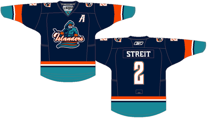 Ryan Haslett Ryan Haslett |
I'm a big fan of this one. Ryan, a prolific concept artist, has put a unique spin the much-maligned Islanders jersey from the mid-90s. Not a bad treatment if you ask me. Perhaps if the Isles had done something a little less radical and a little more like this, fans wouldn't have rioted so much. I like that font, by the way! |
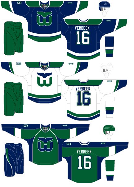 Connor Hanley Connor Hanley |
The Whaler talk these days has been intense. More on that in an upcoming blog post. In the meantime, Connor joins Howard Baldwin in hoping for the NHL's return to Hartford. Such a great logo. And solid uniforms all around. |
 Jack Martineau Jack Martineau |
And finally, while the Canucks aren't actually planning a new third jersey — that we know of — I decided to toss Jacks' concept into this post as a bonus. The logo used on the jersey just won the NHL secondary logo tournament here on Icethetics. |
As always, feel free to email in concepts. I'm working on adding a bunch more to the Facebook page this weekend.

Reader Comments (24)
NYR looks too plain, VAN is too stripy, I STILL hate the "Buffalo Buffaloes" concepts, and will NEVER like a logo with a buffalo in it...
For PIT, I'd like them to use the old penguin logo on that, although I never understood all those stripes.
And NYI, seriously? I liked it... but just, no.
As an Islander fan I want to riot at any jersey in those colors with the fisherman logo. I don't think any non-Islander fan will ever know the feeling that jersey or any jersey like it brings to some of us.
Kevin Y, I'll never understand why you call them the "Buffalo Buffaloes." The Sabers is an all time classic logo. They are the Buffalo Sabers ... so the logo works ... a Buffalo and two sabers ... classic. I'm not a Sabers fan, but I've always like that logo and jersey too. They never should have changed them.
I agree, great logo and great jerseys
BUF one is nice. Not really groundbreaking, but simple the way I like it.
NYR one is like the Oilers one everybody hates so much.
PIT one is lame. Although that is partly because there is no logo and partly because I hate powder blue (yes the ones most of you love).
NYI one is ugly.
Whalers is great, except for the third.
VAN one is horrible.
Who are these "Sabers" CharlieM keeps talking about???
I really like the Rangers concept, and I think it has a chance if you look at the logo on their practice jerseys this year...
That Canucks jersey is truly awful, The whale is decent, but the originals were better, I like the simplicity of the Isles, Pens is a fail, but the sabREs look good.
There will be a Whalers team soon.
Howard Baldwin is close to buying the Hartford Wolf Pack and is planning to rename them the Connecticut Whalers.
Im digging the idea of nike swift coming in for third jerseys I think rbk is over rated
I like all the NY state ones, even the Gorton's Islanders.
I commend the outside the boxness of the Canucks jersey, but if the green sleeves are modified just as vertical stripes along the arm and add another horizontal green stripe at the bottom of the torso, it might pull together a little better. Even so, not sure if that's enough to salvage it though.
I love the home and road Whalers set. Classic, yet modern.
Howard Baldwin should never have left Hartford. After all, what happened? They end up moving, he buys into the North Stars only to sell his share to his partner, Norm Green (and we all know how that went for Minnesota), then he buys the Penguins... yeah. As far as the Whale concepts, not too bad on the blue and white ones, but the green one is a little too EDGE-y. (Then again, I didn't care for the Plymouth Whalers' new home blue EDGE uniforms this year for similar reasons - disappointing considering Seattle managed to successfully import the 90s Whalers design to the new system.)
Not too shabby with the Isles concept, although that number font... kinda... makes me think of a flight into the shadowy world of a man... who does not exist!
I really like Alex's take on the Sabres. Although... I would really, really, REALLY like to see that holdover B/sword logo either changed into a different font, or gone altogether. Yes, I know it counts as part of their history, but it's just so 1990s... in a bad way. In any case, it would be nice if they did away with the extra piping and the silver gussets (a.k.a. grey pit stains) on the blue jersey, wouldn't it?
Oh, and what's not to like about the classic logo? Yes, it does have a buffalo in it, but it literally reads as "BUFFALO SABRES"!
Vancouver's... interesting. Not quite the way I'd go... the others aren't too bad, but the Rangers could use a little extra boost of red on there to spice it up. As is, it looks a little too plain.
I'm a big fan of the Sabres quasi-retro look, but I wish they'd get rid of the complicated piping and striping on the home jersey. I agree with Kevin, the Rangers jersey is just about superb, it's just missing a stripe at the bottom, and an armband that goes all the way around!
Is there a difference between the white Sabres jersey in the post and the one worn at the 2008 Winter Classic?
the only thing the sabres jerseys are missing in that are the stripping on the pants. i feel that it looks better (see the winter classic jerseys) with the stripes. i cant wait to see what the 3rd looks like and to buy the new white one (assuming there is one)
@KYOJIKASSHU
For my concept I purposly went for the Plymouth whalers look.
@ Kevin. Dude that logo says Buffalo sabres. It has a buffalo and it has sabres. What else do u want?!! ?
Sabres is a gimme, even I've made one like that.
Rangers is BEAUTIFUL- needs a bottom stripe and full armbands
Pens is okay
Islanders- WE WANT FISHSTICKS!!! (nice design, except for Mr. Gorton)
Whalers is bad
Canucks is WORSE
Sorry Jack, but that Canucks design seems too much like a soccer uniform for my liking. I applaud you for creativity although I dislike the white nameplate particularly (I think it works for the Flyers, not the Canucks).
The Whalers third uses my Blues pants design. A team with an awesome logo using a another team with an awesome logos designs. Ironic in a good way, nice work Connor
I don't know why the Penguins blue is maligned by many... it's actually supposed to be a Columbia Blue, which was a common colour in the 1960's. It's a little darker than "powder blue" and looks sharp in the right circumstances, one of which is this original 1967 Pens jersey. What I'm REALLY hoping for, if this is in fact the direction they're planning to go, is that they keep the '67 font, which features rounded numbers, with a Rangers-esque "shadow". There's nothing else out there like it today or even back then. It's really cool... check out a pic of one at nhluniforms.com or Google pics of the goalie, Les Binkley... you should be able to get a good photo.
Am I the only one whole liked the Whalers jerseys when they added the grey?
@Reilly: I preferred the grey ones.
Any planned updates with new concept art? It's been over a month... Not that I don't fully appreciate all of the blogs and the ToL, just curious when I should return to this tab for new stuff.
I miss concepts... :(
Hey its good to see Anaheim Return to the old Mighty Ducks logo i figured Anaheim would eventually bring it back i cant wait to see it on the ice