


Predicting the Future
 20 Comments
Hey, looks like it's time again for our monthly concept post. Really sorry about that, but as I've said, the blog and logo tournaments come first because that's what most people seem to be interested in — though I recognize there's a core group here that just can't get enough concept art. This one's for you.
Today's theme deals with the future — our designers taking a stab in the dark at what could be. Bookmark this page. We'll see how close they get.
 Brian Brideau Brian Brideau |
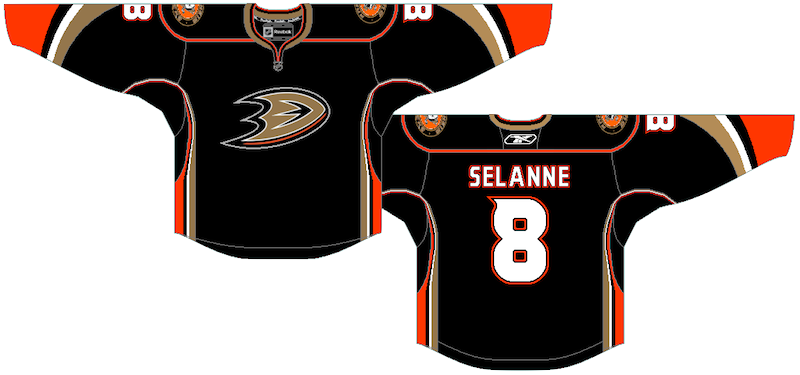
First up, Brian sent in this concept based on a description I wrote of the Anaheim Ducks' new third jersey. Based on what I saw, it's pretty darn close. There are some minor dissimilarities, but for the most part, he's got it.
The Ducks will sport their new alternate sweater for the first time on Nov. 26 against the Blackhawks. That's probably the first time we'll get to see it legitimately. |
 Jayde Garrow Jayde Garrow |
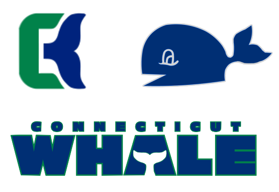
The other day, the Hartford Wolf Pack announced Howard Baldwin is taking over business operations and his first act will be changing the team's name to the Connecticut Whale at midseason. So Jayde took a stab at a possible logo. Very nice tribute to the classic Hartford Whalers mark and very simple. |
 Stephen Griesmer Stephen Griesmer |
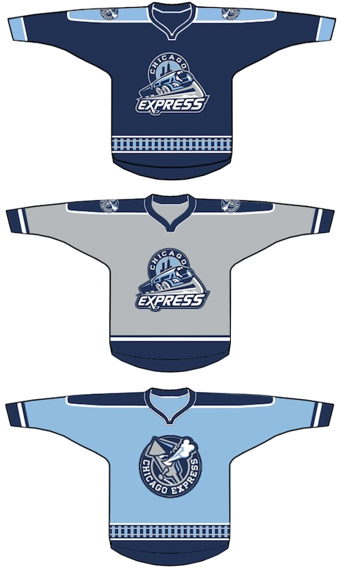
Yesterday, it was announced the newest ECHL team will be named the Chicago Express. Logos were unveiled but jerseys are still under wraps. Here's one idea from Stephen for home, road and alternate sweaters. The team doesn't begin play until the 2011-12 season. |
 Mike Wytrykus Mike Wytrykus |
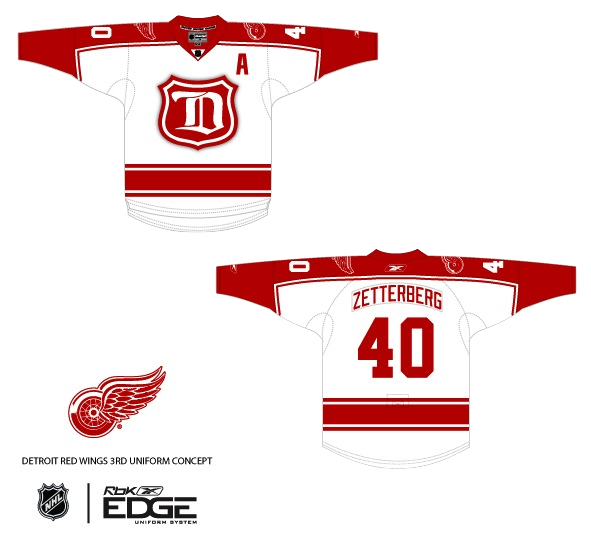
The next two aren't really future jerseys — but I suppose they could be, right? Mike's rendition of a throwback-inspired Red Wings jersey is, well, inspired. This is one example of a jersey that in no way takes away from the team's long history. In fact, it plays it up. Count me a fan. |
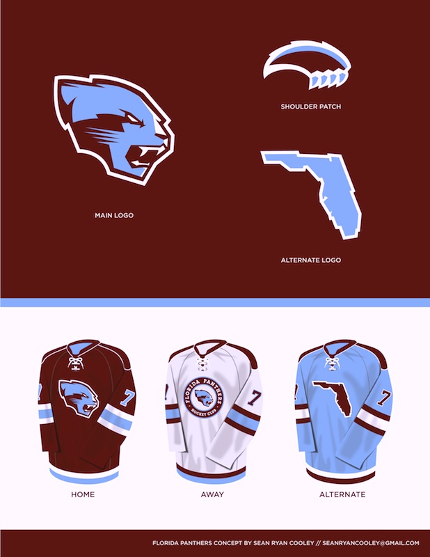 Sean Ryan Cooley Sean Ryan Cooley |
And lastly, Sean tried his hand a rebrand for the Panthers. As I told him, I feel like the colors don't work together that well, but I like the direction and the logo designs are solid. I think the Panthers have one of the best logos in hockey, but they're certainly working toward something simpler as evidence by last year's third jersey. |
Until next time... (which I do hope to be sooner than a month from now.)

Reader Comments (20)
Anaheim is....well....I guess I can't blame Brian, he did a good job based on what we know, it's just a shame that the Ducks feel the need to introduce a black alternate to their black jersey.
I'm still not fond of the name "Whale" but the concept is probably pretty close to what we'll actually see, and I love the wordmark.
Express I can take or leave, though I'm not a big fan of the grey home. That would've caused some serious problems had the team played in the AHL last year and dealt with Milwaukee's already troublesome grey road jersey. I just think that white needs to be white and the dark jersey needs to be something that's obviously different to white even on a B&W tv.
That wings concept is killer, I'd buy one, and I can't stand Detroit.
As for the Panthers....I can agree with Chris on the colours not feeling right together, it just looks really washed out with the maroon, and I'm not fond of three jerseys with three different logos. (How's it going Atlanta through the ages).
FINALLY!! CONCEPT ART!!! Glen is VERY HAPPY right now!
That Panthers concept is pretty cool. I actually don't mind the colours either. I just don't like the circle logo on the white jersey or the idea of a state as a logo.
That Panther rebrand is downright fantasic!
Love the Detroit one....not a fan at all of the Florida...I like the logos, but not a fan of the different logo on each jersey, and the colours are too similiar to colorado to work...when I think of Florida, I think of bright colours...not dark
That Ducks concept is certainly an improvement over what they have. And, hey, if it gets rid of the DUCKS wordmark eventually, I like it.
I really like that CW logo, it does a great job paying homage to the Hartford Whalers logo while still looking different. I hope they go with that whole set.
I like the 3 jerseys for the Express, but I don't know if not having a white jersey is a great idea...I second Ian K on that one.
Detroit's jersey looks fantastic. Hate the Wings, but that's just cool.
As a Florida Panthers fan, I hate that whole concept. Light blue is not a color of the Florida Panthers I support, and it should NEVER be used full-time, even during a total re-brand. I do like the layout of the jerseys, just make the home Panther Red and the alternate navy blue, and throw on the original Panthers logo that I still love (the Panthers are not a 1960s franchise and does not need/deserve a 1960s-esque logo). While the new logos (aside from the state logo...leave using that to the Lightning) are nice, they'd be better suited for a new team (i.e. Hamilton) than a re-brand of the Cats. But, again, the Panthers need to keep the original, scrap the new alternate, move the current home to the alternate, and introduce a Panther red (bright red) version of the jersey to be the home. I loved the navy when they introduced it 10 or so years ago, but the Panthers' main color has ALWAYS been red, and we need a RETURN TO RED.
I think I saw Coach Bombay wearing that Panther jersey in the Mighty Ducks movie
By the way, to Sean, it's not that it's poorly designed (the Panthers jersey) or anything, it is quite sharp. It's just that I don't want the Florida Panthers to switch to that color scheme or a simplified logo. Did not want you to take any offense from my comments or feel that I didn't like your designs, they just don't belong with my Cats. :)
I agree with Drew. I don't like the fact after the Penguins reintroduced their powder blue jerseys, and were successful with it, the Panthers decided to make their own version of it. If their was anyone else that did the same, please say so. I feel like there is more than just Florida. Remember, Atlanta have had their awful blues for a while.
When the Ducks adopt this as their primary (which they will unless they aren't too bright) I will finally be able to stomach the fact that they exist. I haven't been able to watch any games of theirs on TV, even against my team, or play as them in the NHL series from EA because I cannot stand how atrocious they look. Which is sad, because Hiller is awesome.
I can't wait for the Ducks new thirds, finally the D will be where it needs to be! Last season the D was painted on center ice, now the third jersey this season and looking at the pics of preseason they have the D decals on their helmets!!! I just hope they make the third jersey the primary quick like next season cuz u know they are eventually.
Cannot imagine that Disney would let them use the old logo without their being a substantial dollar amount attached to it... They wanted a ton when they sold the team for the rights to the "Duck Mask"... Is that really what the shoulder patch looks like?
Why can't we rate the concepts?
Sorry about that. Forgot to add the rating widgets. I'll get 'em next time.
thats a very nice Ducks jersey. i was never really a fan of any of the ducks jerseys but i wouldnt mind seeing something like that replace the current jerseys
I like the panthers redesign, but hate the third jersey, as they are not the only team in florida.
Love the Detroit. That should be their alternate.
I really like Sean's designs for the Florida Panthers jersey. I really enjoy the color scheme as well. These Floridian colors harmonize well with the simplicity of the Everglades, and the Reddish/Brown would be a unique tone for the NHL. I'm all in favor of new color schemes for the Panthers and other teams that have overused the Red/Blue color scheme. The alt-jersey with the state of Florida as the crest is a terrific, surreal idea. What a statement this would be to all the old-timers who never thought think there shouldn't be professional hockey in Florida. I think it's a crest that would conjure up pride in the player and fan alike; an excellent display of minimalism.
@Richy As a die-hard fan of the Florida Panthers, I completely and utterly disagree with you. The state of Florida as a crest is something the Lightning have used (as a shoulder patch). The Florida Panthers use a fantastic shoulder patch of a sun with a crossed hockey stick and palm tree to represent the state, particularly the South Florida area. The navy/red color scheme may be overused, and I completely agree that they need to shift from the navy/red color scheme. But not to ANYTHING but RED, navy, and gold like that Panthers are supposed to look like.
Maroon and baby blue are NOT Floridian colors. The colors of the Florida state flag are actually red, white, and gold. Take those colors, and add navy as simply an accent color (shoulder yokes or stripes on the bottom and/or sleeves), and THERE are your Florida colors for the Florida Panthers.
I appreciate the minimalism thought, but I would NEVER have pride in a jersey with the state on it as a crest. I don't know if you are a Panthers fan as well (and, hey, maybe you are), but there is NO Panther fan that I know that would want anything but a RETURN TO RED, and Panthers red, not maroon.
Just to reiterate, none of this is aimed at the artist, who created a great logo, just not for my team.
It just dawned on me - that Panthers concept borrows the colors of the 1983 USFL champion Michigan Panthers! Clever, but I don't think it quite works for Florida. Maybe if the design was recolored...
I'm not crazy about that weird, stretched-out "D". The blackletter style works fine for the Tigers, but there's probably a good reason it only stayed around for one season with the then-Cougars, while the Winged Wheel's remained front and center for nearly 80 years. And that shield is more Montreal Wanderers, IMHO.