Saturday
Apr022011
Collection 21: Calling On Quebec
 Saturday · Apr 2 · 2011 | 10:23 PM PDT
  14 Comments
 Earlier this week I asked you guys for modern-day concepts for defunct NHL franchises. I received a lot of awesome work, but the Nordiques were the most popular.


In the next set, we'll visit some other former teams including those once in Cleveland and Kansas City, plus one you'll likely not recognize.


Reader Comments (14)
Jack Fraser's inclusion of Tavares in his design is a ballsy statement. I love it.
As usual, Dallas' are absolutely beautiful! I'd love to have the home jersey.
Of these, though, I have to say that Bryan Scartozzi's is my favourite.
I can see them not being the Nordiques (Unless Colorado decides not to be (insert your favourite swear here)), however, so I like the idea of the Fleur-de-Lis as the main logo.
I think Fraser's are definitely the benchmark of this collection
the fraser concepts are pretty nice. they just need a hint of red and it would look nice. :) the last one looks like it can be used as a shoulder logo only, not as a main though.
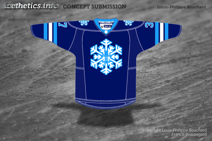
The snowflake is very cool. Too bad they won't be the Nordiques if they get a team. Get some with other nicknames.
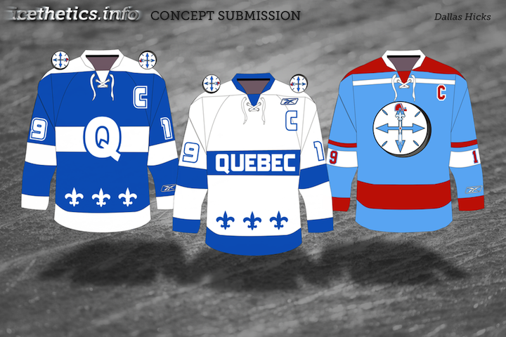
My inspiration for the first two comes from the Quebec Bulldogs of the 1910's, actually; they're clean and simple designs and allow for pretty much any new nickname the team would like to use. I'm aware that "Nordiques" will simply not be an option, but I slipped their logo into the alternate logo: the Compass ("Nordique" means "of the North", right?). The compass logo is on the front of the 3rd jersey, which is an homage to the very first WHA Nordiques jersey. In retrospect, I wish I'd changed the opposite end of the compass arrow into a goalie stick shape! I also made a second set that might be more likely to see the light of day based on another famous Quebec City team: the Aces. Maybe Chris will slip it in next update?
I really like a lot of what I see here, guys! The two-tone blue concepts are excellent (something as simple as adding those lines to the left side of the N on Mr. Fraser's logo add a lot; again, a shame they can't use it anymore). The snowflake logo might actually be a great shoulder patch!
The Lacaille concept takes the cake on this one. Perfect amount of red, classic-look stripes, great use of the Fleur-de-lis. Good job.
I really like the dark tones of Mr. Fraser's design. Although the other's show some creative flair, the first referencing the Quebec Bulldogs', I really wasn't feeling most of the designs. I am curious to see if anyone is working on a Winnipeg Falcons' or Red River Rebellion Sweater as well.
The problem with the snowflake and the fleur-de-lys: I just mixed some low pixel images. Plus, I could work I little more on different mix of colors. I saw that jersey as a third one for the Nordiques. True, it woulf fit as a shoulder patche. By the way, I really love Foster's concept. Really cool colors (no red!!) and cool blend between the white bear and the old logo. Sweet!
I hear a lot of comments on the impossibility for Quebec and Winnipeg (if those cities gets a NHL club back) to name their teams using the Nordiques and Jets trademarks. How's so? Why wouldn't the NHL let those cities use the name of their past teams?
He should more worried about getting the team before getting Tavares.
thanks for the kind words about the jersey. JSYK, I'm from halifax with no attachment to Quebec or the Nordiques. I put Tavares on the back to spite a particularly anti-Quebec member of sportslogos.
Jack's designs are the best of the bunch, but speaking as an Isles fan, putting our guy's name there is like a knife in the kidneys.
the owners of the names Jets and Nordiques are the Colorado Phoenix Coyotes. So they would either have to sell the name to Winnipeg or Quebec or be the franchise that moved. Phoenix back to Winnipeg colorado back to Quebec
That's so scary--Tavares on a Nordiques jersey!!! Hopefully the Isles are going NOWHERE!!!