Sunday
May292011
Collection 33: New Looks for Long Island
 Sunday · May 29 · 2011 | 11:52 AM PDT
  27 Comments
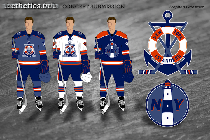
 Reebok has told retailers to expect a new alternate jersey for the New York Islanders next season. The rumor mill has told us to expect it to be black. That's inspired our concept artists to designs some new looks for the Isles — some of which are, in fact, black.


What do you think of these? And what do you think the Islanders should do with a new third jersey? Is black the right way to go? Orange? Will they add a new logo of some kind? Speculate away!


Reader Comments (27)
At first glance, the last one didn't look that good to me. But when I looked for a second time, it looked really evil and badass -- as if the player wearing it will murder you or something.
No kidding that none of them are getting good ratings. The Isles' jersey history should be as simple as it began. Retro royal blue and orange. Black doesn't agree with it, like what the Mets have tried.
MIke Majeski's Mets knockoff is interesting. Let's see something in pinstripes!
For some reason I really like the Mets inspired jersey !
This batch is a bit lackluster. Griesmer's concept might be the best of them, but the faded blue and the logos aren't spectacular. I personally like what they have now.
Mikes concept looks like a New York Mets hockey jersey? Actually, I'm positive that's the Yankees "New York" with a drop shadow.
Stephens is great. Easily the best of the bunch with nicely done primary crest.
Alex's concept is great, except for one major eyesore, those gloves. Wow, never thought too much blue could be a bad thing, but those make the whole look fall apart. If they were black, this concept would be dynamite, but with those solid blue gloves carrying into the blue sleeve stripe, it's not a winner.
Black just does not look good with the Isles.
I don't think you can improve on the Isles' original design that much, but Stephen's buoy logo would be an amazing shoulder patch.
Make Chris Wright's blue or orange and I'm sold. Love the NY and the island by itself without the circle. Nice change.
the mets inspired one is laughable, but I really like Colin May's concept. its so hard to make orange look good while being the primary color. the logo needs to be bigger though
Well the first one, if they go back to the normal pants and drop the Blue Shoulder Yoke, might work.
PLEASE ISLANDERS NOOO BLACK JERSEY
The last one looks really menacing; I like it. Can't say I care much for the others...
Despite making one of the concepts, I have to agree that black just doesn't belong. I definitely couldn't handle black, royal blue, and orange, but any concept with black and orange (e.g., mine) would look as good or better (or, at least, more appropriate) in royal and orange.
Actually, to disagree with most of you, I like the Islanders adding a black alternate jersey! I think the one by Chris Wright designed, the "NY" and the island without the circle looks really cool; and if he were to add some blue in there and I'm sold!
The third one looks like the Mets' alternate jersey.The Isles need to forget about using a third jersey and just continue to use their current threads. Right now their jersey lineup is pretty sharp.
Stephen's anchor logo is spectacular. It's the first original new logo concept I've seen in a long time.
I like the last one, IF you added some sort of horizontal stripping to the bottom of the jersey.
A black version of the away jersey would make sense and actually look quite good, but what the fudge Islander? BFBS....
I think that the Islanders should follow the Sabres' lead. Don't mess with it. The Sabres have the best jerseys in the league, third jerseys' included. The home and away are simple and based off their original sweaters. The third has connections to hockey in Buffalo, with the script harkening back to the Bisons of the AHL (the Bottlecaps to some..) and the lighter blue and yellow touching back more to the original blue. I think if the Islanders were to darken up their current and just find a way to retro their jerseys it'd work.
Too often, hockey teams try to go "Futuristic" and they lose their identities. Hockey is a traditionalist sport, stick with a traditionalist look!
Second one looks coast guardish but I really like it.
i'm liking alex valvo's concept quite a lot, would really like to see a version where the blue & white are swapped around (and with black gloves).
i like chris's, and i think you could put that in either blue black or orange and it would look good
The more I see Alex's concept (the first one) the more I like it. Fix the gloves (add some orange, black, and white) and I'd love to see that on the ice.
I really like the last one. Only thing is I would use a dark blue instead of black
The last one is so amazing. I would do anything to have it be their 3rd. At least one thing would go right with this organization for a change.