Wednesday
May252011
Collection 32: Gone But Not Forgotten
 Wednesday · May 25 · 2011 | 1:16 PM PDT
  17 Comments
 All the Winnipeg Jets talk of late is practically begging for a concept post in which we look at other defunct franchises. What have our talented artists envisioned? Let's see.


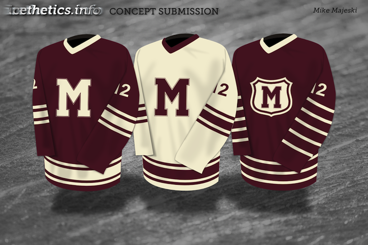
Above, you'll recognize the illustrious California Gold Seals of old — and below, the Montreal Maroons of even older.


There are no Jets concepts here but we've seen plenty of them recently and I'm certain there will be more to come in the near future. If you've got one, you know where to send it.


Reader Comments (17)
Why a wolf cousin? Why not a seal or a polar bear?
Because it'll hurt more, you twit.
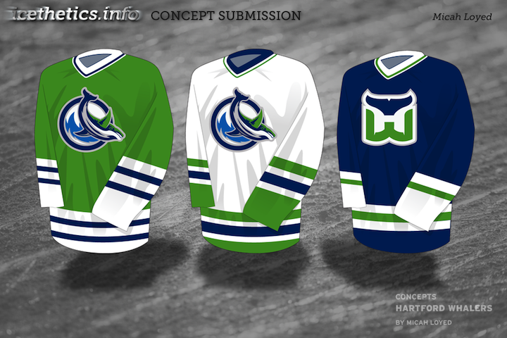
In the first Whalers jersey, it looks like the whale is diving. [insert Canucks-as-divers joke here]
For my Maroons concept, I looked to the old Maroons uniforms obviously, but it should be noted that the third jersey incorporates elements from two former Montreal teams...the Maroons and the Wanderers.
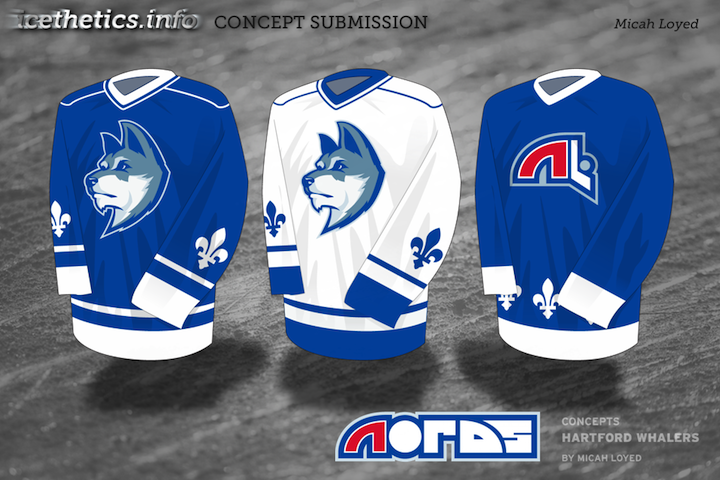
I love the Nordiques jersey. Especially the husky logo, but the original should be the main one with the husky as the third
I like the Maroons. The other jerseys (the originals) are classics and are perfect they way they were.
Particular props to the Whaler's logos. Those would make for a great alt logo, and are definitely much, much better than the abomination that is the Connecticut Whale logo.
the nordiques concept is tremendous. i do like the first whalers navy jersey and the seals set too
The Quebec concept is unreal I love the wolf
EXCELLENT Nords jersey. Heck, all of them are excellent.
I love that Maroons uniform... would love to see that on the ice....
Manitoba Maroons perhaps? Nah, they would never take a name from an iconic team of the past... too bad...
The Nords jersey is nice and simple. I see the take was off the version of what the Nords would have switched too had they not moved to Denver. They were to switch to a Huskie during the off-season and the league deemed it too late to switch, so they were going to switch the following summer. Unfortunately, it was that summer where they were sold and moved.
I love that the wolf is not baring its teeth or biting a hockey stick
Nordiques concept is amazing for the same reason John D gave and it's also mislabeled.
I love love love! that Maroons concept. I'd kill to see those on the ice. The Nordiques one as well. All of these are fantastic though.
wow... I had a customer at work down here in Gainesville from Montreal who came in with a Maroons hat on. Pretty wild.
I view a lot of concepts here, but rarely comment. I just have to say that Micah Loyed's Whalers and Nordiques jerseys are among the nicest I have seen on this site. So simple and clean, with a fresh and new look that still does a great job with the team's original colors and identity. Also, great use of striping and fleur de lis on the sleeves.
The Maroons conepts are very nice too.
Don't really like the Seals logo...If it didn't say "California" on the jerseys and it was a different color scheme, tbh I'd have no idea what it was... Like the jersey though.
Plus, I love the updated Whale Tale logo on the first concept.